Quintype Review - A True Digital Publishing Platform

Quintype can be best described in three alliterative words; the “publisher’s publishing platform”. Everything in this headless CMS is directed at the dedicated content creator, and all aspects from the design to the UI to the UX are focused on the content.
Getting Started
Getting started couldn’t be easier. You can get a free trial from the homepage and from there you’re taken to your Workspace. The Workspace is the hub from which all of your content can be created, pushed and managed to any scale.
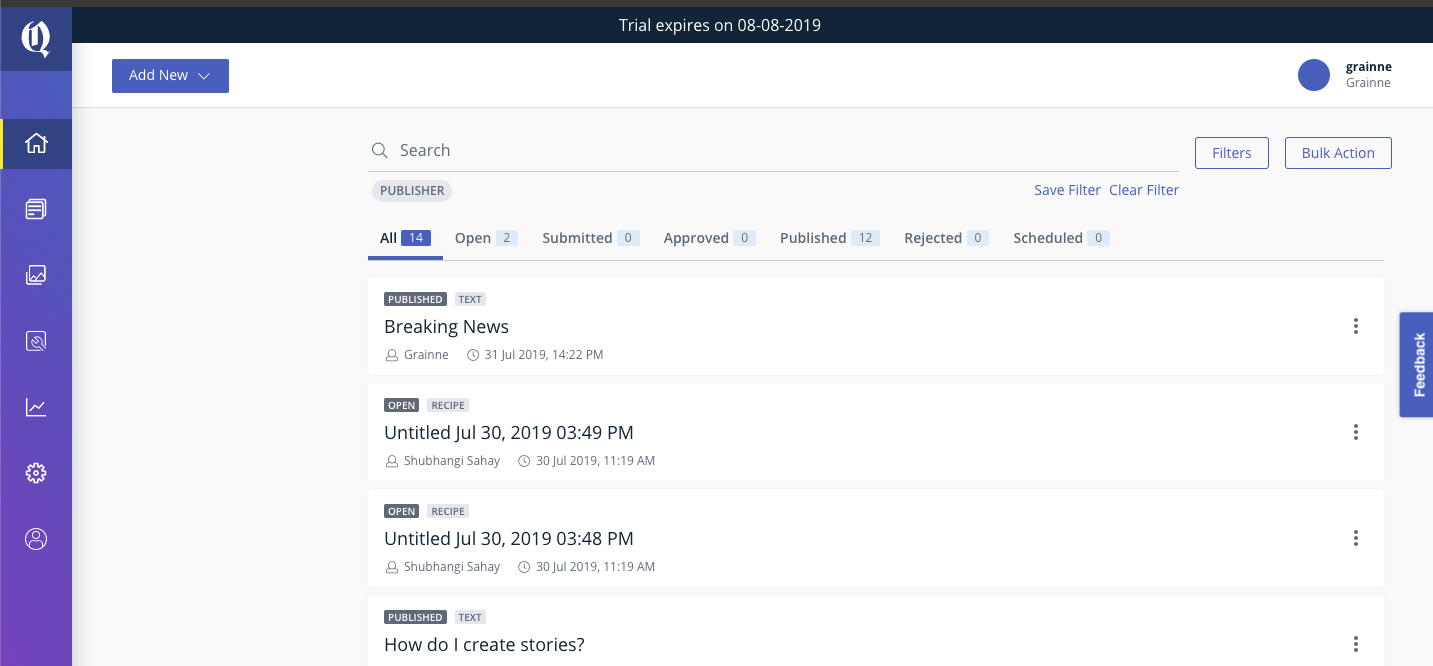
It really is very simple but it’s far from basic. The Workspace places top priority on posts and the content management, which isn’t as common in a CMS as you’d think.
Getting into the application was incredibly easy and well designed. There were just a few short clicks between signing up and getting right into the central hub of the site.
Design
The design you’re met with when you enter the Workspace is reflective Quintype’s entire aesthetic – simple, easy to use, and content focused.
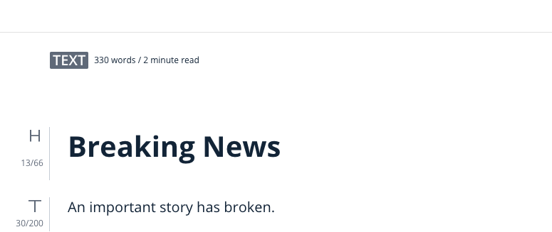
Quintype is incredibly intuitive to use and everything follows a WYSIWYG formula that never feels clunky or under-utilized. Everything just seems to flow. Want to change the header? The steps are clear. Want to add a hero image? Two clicks and you’re in.
The basic template I saw on the trial I used was eminently readable and well put together.

Quintype have more expansive design features available once you subscribe to their service, which they say will help you establish your brand guidelines and “deliver custom design templates”. The templates shown on their site are of a high quality with a design aesthetic that could suit any size of business and any style of content. Simplicity and a content-first approach sums up the approach of this CMS to their templates and layouts.
The backend, where all the real hard work takes place, is focused entirely on managing your content and making it as easy as possible to get your stories in place.
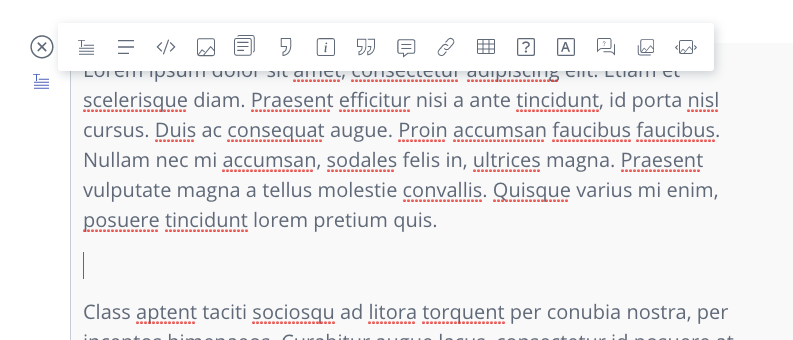
Their text editor is clean and easy to use, with an ability to layer in different images, hyperlinks, quotes, tables, slideshows, and question and answer sections. All of these are tool tipped and easy to use with clear instructions. It makes creating and polishing content incredibly easy and it comes out in a lovely, crisp layout that’s very easy to read. From a design perspective, Quintype is really sharp.
As Quintype is a headless / decoupled CMS. clients also have complete control over their front end development.
Usability and Support
Quintype is one of the easiest to use sites I’ve tried in quite a while. It’s intuitive without losing finesse. It’s a powerful CMS that places a lot of focus on the articles and stories. In my opinion, the placement of the content as the primary focus on the homepage of the Workspace offers a key differential from the likes of WordPress. Everything felt like it was in easy reach or just a short click away.
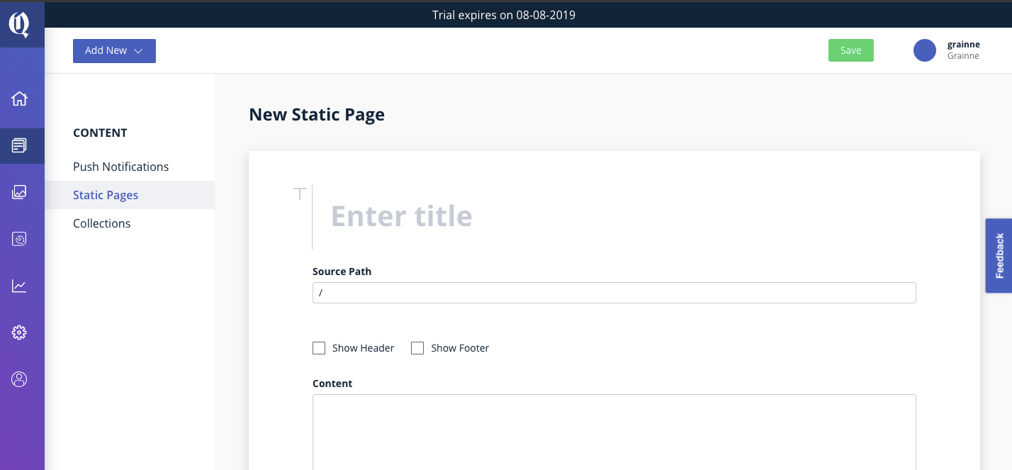
Everything you could want to access is clearly labelled and presented with as little jargon or proprietary language as possible. Do you want to add Facebook or Twitter integration? Just go to Settings and Social Sharing. Within three clicks, you’ll be ready to set yourself up.
Quintype has an extensive FAQ and Help section that covers everything you could need when you get started. I had an extensive look through everything and it seemed to cover every base you could reasonably expect to query. The answers were detailed and clear.
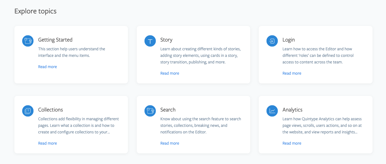
If the Help Section isn’t doing it for you then they have multiple support languages and online chat support. In addition, you’ll receive regular emails with helpful tips and tricks for using Quintype after signing up and you can also book a free demo to run through how to get started. These aren’t like those annoying emails you often get when you sign up to an app either; you know the kind that basically just want you to level up to a pro plan? Nope. The emails I received from Quintype offered genuine and quality support and really helped to enhance my user experience and motivate me to use the app.
The readily available free help and support and the effort that these guys put into making sure you know exactly what you’re doing from the get-go is commendable.
Key Features
Quintype’s scalable server capacity is a key feature of their offering. Sometimes a viral article or piece of content can stretch your web server to breaking point and beyond. Quintype’s scalable servers react to large traffic events by increasing your bandwidth as and when you need it.
Their custom ad monetization service looks really interesting too. They have a mix of native advertising and custom ads that are in line with your branding, with the overall aesthetic being key.
I also really liked their different product offerings. There really is something for every content vehicle, large or small. Their AccessType feature is heavily geared towards reader subscriptions with metered paywalls, pay per article, recurring payments, multiple levels of access, coupon codes, gift subscriptions, and more.
It’s a spectacularly powerful service that immediately puts them in the same sphere as a service like Patreon, except with better fee structures and more control. It’s a massive potential upside for them.
Pricing
Packages start from $99 depending on your needs.
Pros
- Easy to use.
- Clean design and intuitive UI structure.
- Very clean and professional templates with potential for custom development.
- Different site-packages for different website needs such as Bold, MeType, AccessType and Ahead.
- All with their own styles and individual features.
- Scalable server capacity to handle viral stories without changing your entire hosting package and all the costs associated with it.
Cons
- The pricing structure isn’t viewable on the site for understandable reasons this early in their business but it may put off some potential clients.
- The templates aren’t endlessly customizable in the same way as WordPress which isn’t a bad thing in my opinion but might not suit some.
Final Verdict
Quintype is an excellent, powerfully built CMS that scales to any business’s needs. It’s clean design and content focused aesthetic is perfect for companies with multiple editors and writers who need one place to manage their workflow and production. It’s one of the best content management systems I’ve seen of this type and it has the potential to make a big splash as it grows its user base.
Other great articles to read: