5 Steps Towards a More Effective Landing Page

A landing page.
On the Internet, you've seen it countless times. And still, a good landing page is something of a rarity. A good landing page is something you fall in love with.
A landing page is something you've created specifically for your the people who you want to attract. It's like a date or an important speech. A good landing page conveys not only an idea of your service but also the feeling.
For it to work, you have to pay a lot of attention during the development of your landing page.
There are five important things you should look for. Those five things together make or break your landing page strategy. After all, in the modern Internet the interaction between you and your potential audience happens in a matter of seconds. You have to catch attention before the page finishes loading.
Are you interested to find out how your next landing page strategy should be shaping up? There a lot of different techniques and tips. Today, we'll be talking about the five that are essential to every landing page.
1. A Call-to-Action

Your call-to-action is the most important part of your landing page. It informs the reader of what action to take.
Steer clear of going with the dull, overused “submit” text on your call-to-action button. Try something descriptive like:
-
Give Me a Free 30 Day Trial
-
100% Money Back Guarantee
-
Show Me What I’m Missing
-
Yes! I Want To Be A Winner
-
Schedule A Meeting
-
Take the Tour
-
Yes! Place My Order
The list goes on and on, but you see how all of these buttons are more engaging than “submit.” And, who wants to submit anyway? Empower the reader.
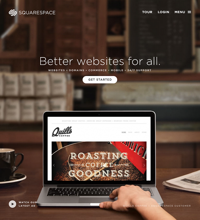
Additionally, make your call-to-action stand out. Most call-to-action buttons are red, yellow, or orange because these colors pop off the page.
Another key point — get to your call-to-action early. Readers shouldn’t need to scroll down your page to find it. In fact, people spend 80% of their time on your website above the fold.
Your call-to-action shouldn’t be an after-thought, it should be the main driver.
2. A UX Friendly Form

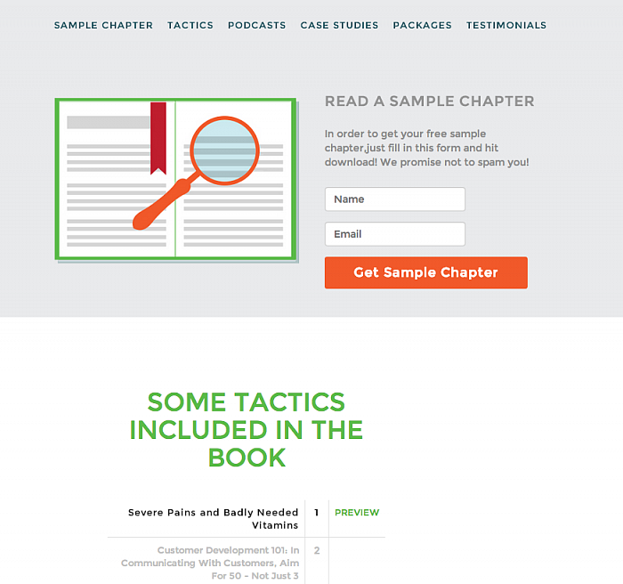
There’s nothing worse than a needy form. If your form is asking for my phone number, my date of birth, the name of my first born children, and whether I believe in unicorns, it’s asking for too much information. In fact, I’m a big believer in asking for just name and email address — and maybe that’s too much.
With social logins, it’s not even necessary to ask a user to create a new account. Most people hate that anyway, and 88% of people enter incorrect or incomplete information on registration forms anyway. Instead, get them to sign up with their social login, if possible. That way, the information is likely correct, you get a huge amount of information about them, and you don’t annoy them by asking that they join yet another site.
If social logins won’t work for your application, just remember to only ask for the information you need, and most of the time, it’s a name and email address. When you ask for more (like a phone number), you’re entering the scary “I’m going to call you during dinner” telemarketer zone, and potential leads will just leave.
3. Social Proof

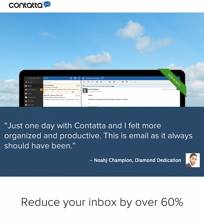
People trust other people. That’s why it’s a good idea to add testimonials on your landing page. I prefer to do it below the fold for two reasons:
-
To keep the main message uncluttered
-
To capitalize on the 20% of time that readers spend below the fold
Don’t simply settle for word-only testimonials. They’re not as effectual as having an image of the person smiling next to the testimonial. Bonus points for linking to the actual website or social media profile for that person or company.
Videos are fun, engaging, and adds even more validity to social proof.
In lieu of actual testimonials, you can add the logos of well-known companies with whom you’ve worked.The type of endorsement validates your product in the eyes of your audience.
4. Make It Responsive

According to mobile research study, over 60% of smartphone users surf the Internet from their phone, and approximately 34% access the Internet from their phones alone. Is your landing page considering these visitors?
Responsive design means that your landing page adapts to any screen size, from desktops to tablets to smartphones. Instead of asking visitors to pinch-to-zoom, you can page adapts to be functional and readable on every format.
Your responsive landing page should be finger-friendly. Tiny call-to-action buttons won’t work well on a mobile device. Also, you don’t want to make the reader scroll too much on mobile devices.
If you’re using WordPress, a theme that supports responsive design is the necessary way to go.
5. A/B Testing

How do you know what’s working unless you test? A/B testing lets you study each variable on your landing page to determine what’s more successful.
For example, you can test which call-to-action text is more persuasive. Keep all other elements on the page the same. Route half of the visitors to page A, and the other half to page B. Once you determine which is more persuasive, keep that element, and go on to test another part of your page.
It’s continuous testing, and it’s all worth it. Very small changes can make a world of difference in conversion.
In Closing
Those five principles of landing page design will make your landing page into something truly special.
Don't be afraid of talking to your potential audience. Fall in love with them instead.