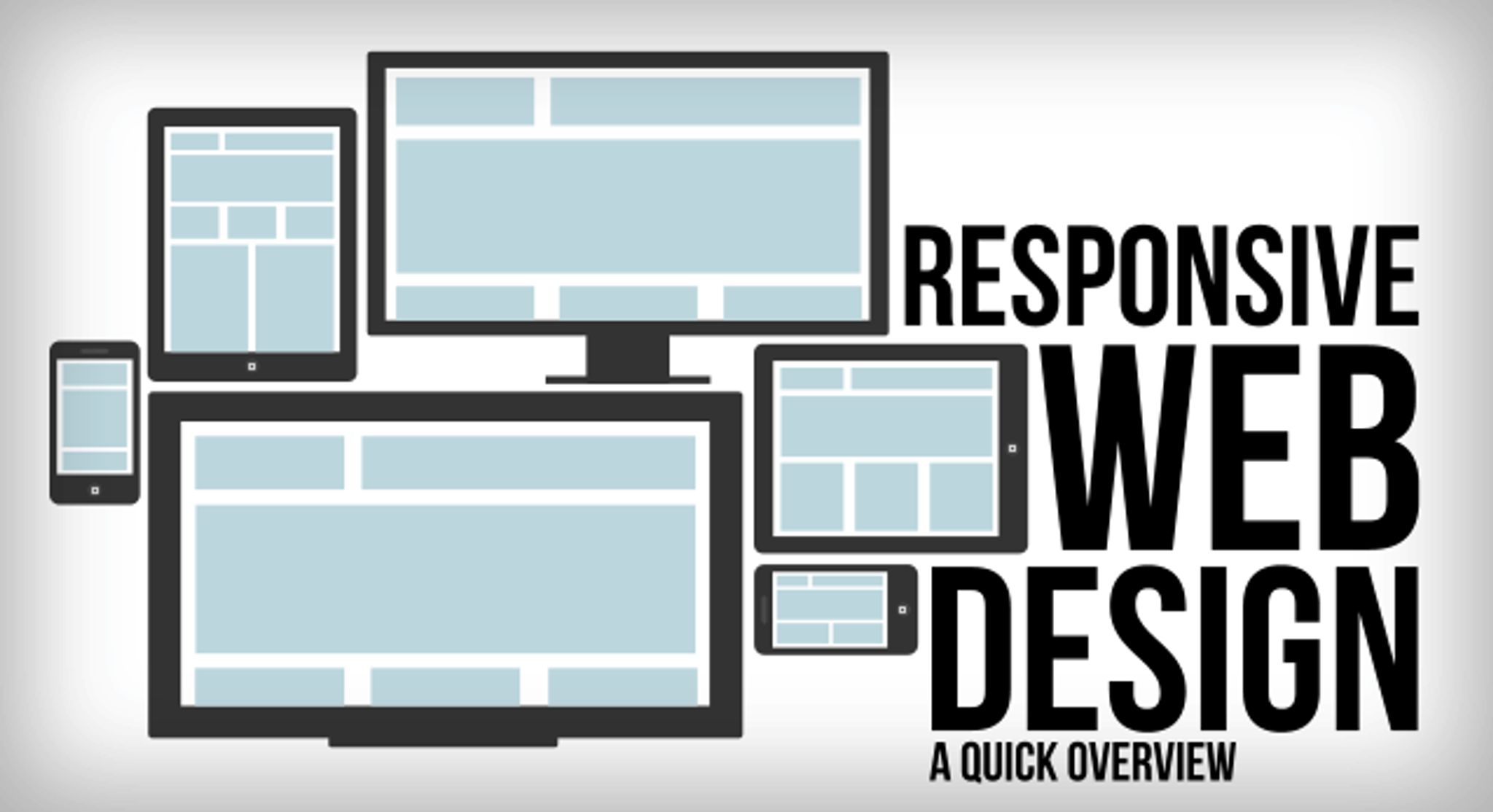
A Quick, Easy and Basic Guide to Responsive Web Design

As a heavy internet user and a bit of a gadget geek, I’ve been accused of being one of those people who’s always glued to some kind of interactive screen. This is part of my life, as well as hundreds of individuals across the world. Gone are the days when you would wake up, check the morning paper and head out to go to work. These days, the first thing you’d check upon waking up is your email using your phone, and then probably flick through a couple of websites on your iPad or android tablet while sipping your coffee.

This presents an interesting challenge for web designers who have, for the longest time, been creating websites for laptops and personal computers. This challenge is in the form of responsive web design, and something that can make web pages adapt to different screens to accommodate the numerous handheld devices that are currently being used by a large segment of the world’s population.
It is estimated that more that by 2014, the number of mobile devices will exceed the world’s population. This means that web designers simply can’t afford to ignore mobile users anymore given the incredible demand for mobile-based services and websites. At the same time, continents such as Asia and Africa lead the pack in having the most number of mobile phone users. This peculiar statistic is due to the cheapness or easy availability of internet-based mobile devices compared to that of laptops or tablets.
If you’re a savvy business looking to gain more exposure, the best thing you can do for yourself is to ensure that your customers can navigate through your website on any device that’s currently being used by many people within your target market. This means that you need to know of some basic web design tenets to help you build a responsive site. What follows is a list of tips that can help you come up with a versatile and easily adaptable website.
Keep It Simple, Stupid
The KISS acronym is like a cactus tree for most web designers. This group of people likes to play around with code and design template in their quest to come up with a website that has all the bells and whistles you can cram into it without causing a server crash. The problem with this kind of overzealousness is that most of these design principles don’t translate when you try to view these sites on smartphones or tablets. The idea here is to exercise some self control and simple but classic design aspects. For example, the designer might want to use a simple HTML5 doctype and guidelines, as well as a simple and semantic core layout which can go a long way in helping the website make a smooth transition from laptop to mobile screens. Another way of simplifying web design is to get rid of all inline styles.
Content Matters
One of the most ignored aspects of web design has to be content. This is because there might not be clear collaboration during website design between copywriters and web designers. The result is often a clunky website with chunks of text that can only be read with a magnifying glass. Jokes aside, this is something that may drive away potential clients to your website. You want to have a marriage between content and web design that is complementary. You can do this by ensuring that your content is ready for uploading during the early design phases so you can see how the puzzle pieces fit. Waiting until you’re done will be like completing a huge puzzle game and realizing that you have an extra puzzle piece remaining.
Media Queries to the Rescue
Media queries let you specify width, height, orientation and color conditions, helping you create websites that can shrink down to fit different screen sizes and resolutions. These are easy to use, and can be set once without you having to reset them over and over again. You can come up with a media query via an external stylesheet as well as writing directly inside a stylesheet. It’s worth noting that media queries aren’t only made for smaller screen, as it’s not uncommon to have gaming devices that connect to the internet via browsers splashed on huge LED screen. The fact is that media queries can be manipulated to fit either small or large screens, making them infinitely versatile.
Lastly, other tips such as having a fluid layout to enable you to have flexible sites can go a long way in making your brand visible on handheld devices. Lastly, use breakpoints for alternate pictures if you have enough bandwidth to pull it off. There are so many things you can do to create a responsive website, and the best way to approach the whole thing it to test and retest, whittling down to what works for you in the end. Do you have any responsive web design tips you’d like to share with our readers? Please leave a comment with your suggestions in the text box below.