Format is Using Portfolios for Historical Figures to Inspire Creators

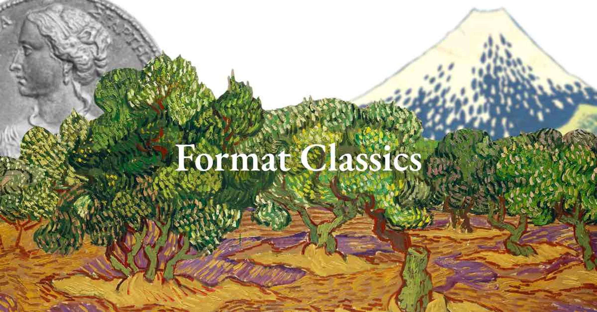
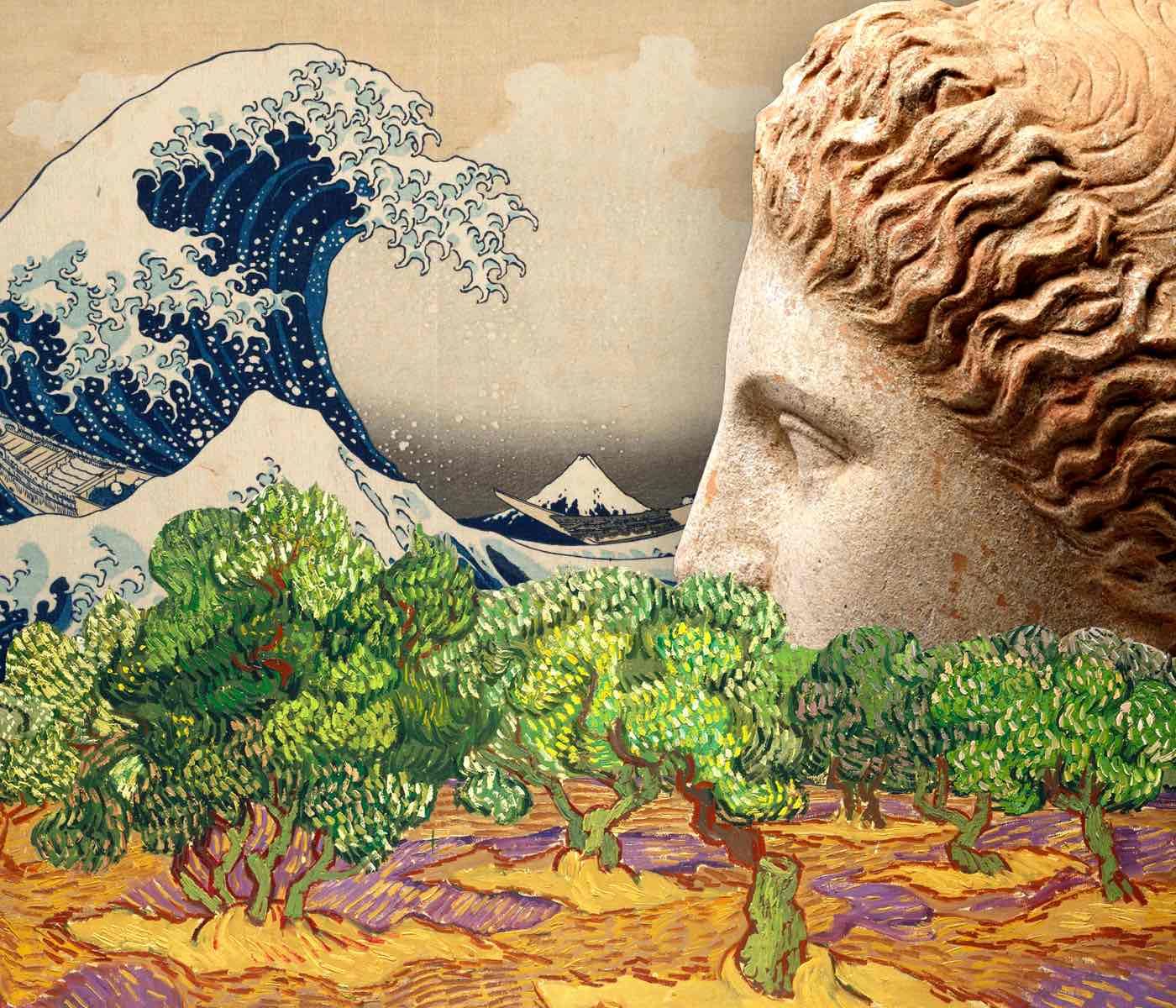
Online portfolio website builder Format.com recently launched their latest campaign, Format Classics. By recontextualizing classical figures like Vincent van Gogh, Hokusai, and Helen of Troy, they’re highlighting the idea that sharing work is central to the creative process. Whether work is new or old, it is imperative that creators share in order to learn, grow, inspire—and create more.
The campaign’s concept of making old work new again is echoed in the design decisions. Much of the design takes something familiar and presents it in new ways. On the landing page, the artwork is teased as a way to hint at the historical figures without showing them completely, and as you dive further into the campaign you’re rewarded with more information.
Since much of the work is well known (everyone with a smartphone will recognize Hokusai’s wave), Format frames the work differently—even down to the way the figures are silhouetted, with shapes that enhance perception through the presentation. Van Gogh is wearing a large, wide-brimmed hat that creates horizontal lines and a square frame is used to emphasize that shape. Hokusai is known for his wave, so he’s framed by a large curve. Helen’s pulled-back hair creates a circular shape, echoed by a circular frame.
The portfolios themselves showcase each figure both visually and through the copy. Van Gogh’s vibrant work contrasts his dry wit, Hokusai takes his role as a creator very seriously, and Helen merges the worlds of high fashion and high followers as a supermodel-meets-Instamodel.

“With van Gogh’s portfolio,” says creative lead Josiah Bilagot, “we felt it was important to showcase his worldview through his work as well as his personality. Many creators choose to show their audience who they are via captions, blogging, or an about page, and we wanted to give van Gogh the same opportunity.
“We also wanted to show how sharing work is a key element of being a creator. We were deliberate in our selection of paintings—you won’t see Starry Night, for example—to highlight the idea that sharing can breathe new life into old work to encourage creators in any stage to look at their entire body of work through a new lens.”
Hokusai is a master of ukiyo-e, a type of Japanese art that embraces negative space, so his portfolio includes a lot of enforced negative space. “Instead of crowding everything together, there is a lot of intentional space around his work,” says Bilagot, “which is how we think he would do it himself.”
Helen’s profile tackles the question of presenting three-dimensional work in a two-dimensional space. Bilagot solved this by letting the sculptures stand alone, apart from any framing elements, leading with four different angles of her face and giving the audience a glimpse into Helen’s world—which is all about Helen.
Small details go even further to really personalize the portfolios. For van Gogh, the Iris theme is very recta-linear, so his signature is used as the wordmark—similar to the way he might sign one of his paintings. In Helen's case, her personality shines through her integrated Instagram account, while Hokusai's journal includes how he felt about himself as an artist in his own words.
The portfolios were created solely using Format as a way to showcase old work in a fresh way. Each portfolio uses a different theme, as well as highlighting Format features like Galleries, Store, Blog, and Instagram integration.
About Format
Meet Format, the online portfolio platform that empowers creatives to succeed. A website builder and so much more, beautiful themes showcase your work alongside integrated business tools. Whether you’re just getting started or you’re a full-time professional, Format has the tools and support you need at every stage of your business. Build the website you want to share, promote, and sell your work all in one spot.