Ghost Improves Interface with New Look and Functionality

Ghost, one of WordPress' competitors in the blogging arena, have made some major interface changes improving the overall look and feel of the system and making it easier to work within it.
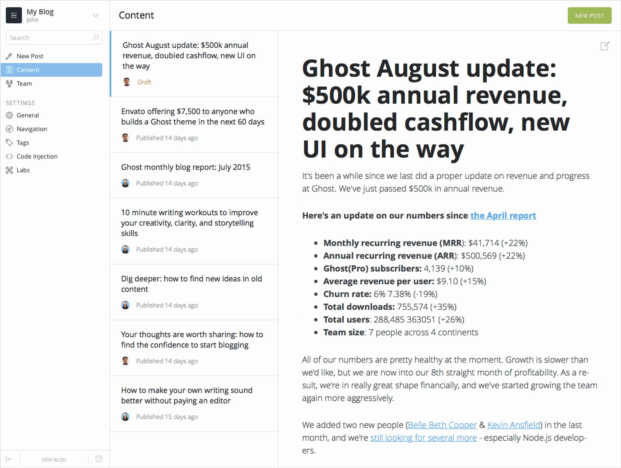
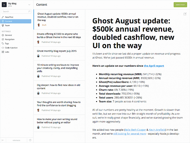
Here's a screenshot of the new interface:

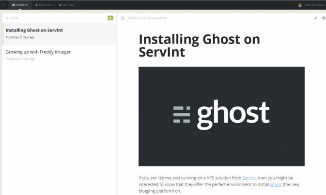
Now, for comparison purposes, here's the old one:

Are you can see, pretty significant changes. From the post on Ghost.org announcing the change:
This project has been a work in progress since the end of last year, and we're very excited to see it being used out in the wild.
The biggest change has been to the main structure and navigation within Ghost's admin. We were fast hitting the limits on the old top-nav placement. The new side-menu placement should provide some familiarity to most desktop applications, works better on mobile and, significantly, gives us a lot more space and flexibility to introduce upcoming new features. Winky face.
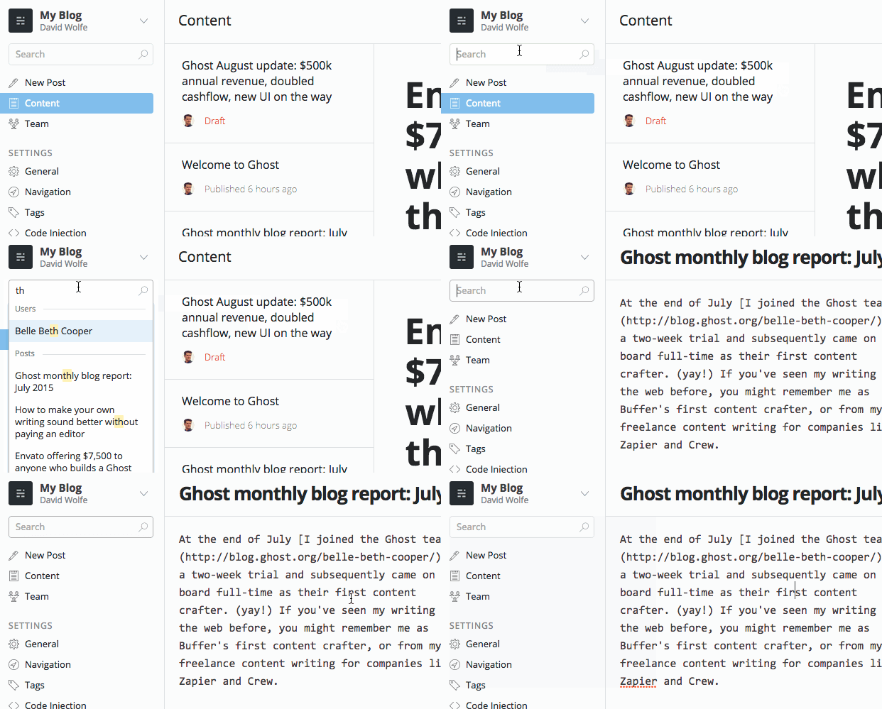
Search has also been improved drastically as show in the animated gif below:

For more information on Ghost visit their page in the CMS directory or check them out on the web at http://ghost.org