Gutensite Gets Fluid with Mobile Responsive Design


If you’ve been around web designers much in the last year, you can’t have missed the buzzing excitement (and a few tears of joy) around the growing use of “responsive website design” (RWD) and the compelling case for why having a responsive website is critical for your business. The web is a wild and crazy place, with constantly evolving demands to support new technology and changing standards to meet those needs. We have known that mobile audiences were important, but until now there hasn’t been a simple solution for creating a “mobile version” of your website.
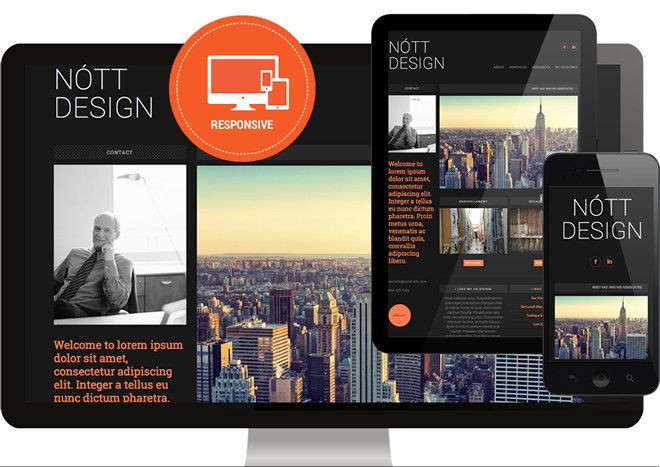
A beautifully designed, responsive website is the mobile friendly solution we’ve all been waiting for. Responsive design allows you to have one website which resizes it’s text and images and realigns it’s layout to fit any sized screen, be it phone, tablet or desktop computer, shaken, flipped, or stirred. It’s elegant, and it just works. Having one website that does it all makes it easy to edit in one place, which simplifies managing SEO as well.

View one of the Gutensite Demos on your smartphone or open it up on your computer and resize your browser to make it the size of a phone screen and watch how it automagically “responds” to the new size. It's really fun!
Even many big CMS/website builders like Wix, haven’t converted to responsive design yet (it’s easier said than done for dynamic user generated content, particularly a WYSIWYG editor). For companies like Gutensite, which are known for cutting edge design, going 100% responsive was a major priority. This month, Gutensite finished a major platform upgrade to support native responsive design. Gutensite also released several brand new free responsive templates and redesigned nearly all of their existing free templates to be responsive. All the specialty content types were also redesigned. And of course all new custom designs are responsive. The response from our customers has been overwhelming!
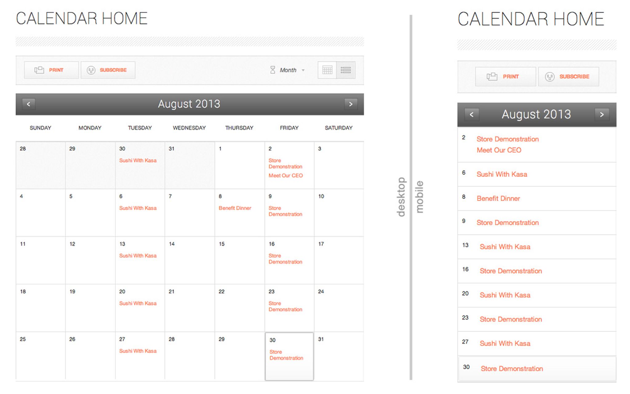
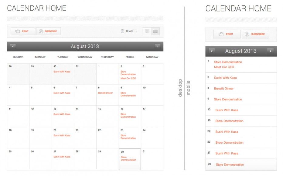
If you browse through one of the demos you’ll get to see a wide variety of pages in action, like this beautiful new calendar which shifts to a list view when it gets to phone size. All this brand new design also looks beautiful on regular desktop computers too!

According to a recent report by Morgan Stanley, by 2015 more people will access the internet through mobile devices than desktop computers. And you’ve also probably heard that smartphone sales have exceeded desktop computer sales, with tablets growing 83% in 2013 while desktop shipments dropped 13%. The desktop computer is still the preferred device for serious work (we love our big screens). But the convenience of smartphones is undeniable, whether you are browsing the latest news while you are waiting in line at the grocery store, or searching for information about a business you are visiting.
The importance of the mobile audience is no longer possible to ignore. And now that there are so many affordable platforms like Gutensite, which natively provide mobile friendly websites out of the box, there is no longer any excuse to have a website that isn’t mobile.
If your website hasn’t been updated in a few years and isn’t responsive yet, you should find a progressive CMS platform, and have them help you migrate all your existing content to create a brand new site. For most businesses, migration is easy. Aside from being mobile friendly, you’ll also probably appreciate the other features and great support you’ve been missing.