Hands-on With PrestaShop 1.6

With a release date of March 17 th, PrestaShop version 1.6 is right around the corner.
PrestaShop's popular ecommerce platform powers over 165,000 online stores across the globe, throughout 160 different countries.
Version 1.6 promises to bring about an array of new features, including a completely re-designed front and back end.
The team over at PrestaShop recently gave me early access to version 1.6, and with just days to go before launch, I can confirm that PrestaShop users have a lot to be excited about.
A Revamped Front End
Before I delve into what PrestaShop admins will soon be enjoying, there are some notable improvements made to the PrestaShop “Front Office” which will drastically improve the shopping experience for customers.
PrestaShop has gone into detail about all of the updates version 1.6 brings to the front office via their official blog, but I was less concerned about the features list, and more concerned about how it all came together – so I made my way over to PrestaShop's brand new Front Office myself.

First things first, I think that PrestaShop 1.6 brings about one of the best looking default themes offered by any ecommerce platform on the market.
The theme is sleek, responsive and beautifully presents customizable banners in a way which is eye-caching, yet professional. Also, thanks to Sass Compass technology, you can edit colors, fonts, CSS and much more with just a few clicks using the Live Template Edit feature directly from the Front Office.
Another notable feature I quickly came across was the “Quick View” functionality for all listed products. The feature brings up a “Quick View” button whenever customers hover over a product, which in turn opens up a lightbox presenting key product information, images, pricing, social sharing buttons, and so forth.
Changes to the catalog pages also stood out for me. Customers can choose between viewing products in a grid or in a list, with both options looking and working well.

Furthermore, the catalog pages house a host of search filters, making shopping extremely easy. Customers can filter products by colour, size, materials, styles, price and more with just a few clicks.
Banners make another appearance on catalog pages, allowing you to add some colour and creativity to the page. The sidebar beneath the filter section offers more space for promotion, enabling you to showcase new products, special products, previously viewed products, and so forth. This may sound like a lot of features to include on one catalog page, but thanks to the very light and spacious design of the theme, it all just works.

Finally, I can't ignore PrestaShop's brand new and improved Shopping Cart system – which is arguably the most important element of an ecommerce website.
Quick access to the cart is available via the top right-hand corner of the page, but unlike previous versions of PrestaShop, the drop-down menu gives you a large, cleaner window, along with the featured image of the products in your cart.

The shopping cart page itself is once again sleek and easy to understand. Check out is separated into five sections: Summary, Login, Address, Shipping and Payment. Pretty straightforward stuff.
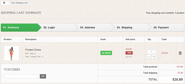
All of these features and modules make shopping on PrestaShop 1.6 a breeze. Customers receive a professional browsing and purchasing experience from the homepage, and all the way through to check out.
Social sharing buttons are common place throughout the theme, catalog filtering is easy to use, and the overall design of PrestaShop's new responsive defealt theme is simply elegant.
Back End Beauty
To accompany an impressive new Front Office, PrestaShop 1.6 also introduces an all new modern and user-friendly “Back Office”.
Much like with the Front Office, PrestaShop have documented many of the new features of their new Back Office via their official blog , but I was more interested in perhaps shedding some light where it had yet to be shone.
So I got to grips with its sleek interface, and I have no qualms in confirming that it is indeed a colossal improvement on the current PrestaShop admin panel.
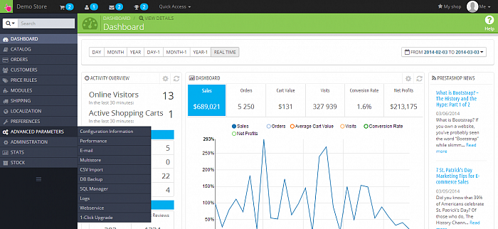
The top menu, which provides access to latest orders, registrations, messages, achievements, and more, is very neatly laid out and unintrusive, even with drop-down menus. The left-hand sidebar contains the bulk of available features and functions, all of which are listed below a handy search bar.
Quick access to product uploading, profile settings and your store's homepage is provided by the top menu bar, which sits above a secondary tab containing a help button specific for each page of the Back Office.
The sidebar can be minimized too, allowing the main window to take center stage.

PrestaShop 1.6's dashboard itself is a sight to behold. It houses a wide range of statistics, insights, useful links, news and even gives you the ability to add further measurement tools via Addons , if you so wish.
All the interfaces I came across in the back office of PrestaShop 1.6 maintained the modern feel I found on the dashboard, with each section offering detailed functionality.
Further statistics could also be found via the newly introduced “Intelligent Merchant KPI” feature, which displays relevant facts and figures relating to stock levels, profit margins, abandoned carts, and more. These stats are all displayed across the top of different pages and sections of the Back Office.

Another feature I noticed, was that certain back-end pages offered me “Recommended Modules”. For example, the “Orders” page recommended me modules pertaining to fraud and feed management systems. Impressively, I didn't even need to leave the lightbox in order to install these modules.
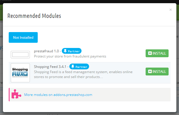
It was these smaller elements which were standing out for me. Each page had its own dedicated help page, a set of recommended modules, relevant statistics and more. All of these features combined to give the entire admin panel a real sense of detail.
Real Time & Forecasted Statistics
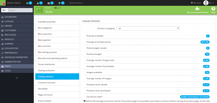
PrestaShop version 1.6 really is all about the statistics. The dedicated “Stats” page is still around, but with a brand new look. It allows you to get a wide range of statistics from all the nooks and crannies of your store – all of which are automatically measured.
The Stats page offers insights into areas like best product categories, best customers, best sellers, sarch engine kewords, visitors, best vouchers and many more. Although this feature isn't new, the enhanced design makes it feel as if it is. There is so much to monitor, and yet the simple graphs and lists associated with each parameter makes that monitoring easier to do than ever before.
But wait, there's more.
PrestaShop 1.6 also brings about a truly unique ecommerce feature – “Real Time Net Profit Margin”. As the name implies, it automatically updates net profit margins in real time, presenting you with sales and your profit figures instantly, every minute of the day.
Finally, the “Forecast Statistics Panel”, lets you see how your sales are trending and what the outlook is for the future. Using this tool, you can make smarter business decisions based on current trends and forecasts based entirely on the performance of your store.
These progress measurement tools, accompanied by the “Intelligent Merchant KPI” I mentioned earlier, makes PrestaShop 1.6 a statistical powerhouse, enabling you to monitor various metrics from a variety of helpful angles.
Newly Integrated Technologies, Seamless Upgrading & More
Technologies such as Bootstrap 3.0, FontAwesome, Sass Compass and D3 Data Driven Documents have all been integrated into version 1.6 of PrestaShop, putting it right up there with the most technologically advanced ecommerce platforms.
Seamless upgrading for nearly all PrestaShop users is also offered, thanks to version 1.6 having virtually zero core changes from 1.5x – meaning that any 1.5x store can be upgraded with minimal effort.
Additional noteworthy features include integrated product comparisons with dedicated URLs, cross-selling features via the “Add to Cart Confirmation” screen, and more.
Community Driven Progress
If you caught my previous coverage of the PrestaShop , you'll know that they are an ecommerce platform who are big on community.
Whilst piecing together version 1.6, PrestaShop have worked closely with their expert community volunteers through GitHub , and have also obtained feedback and suggestions from their thriving online forum which is populated by over 620,000 members.
Because of this community connection, PrestaShop have been able to gather feedback directly from their user base, and implement it into version 1.6.
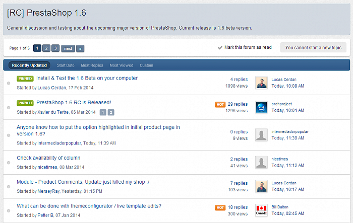
The proof of this community driven progress is in the pudding. For example, PrestaShop have listened to the calls from their community by taking a number of paid-for features from their Addons store, and have converted them into integrated features included as standard in PrestaShop 1.6 – making them completely free of charge for everybody.
Such features include Rich menu navigation, Add to Cart with Cross-selling, Quick Product View and Advanced statistics.
Now that's what I call giving back to the community.
Just Days Away
Version 1.6 of PrestaShop has been in development for a while now, but its launch date is now tantalisingly close. Just days away in fact.
There is excitement within the PrestaShop community, with merchants the world over anticipating new ways to sell, monitor and improve their online stores. The first impressions were extremely good, and the platform only grew on me as I explored it further.
I believe many of the new and unique features implemented by PrestaShop will become indispensable for store owners before very long. Many will forget what it was like to run their store without instant profit margin reports or forecasted sales figures – and for those reasons alone, PrestaShop 1.6 is an impressive piece of software.
PrestaShop 1.6 is set to be released on March 17th at 12:00pm EST. To find out more about PrestaShop, visit their official website , or check out the PrestaShop 1.6 progress page .
Additionally, you can explore more of PrestaShop via our CMS Directory