How to make your store visitors stay, buy and come back
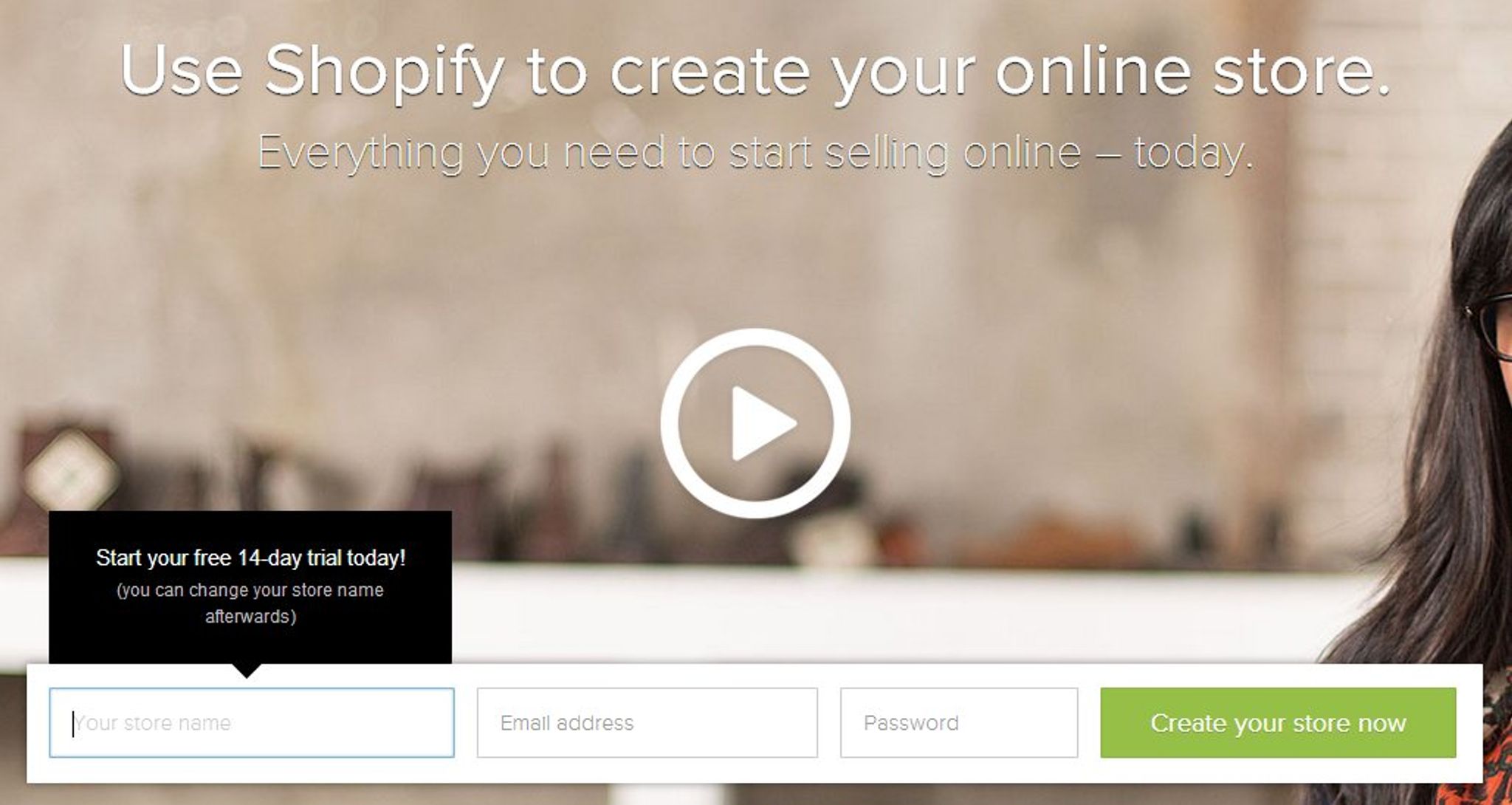
To open an online store is not a tough thing. Yet, to make sure your new store generates sales at its max is going to take a good thought from you. Simply providing required products or services is not enough, a store owner must accompany them with an outstanding customer experience, both digital and real-life. At nopCommerce, an open source eCommerce platform, we constantly monitor and analyze the latest eCommerce and design trends and well-doing shops’ experience, we brought together some tips that would help you to make shoppers out of random store wanderers.
First page
What do your customers see first on your site? Is it clear with just a quick glance what your store is all about and where they can find required information? Leaving a site with no action there is a matter of seconds, so it is extremely important to keep the homepage precise and informative at the same time.
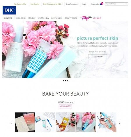
The above screenshot of a homepage has no extensive text or irrelevant info. Simplicity is combined with a clear call to action. Further navigation made easy with the links to categories. Special offers and promotions are also highlighted.
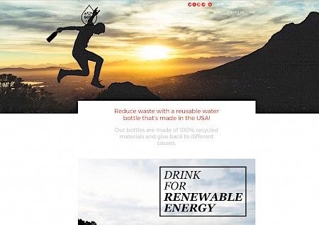
Setting up your value proposition and making it clear how you’re different from others is also important, especially when you convey some rather more targeted values. Make your customers aware of what you stand for within first moments on your site. As shown on a homepage below, a company explicitly demonstrates its attitude towards sustainability:
For some businesses, quick customer support is often required. If this is your case, place contacts or a live chat on the homepage too, and make it impossible to miss.
Product selection and comparison tools
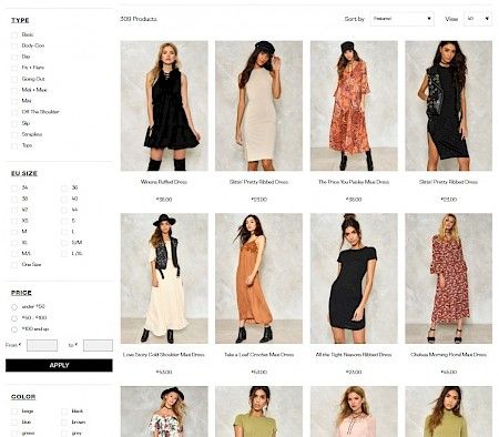
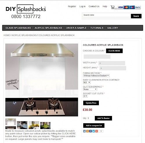
For stores with large collections, product sorting and filtering are must, unless you are ready to let your customer go feeling lost in the abundance you offer. Let your visitors browse by color, size, materials, price category, etc.
Another good idea is to suggest your clients pairing options (for example, wine with ideal snacks) or DIY product design.
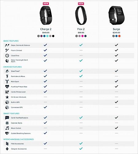
Comparison tables also make it easy for your customers, especially if you sell mid-range to expensive consumer goods, like electronics or cars. They help people to select among a set of alternatives comparing their advantages and disadvantages according to a number of criteria.
Products ratings and reviews
According to BrightLocal, 74% of consumers trust business more if they read positive reviews. This tool is a great way to add credibility to your site and help your customers get the best item.
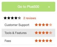
Try to organize the ratings in a way that they are as detailed as possible, for example, breakdown what previous customers liked and disliked about the product in three categories: customer support, tools & features, and fees. Different customers might be more sensitive to some of these categories than to others, it helps customers see whether the product is likely to be a good fit for them.
Checkout with no friction
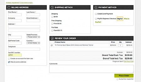
The importance of a fast and convenient checkout is well-known and much discussed. Summing up all the great ideas, include all your costs upfront because no one likes finding out that after filling all required information and proceeding to payment a product is going to cost significantly more; provide guest checkout option for those who want to stay anonymous.
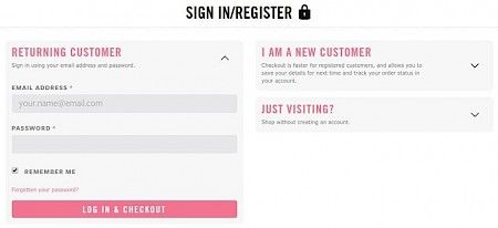
Keep your checkout pages simple with no upselling, no testimonials, and no social sharing cues – fewer steps and faster process to finishing.
Implement “Save for Later” button in your checkout, it gives users time to consider the purchases and at the same time makes it easy to complete next purchases.
A pleasant after purchase experience
Some companies pay less or no attention to an after purchase user experience, meanwhile, according to Monetate, returning visitors convert twice more likely than new visitors.
What can be done after purchase? Customize your “Thank you” page. A good idea could be placing some tips on the product usage. Alternatively, you can keep it minimalistic and leave the information for your confirmation letter. Fill the confirmation letter with detailed information on delivery, returns, and warranty, provide shoppers with links to contact your customer service representatives, offer some discounts for next purchases, outline how exactly the shoppers can get most out of your product and suggest some complementary goods.
Important, don’t forget about real life unboxing experience of your customers. Keep your brand voice in every detail.
Images
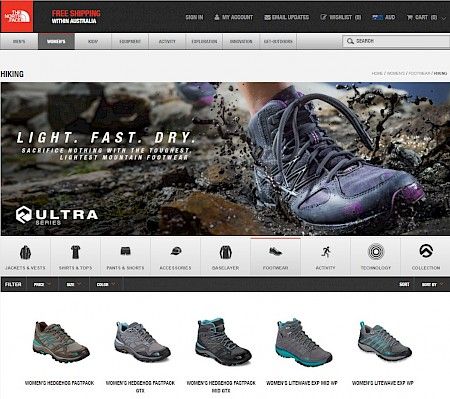
No matter what you sell, needless to explain why quality of your pictures matters. Ensure to provide high resolution appealing images, because they really can help you close the sensory gap between walking into a store and shopping online.
Final note
There are basic tips, but every store is unique. You don’t have to rush to implement them all, test carefully different options to find out what works best for your business.