Introducing Strikingly 4

Strikingly, the website builder that specializes in one-pager style websites, has released its latest version in the form of Strikingly 4.

Chosen as one of the few website builders to be covered by Website Builders Critic, Strikingly has grown to be one of the leading products for the one-pager website space.
Here's a closer look at what Strikingly 4 brings about.
Template Switching, Improved Layouts & Social Feeds
One of the gripes I (and many other users) had with Strikingly, was the rigid templating system. If you worked your content into one template, you were unable to switch to another one. To change templates, you had to say goodbye to all your content.
Now though, Strikingly has made it possible to switch templates at any time, without the need to start from scratch. A feature that is most welcome indeed.

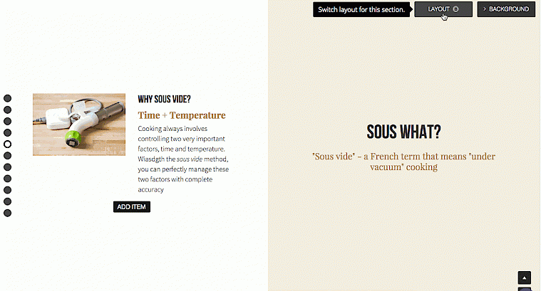
Speaking of content, Strikingly 4 also makes it easier to maneuver text and media within page sections. Simply clicking the “Layout” button wil prompt Strikingly to automatically “spice up” the placement of the content.

I'm sure users would prefer to simply drag-and-drop more freely, but this feature will help switch things up a little nonetheless.
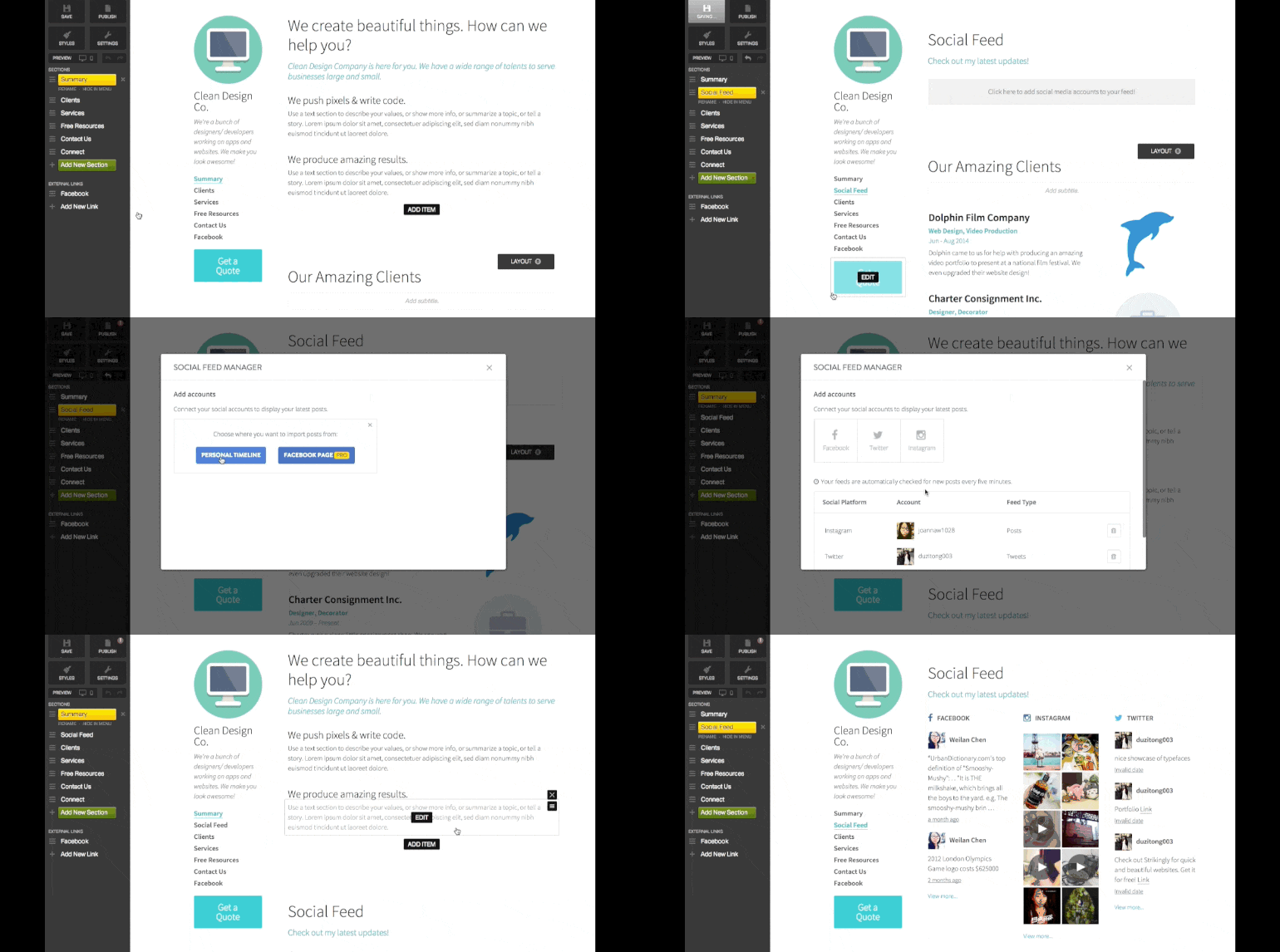
Finally, Strkingly users can now incorporate their Facebook, Instagram and Twitter feeds into their website.

A tidy update for a quirky website builder. To find out more about how to upgrade to Strikingly 4, read their official blog announcement. To get yourself a Strikingly website, check out their website.
You can also check out our Strikingly video tutorials on Website Builders Critic.