LightCMS Review
There are a number of great hosted CMS solutions on the market, we've highlighted a number of them in one of our recent issues of CMS Critic Recommends (read) and LightCMS is definitely a contender.
LightCMS is packed with features at what we think is a reasonable price compared to other options on the market. For a full list, visit the LightCMS tour after you read our review.
What makes it unique? What are it's strengths and weaknesses?
Let's take a look.
First off, for the average user, you may be able to make do with their free package which allows you a decent starting point to begin seeing what the system can do for you. It's a great way to try out LightCMS and decide whether you want to give it a go long-term or not.
Once you've chosen your subdomain you'd like to use from their website, you are ready to get started. We chose http://cmscritic.publishpath.com (for obvious reasons).
On your first visit, you are greeted with a basic website waiting for your input. You can access the main administrative interface by adding /admin to the end of your URL (ie: http://cmscritic.publishpath.com/admin) which would then prompt you to log on for access to the “dashboard”.
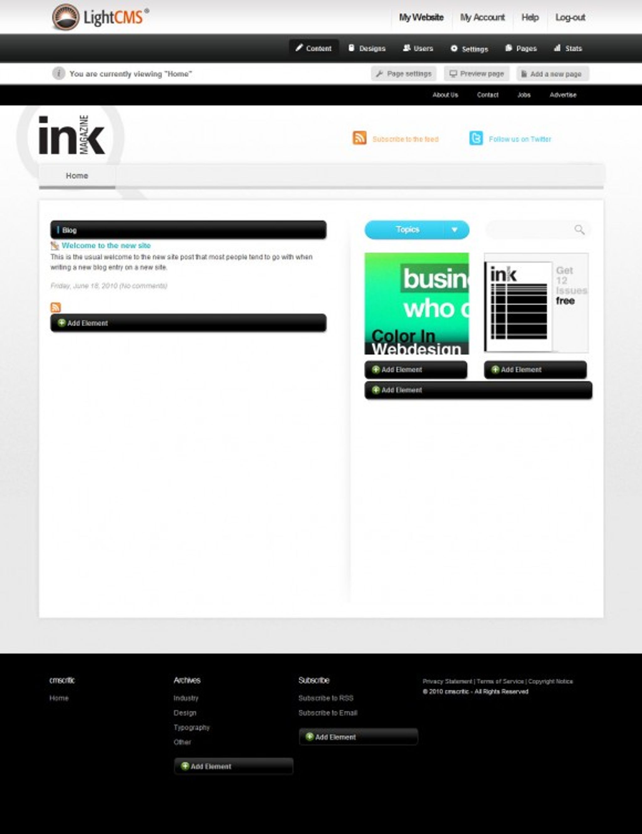
Upon logging in, you'll be greeted with a screen similar to the following (dependent upon the theme you chose):

Initial Screen – LightCMS
As you can see, a number of areas of the website became activated once you logged in. You are now able to add/remove elements and edit the various areas of the cms simply my clicking no any of these buttons.
As an example, clicking on pencil icon to the left of the “Welcome to the new site” text area would present you with the following easy to use content editor, complete with WYSIWYG (what you see is what you get) editing area, tags and more:
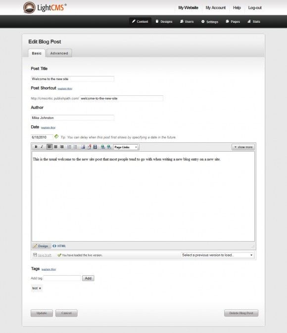
Content Editor – LightCMS
Visually, the content editor is attractive and akin to something we'd expect to find in a typical CMS. It's intuitive, familiar and easy to use. Good start.
What happens if you click on one of the “Add an element” boxes?
Doing so would provide you with a dialog and a drop down box from which you can select a number of elements to add to the page:
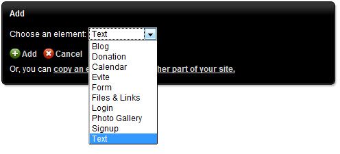
Add an Element – LightCMS
There are plenty of options that can be added and using each of these, we found them all to be very intuitive and well designed.
One of the more common of the choices that we can see being used here are forms. Let's take a quick look at what the interface to a form element looks like.
Here's where LightCMS outdoes it's competitors. Once you have added the element for a form, you simply click on “edit form” in a drop down box within the element which will take you to the form edit screen.
From within this screen, there are two tabs. One for the various form fields you can add to the form (note: all that is required to add a field is to click on it):
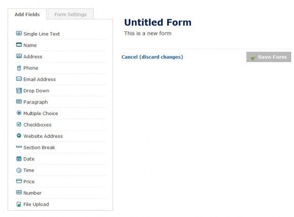
Add Fields – LightCMS
The second tab provides various settings for the form. There are the usual suspects such as form name, description, email notification, captcha, etc. but where it really shines is the option for payment settings.
Clicking on this option allows you to embed payment functions right into your form complete with integration into Google Checkout, Paypal and Authorize.net. Now that my friends, is very simple and very slick. It's the little things that make the difference and this is definitely one of the best and easiest to implement functions we've seen so far in a form module.
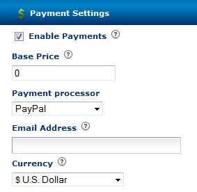
Payment Options in Forms – LightCMS
Now that we've looked at the various elements and content functions of the system, let's dig a bit deeper into the administrative interface shall we?
LightCMS includes the ability to manage settings on a page by page basis or on a site basis (or both). If you wanted to set individual meta data, css, user access permissions or SSL encryption for instance, this can all be done by clicking on the Page Settings button right from the Page you are currently on. You are also able to define custom templates (themes) to the individual pages as you see fit.
Here's a quick screenshot of what this page looks like:

Page Settings – LightCMS
You can see in the screenshot above, there is another menu bar in black that offers links to Designs, Users, Settings, Pages and Stats as well.
Under the Designs menu, you are given the ability to perform the following options:
- Upload your own design (this page also has indepth documentation on how to create your own templates as well as how to alter existing ones).
- Choose from a library of provided designs.
- Order your own custom designs created for you by the developers of LightCMS.
The Settings button at the top allows you to setup redirects, modify your robots.txt files and add/remove domain names as needed.
Clicking on the Stats button (an option available to paid and not free accounts) gives you access to a simple but effective statistics screen highlighting activity on your site.

Statistics – LightCMS
Another very unique function that LightCMS provides is the ability to set up and bill your clients (if you are a developer) for each site you create and host with LightCMS.
You can dictate your own pricing structure (separate from what you pay LightCMS for use of their service) complete with your own plans, pricing structures and automated billing. It's like running your own business but all of the work is done for you.
We won't get into great detail about how this works (it's better to just visit the site yourself then for us to attempt to paraphrase it. What we will say is this: It's incredibly easy to use, convenient and a huge time saver.
Final Conclusions
Pro's:
- Everything but the kitchen sink is included.
- Incredibly easy to use, might just be the easiest solution we've found to date.
- Fast, intuitive, loaded with configuration options.
- Pricing is very reasonable.
- Fantastic form builder with integrated payments.
Con's:
- To get all of the cool features such as stats and payment integration, you have to pay. Although if we weren't paying, we'd feel kind of guilty considering the amount of work put into this system.
Overall, LightCMS is one astoundingly agile platform. It's fast, intuitive, easy, packed full of options and VERY reasonably priced. We highly recommend it.