Microsoft's Metro: Content Before Design

Microsoft has had a rough couple of years thanks to a plethora of new players in the market winning the hearts of consumers; from the ubiquitous Android to the unconventional Ubuntu and cultish Apple IOS, Microsoft has had its territory yanked out from under its feet. However, in the last one and a half years, it has been able to wrestle back some of its former well-earned glory by offering the public a new operating system with a bold and brazen design.
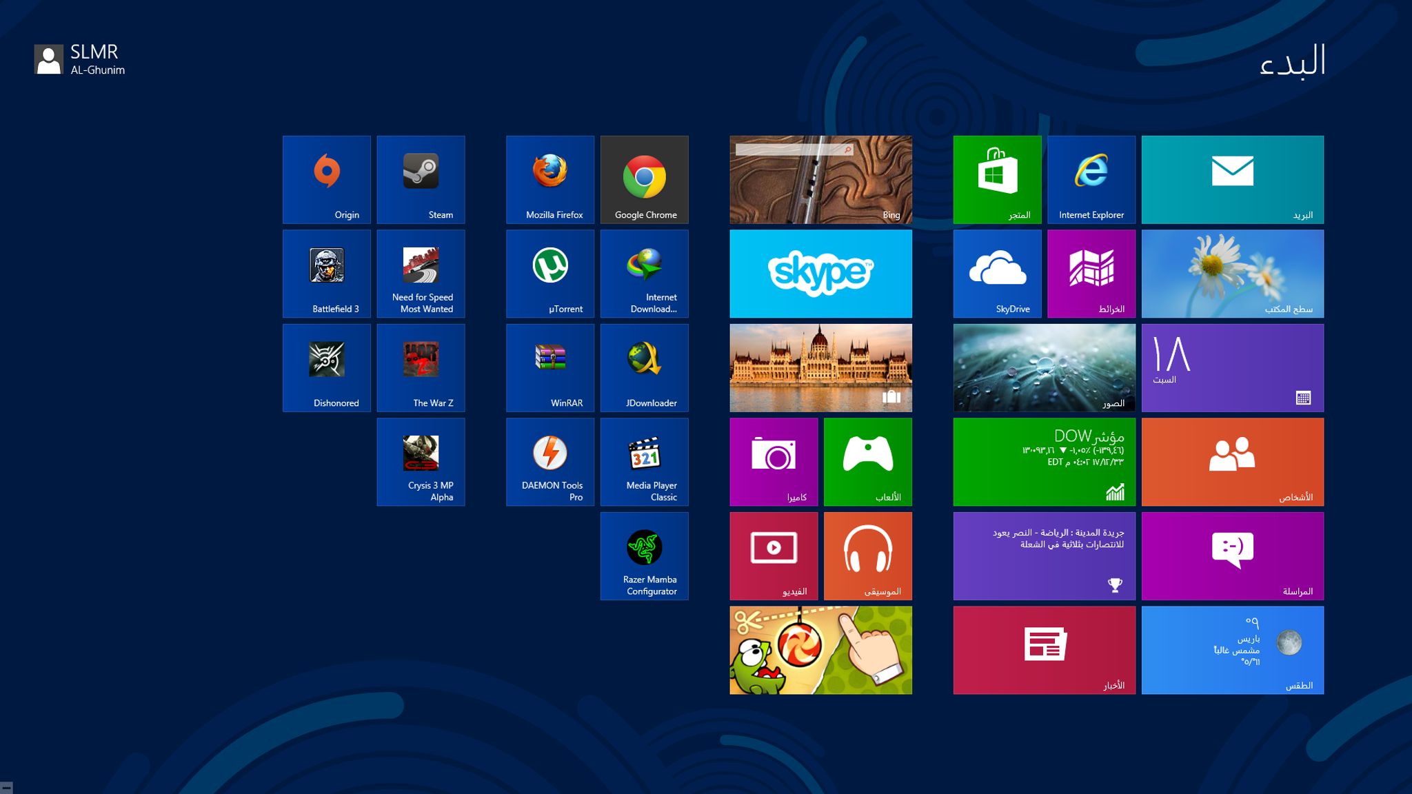
The Metro design principle is basically a template for design language used by Microsoft within the Windows 8 architecture It features clean and bright icons that lead up to content with an almost obvious feel without having to use real-word icons such as telephone, notebook or music note symbols.
Breakaway Design
This is a breakaway design concept that hasn’t been used before by its competitors, and is something that could radically change the way designers create web and phone-based apps for mass consumption. The main premise of this design comes from the idea that content should always take center stage, and design should follow a close second.
While this seems counterintuitive for hardcore web and app designers, this kind of design seeks to enrich the end user’s experience by taking him straight to the information or data he needs without blitzing him with stuffy design.
An illustration of how Metro design works is where you have a Windows 8 UI that has several differently colored panels representing phone functions such as messaging, music, maps and web browser. Once you select a panel, you’re taken straight to the application that you want to access, cutting out unnecessary steps and making the whole process much faster and sleeker.
Eye-Catching Typography
One of the selling points of the Metro design has to be the typography, which basically means the way information is presented. This is done via bold font that is straightforward and basic without being bland. For Metro, information is displayed using an array of differently sized letters that convey structured information. This helps the user know what data they need to pay attention to first before moving on to something different.
Next, we have the concept of motion which is something that makes the whole design come alive. Metro achieves this by creating a consistent set of animation and fluid motion, giving the whole system an intuitiveness that makes it effortless for users, all the while boosting overall performance and user experience.
It’s All About the Content
Content takes center stage within Metro, and this is conveyed in the gesture based interactions that have to operate within smaller screens such as the ones found in Windows phones such as the Nokia Lumia.
With everyone making the shift from physical media, Metro seeks to stay true to the new digital age by giving users an authentic digital experience that can translate well on tablet or phone screens. While many people will wonder what made Microsoft take this giant leap in design, the reality is that Metro has some undeniably attractive positives that may act as a platform for future design templates for other operating systems.
Here’s a 15 minute video of Metro in action:
(Note: Microsoft now refers to the Metro design concept as Microsoft Design language as a result of naming issues with a retail partner).
What are your thoughts on the Metro design for desktop and mobile platforms? Please leave us your thoughts in the comment box below.