Mobirise Review
Mobirise is an offline website builder for Windows and Mac, meaning that it needs to be downloaded to your desktop.
The drag-and-drop based website builder was born out of the Netherlands, and is designed to construct small-medium sized websites, landing pages, portfolios, and other such low-functionality websites.

It's marketed as user friendly for non-techies, minimalist, and totally free (even for commercial use).
Website builders don't need to much of an introduction. Startups, entrepreneurs and small businesses use them to kickstart their online presence, and they usually want to achieve that as quickly and as easily as possible. Oh, and without touching a line of code, too.
Let's see if Mobirise can rise to the challenge. Here's a video to get us started.
Initial Thoughts
The Mobirise website is clean and simple, for the most part.
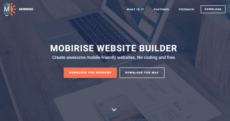
Download buttons dominate the homepage, and it looks like a very inviting piece of software right off the bat. Minimalist indeed.
Yet, further down the homepage, lies an array of review quotes and testimonials. And when I say there is an array, I mean there is an array.
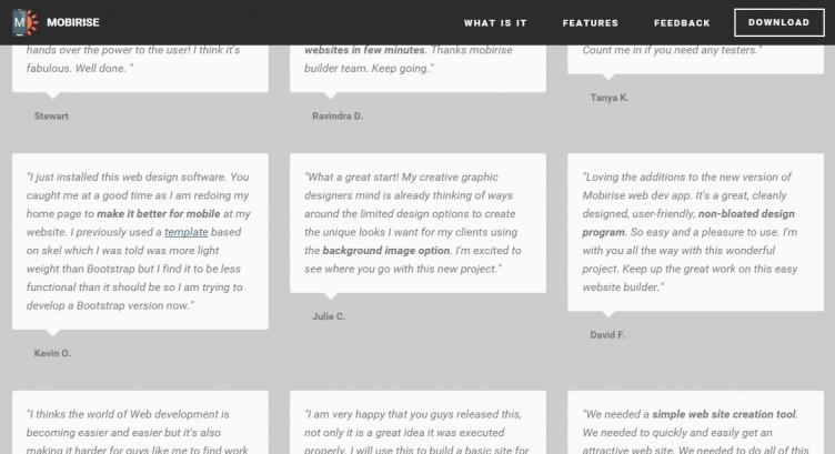
It's a little overkill to say the least. Not a massive deal, but clutter on the homepage of a website builder that touts simplicity isn't a convincing quality.
Getting Started
What's that? A website builder that I can't use through my web browser? Perish the thought.
But hold on just one second.
You may have to download and install Mobirise before you can use it – but believe me when I tell you that it's quicker to set up than most hosted website builders that require no downloads.
With Mobirise, you don't need to sign up or divulge any information whatsoever to begin downloading. The downloadable file is relatively small, installation is lightning fast, and there's no forms to fill out at any stage.
It went from a .zip file on my desktop to a ready-to-roll website builder in a matter of seconds. Impressive.
Page Creation
The page creation capabilities of a website builder help to define it as a platform. Unsurprisingly, Mobirise stays true to its focus on minimalism when it comes to page building.
The platform starts you off with a generic homepage, with a customization menu that can activated via an orange button at the bottom-right of the interface.
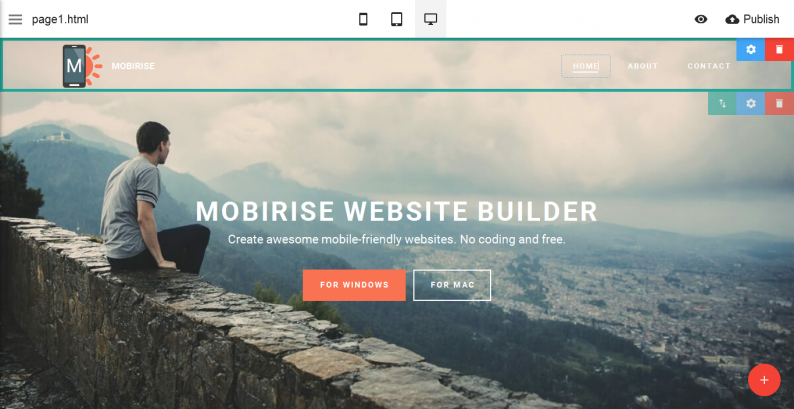
There are no standalone templates as such. Instead, you can choose from a number of different page blocks, piecing them together in a mix-and-match fashion to build a one-pager style website.
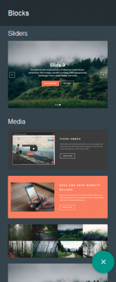
This method ensures that users stays within a pre-defined boundary when it comes to design, with just enough wiggle room to make some customizations. Such customizations include; images, videos, text, background images, background colours, show/hide elements, content aligning, and more.
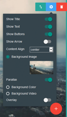
I think there's a healthy balance struck here. The customization options aren't going to allow you to build anything drastically unique, but there's just enough there to help put your own stamp on your website.
As previously mentioned, this pre-defined design boundary will, in a way, push users towards creating a website that looks good, rather than leaving them to their own, (often inexperienced) devices.
In other words, if you suck as web design, you'll love Mobirise's method of website building.
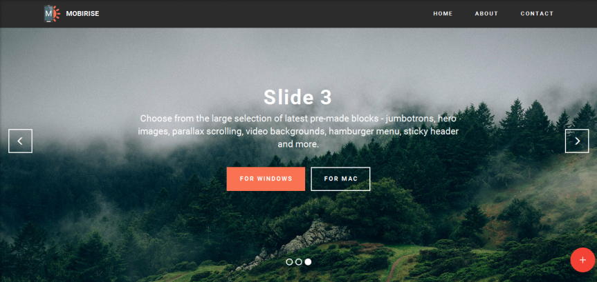
I say that particularly because Mobirise's page blocks are so well put together. They include a selection of full-page sliders, information blocks, maps, forms, a pricing table, and more.
Upon hovering, each block presents three buttons in the top-right; Drag Block, Block Parameters and Delete Block.
The first option allows you to drag-and-drop the block above and below other blocks, essentially rearranging your website like Lego. The Delete Block button is pretty self explanatory.
As for the Block Parameters button, this brings up those customizations I mentioned earlier, allowing you to edit the block in question. Different block types comes with different parameters, too.
For example, a navigation menu block will give you the option to make the menu sticky, meaning that it will scroll down the page with the visitor; remaining visible at all times.
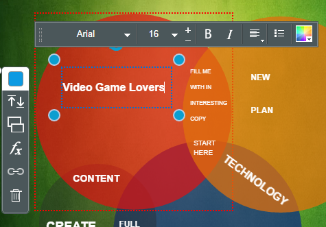
Further customization can be done by simply pointing and clicking on page elements. Otherwise known as inline editing. For example, clicking on a “Download” button brings up options to change the buttons color, and edit the text right there and then.
To add a new page to the existing homepage, you can go to the menu on the left, “Pages”, and then “Create New Page”. further page options enable you to clone pages, edit file names, set page titles, and add meta descriptions.
I feel that now is a good time to highlight the speed of Mobirise. I tinkered with all of the above settings, re-arranged page blocks and edited page elements – and it was a piece of cake. Mobirise is supremely speedy and responsive, just as a website builder should be.
Multi-Site Management & Publishing
Similarly, you can add a brand new website from the same side menu, by clicking “Sites” and “Create New Site”.
Mobirise presents a grid-list of your existing sites on that same menu, allowing you to quickly switch between projects. Ideal for a developer with multple clients, one might say.
The site manager section also allows you to export a website, assign a favicon, and add a Google Analytics tracking code.
When it comes to actually publishing your website, Mobirise gives you a few options.
You can publish it to a local drive, upload it via FTP or use Google Drive. All three options seem to work fine, and they're solid options to make use of, too.
Apps & Extras
Mobirise has a couple of extra features which help round it off.
Firstly, there's the ability to preview your website in desktop view, tablet view and smartphone view. Just to ensure all those responsive pages are looking spcik and spam.
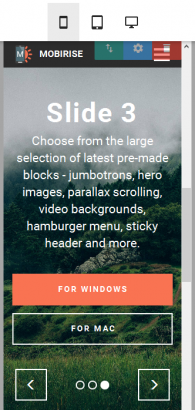
Plus, you can preview the website in your web browser.
You can also import and export Mobirise websites, which is cool if you're looking to share your work with somebody else, or move one website between two different accounts or devices.
There are only four extensions bundled. These are; Facebook Comments, Soundcloud, Code Editor & Google Analytics. However, the Code Editor is very highly priced, at $69.
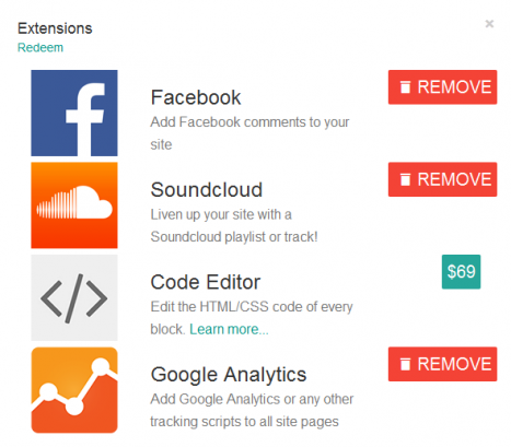
Mobirise is showing its youth here I think. Four extensions is certainly nothing to write home about, and I think this should be an area of focus for the Mobirise team. I also think that charging $69 for a website builder's Code Editor is a little bit too bold. The price needs adjusting, if you ask me.
Extensions like Google Maps, Instagram photos, Disqus comments, a form builder and other standard extensions would all be welcome.
Getting Help
As far as help and support is concerned, there's not much to go on.
In fact, apart from some social media handles and an email address, there's no other way to reach out for support from official channels. There isn't even any documentation, which isn't really acceptable.
I would have expected a simple “Help” option somewhere on the website builder, or perhaps a document that comes bundled with the download. But surprisingly, there's nothing to help guide website building newbies at all.
The only saving grace is that Mobirise truly is easy to use out of the box. But still, that's no excuse.
The Verdict
Mobirise is an extremely simple website builder, and because that's exactly what it aims to be, I'm a big fan.
The level of customization that a newbie can implement is of a good level. There's limits on what can be created, which means they won't get lost in any complex menus. More experienced users can delve further into customization via the Code Editor extension (if they want to cough up the cash).
I'm also impressed with the quality of the blocks which can be dragged-and-dropped into place. They're the foundations of Mobirise, and they're brilliantly designed, with each one looking highly professional out of the box.
I have a few gripes, though. There aren't enough extensions to play with, and I feel that the page blocks could be a little more diverse. A few more different styles will provide just enough choice to ensure that users aren't constantly building similar looking websites.
Also, documentation and support need to be worked on. A user manual would be nice, and so would some FAQs on the Mobirise website.
Other than that though, Mobirise has won me over with its simplicity and speed.
Pros
- Mobirise is extremely quick and easy to download and install.
- Lego-like page blocks can be dragged-and-dropped into place, helping users construct websites that already look great.
- All the pre-designed blocks are sleek and professional looking.
- Customization options are pretty good, allowing for some useful modifications. An optional (yet expensive) Code Editor extension also gives experienced users complete control.
- In-line editing plays right into the hands of inexperienced web designers. Point, Click, Edit.
- You can upload the finished website via FTP, Google Drive or to a local server.
- Easy to manage multiple sites.
- Browser, Tablet and smartphone previews are easily accessible.
- Everything is quick, responsive and bug-free. Mobirise is genuinely pleasant to use.
Cons
- Not a hosted solution.
- Not many extensions at all.
- Documentation & support options are lousy.
Final Remarks
If a website building novice asks me to point them in the direction of a totally free website builder, Mobirise will now be high on my list of recommendations. I'm that impressed.
I expected to find some bugs somewhere along the line. Perhaps an unresponsive button or a slowly reacting page element. But I found nothing of the sort. Mobirise is a dream to use.
Aside from the aforementioned documentation and support issues, the only problem I can see is that a newbie website builder will flinch at the idea of having to find a web hosting environment for his or her Mobirise website. They would much prefer a hosted solution to take care of those technicalities.
Maybe I'm being pedantic, but it seems to me that Mobirise has been built for the same people who wouldn't even know how to “Publish” their site using FTP or Google Drive.
However, if the idea of uploading and hosting your own website doesn't bother you, I'd strongly recommend giving Mobirise a whirl.
Besides, it's a free platform that takes under a minute to set up, can be used by anybody, and can be hosted anywhere. What more could you want?