MotoCMS Review 2016
MotoCMS is a popular website builder that’s been around since 2009. The site takes a WYSIWYG (what you see is what you get) approach to website building, and allows users to design, edit, and publish their own website.
The WYSIWYG setup means that this process should be pretty simple and intuitive.
The software is updated on a regular basis and is designed to appeal to beginners and professionals alike. But does it?
I decided to check it out for myself. Read on for my MotoCMS review.
Getting Started
They don’t make this easy. To get setup with MotoCMS, you have to go on a bit of a field trip. Here’s how the process went down:
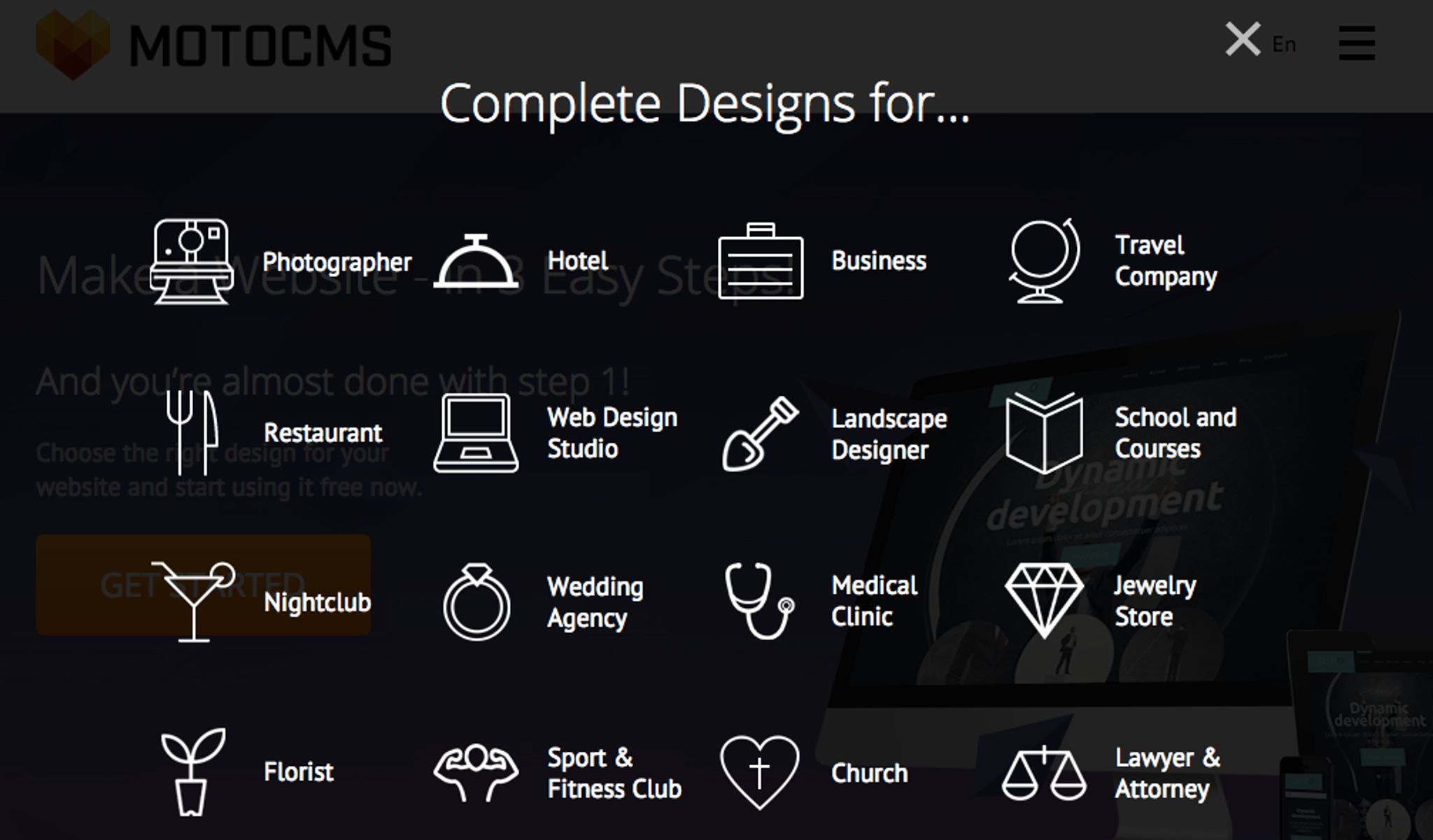
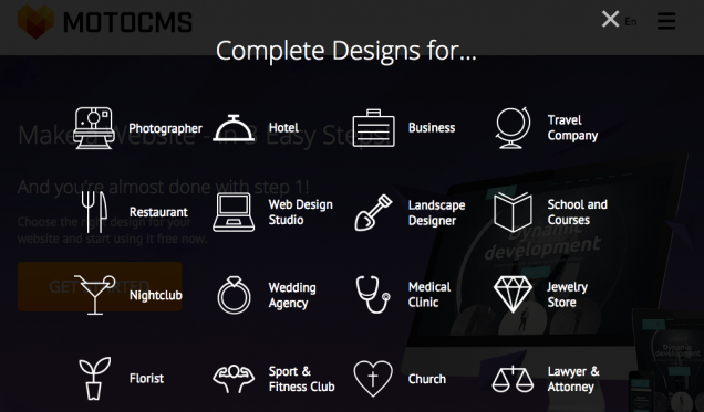
First, you click on the button to get started. This will take you to a screen where you select your chosen industry design.
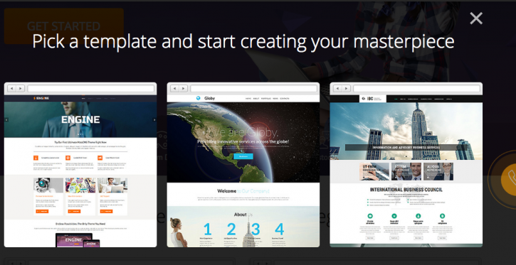
After you’ve done this, you can select a template.
Then, a box pops up to insert your email address and your name.

And when you’ve done all of this, you receive an email confirmation. Once you click on that, you’re all set.
It all felt a bit time-consuming for my liking and it tainted my first impression of the site. There’s an optimal phone verification feature built into this process also, but I felt it just got in the way at this early stage – especially since it doesn’t replace mail verification.
Whilst the setup is generally pretty simple, I’ve reviewed a few of these sites now and I’ve come to expect a speedier signup process.
Usability
Once you get to the main site, users are greeted by a ‘Welcome To The Future’ slogan with the MotoCMS logo presented on a plain background. This is bordered by the admin panel, and the overall look is pretty sleek and sophisticated.
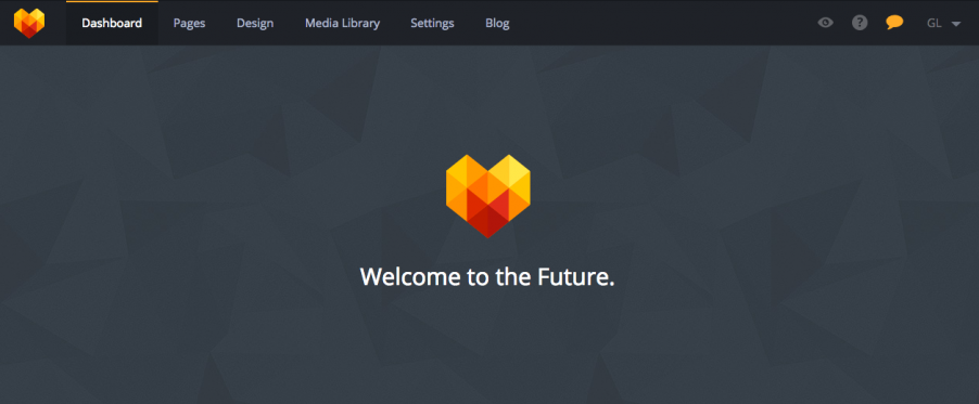
The admin panel utilizes the WYSIWYG system and drag-and-drop functionality, which means that you can see each change as it's implemented. This is especially useful for novice users.
A number of step-by-step tutorials are available via popups and this makes the process pretty easy to navigate – especially when it comes to adding pages.
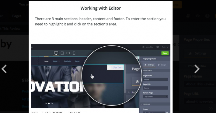
To add a new page to the site, you simply click on ‘add page’ and a popup will come up asking for the page name and URL. You can then edit the page properties using the options in the right-hand column, such as assigning a URL name and assigning parent pages.
If you head over to the ‘Design’ section, you can also edit page specific options such as hiding certain page sections – e.g. the header and footer. By clicking on the viewing tool, you can preview the page to see the exact results.
I found the editor to be perfectly fine – the interface was quite quick and lag-free on all the contemporary browser platforms. The UI seemed to lag on the older versions of Firefox, which might be a concern to potential clients on older machines.
Design
Responsiveness
MotoCMS have made great efforts to make their templates as responsive as possible and there are a wide variety of mobile screens to test your designs on. The platform also allows users to hand edit certain elements of the templates. This is a pretty useful feature, as some of the native content can look a little disjointed.

This screenshot is a random example. As you can see, the picture box is slightly misaligned. Whilst this won't be a massive issue for everyone, it may irritate the design perfectionists out there.
Templates
MotoCMS offer a wide range of premade templates in various styles and tones. There’s enough variety to meet the design requirements of most businesses, and the templates are arranged by industry type to ensure an easy selection process.

However, as I mentioned earlier, some of this design excellence is lost in the transition to mobile.
Features
Social Media
MotoCMS have a social media widget that is quite easy to use and allows you to integrate Twitter, Facebook, and Pinterest. It does this quite well, but it would be great to see a few more integration options available.
Extras
In MotoCMS, each template has an option for a few extra paid plug-ins like an SEO Audit and in-Depth Preloader Customization. These vary according to template.
MotoCMS do have some basic features like Google Analytics available for free, but that’s a bare minimum for most CMS these days.
Widgets
A wide range of useful and functional widgets are available as drag-and-drop items on the page editor. This selection includes galleries/portfolios, contact forms, text boxes, videos, and google maps.
The eCommerce widget is a premium extra and it’s quite expensive (up to $159), but there’s no other option if you want eCommerce functionality on your MotoCMS site.
Blogging
Only some of MotoCMS’s templates feature a blogging section, which will create a bit of a roadblock for many potential users. They have a few templates with blogging options as standard, but the selection is extremely limited.
Pricing
MotoCMS offers a 14 day free trial period. After this, you're provided with a range of price options that are arranged in pack sizes. This applies to your own drag-and-drop creations.
Their basic price option includes a MotoCMS 3 website template for $199 and a HTML template for $139. There are optional extras available such website installation, an eCommerce plugin, an Advanced eCommerce plugin, or a ready-made website.
All of their plans and templates come with 24/7 customer support which doesn't discriminate by price. The pricing is very straightforward and transparent.
Pros:
The full hosting package gives users a comprehensive website including hosting.
The site has a nice range of contemporary templates that are perfectly suited to their ‘genre’.
The WYSIWYG interface is straightforward enough.
Sleek UI and UX design means that navigating is a breeze.
Cons:
The interface is a little clogged with sales pitches, offers of customer support help and calls to action. Distracts a little from the experience.
Signup feature is a little clunky and time consuming. Too much market research crammed in.
The responsive versions of the main templates look very disjointed.
Only some templates have blogging features as standard.
Conclusion
MotoCMS is a decent CMS option for small businesses. It’s a bit lacking in the features department, and the page editor is just about average, but it does provide good value and excellent hosting capabilities.
The template selection is decent and their template + hosting package is definitely good value.
The problem with MotoCMS is that it isn’t really the obvious choice for either the beginner or the professional. It sits on the fence a bit in this regard.
The design professional may not be overly impressed with the features available, and the less experienced site builder may find it a little too complex. Not a massive issue, but it’s worth noting.
Overall, MotoCMS provide a decent service at a reasonable price, and you can mix and match the plugins as you need. The lack of a blogging platforms available will be an issue for some, but this is still a site builder that’s worth checking out.
For more information, visit the MotoCMS site here.
Have you used MotoCMS or are you interested in trying it out? We'd love to hear from you in the comments section below.