Reflecting on My Visit to PrestaShop’s Paris HQ
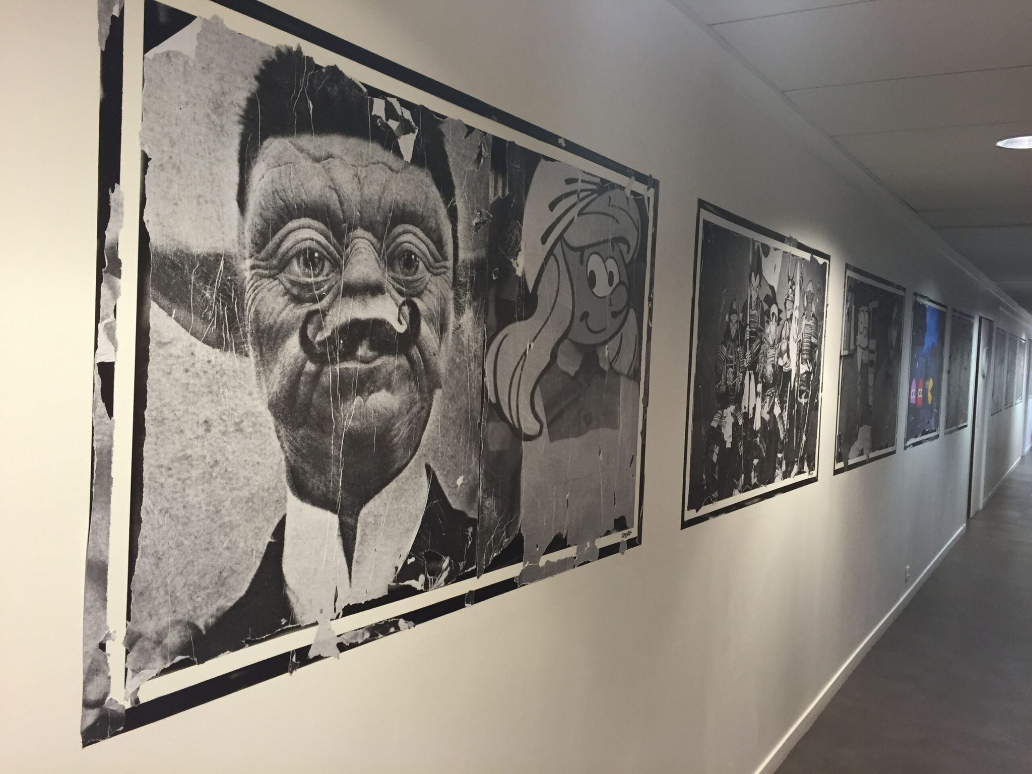
As I stepped into the entrance of PrestaShop’s Paris headquarters,I was greeted by a long timeline of the company’s impressive history, which stretched across the hallway leading to the elevator.
[[__Presta__]]
It was a humbling reminder of PrestaShop’s deep roots in both the eCommerce and open source industries.
When I got to the lobby, Leah Anathan, PrestaShop’s Chief Marketing Officer, welcomed me warmly with tea and biscuits (they had heard about my love for English tea), and we thus kicked off a very casual – yet highly informative – meeting and office tour.
A Chat With PrestaShop’s CMO & Director of Product Management
The first thing I did was sit down with Leah Anathan and Sebastien Levaillant, PrestaShop’s Director of Product Management.
As we sipped on some well-brewed tea, we got to talking about PrestaShop Cloud, and efforts are being made in order to improve it.
Scalability was the word being thrown around more than any other, and I was told that an announcement regarding PrestaShop Cloud was coming relatively soon. Personally, I’m very excited to see what PrestaShop has in store for us (pun intended).
I even got to share the story of my own father’s business, a UK based training course company called The Learning Station, which is powered by PrestaShop Cloud. Leah and Sebastien were excited to ask me about my father’s experiences, and I was only too happy to tell them about his PrestaShop-powered journey.
They also told me about how much closer the PrestaShop team now is to the PrestaShop community. Their move to GitHub has made it easier for their community to submit code, and they now have at least one volunteer from the community who has been granted record levels of access and authority to the PrestaShop project.
A Peek at PrestaShop 1.7
I also got to sit through some short but extremely informative presentations given by various members of the PrestaShop development team.
I was given sneak peeks at PrestaShop’s 1.7 user interface, which has been totally re-worked in line with the feedback received from PrestaShop 1.6 users.
Their development team had spent time with actual users in order to extract their biggest gripes with the PrestaShop 1.6 interface – and they are now working on fixing everything that was flagged up.
And to be fair, they have their plate full, because despite my adoration of PrestaShop 1.6, the user interface had lots of room for improvement.
But with that in mind, I couldn’t help but compliment the newest interface when it was demonstrated in front of me. It really does look good, and you can be sure that I’ll be writing about it in more detail sooner rather than later.
If you want to learn more about PrestaShop 1.7, check out the PrestaShop website.
The Office Tour
After getting to grips with PrestaShop 1.7, it was time to explore the rest of PrestaShop’s impressive European headquarters.
Before I talk about the offices though, let me relay something interesting that Leah Anathan told me about the building itself. As she spoke of the building’s rich history, she directed me to a picture printed on the wall of the lobby, which had a French description.
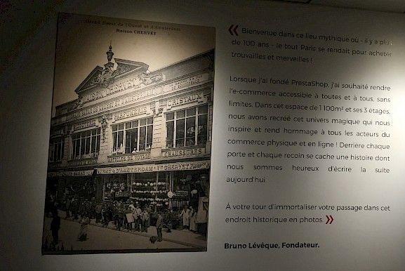
To cut a long story short, a century ago, PrestaShop’s Paris headquarters was actually a popular marketplace. Today, it houses one of the world’s most popular online marketplace builders. I found that to be pretty amazing.
As for the tour, we started off in one of the three office areas that are dotted around the building.
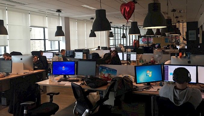
Desks were lined with computers and laptops in typical fashion, and sticky notes with ideas covered a board in what seemed like a snap-meeting area.
This central working space overlooks a picturesque Parisian square, which PrestaShop’s employees get to gaze at (during their breaks, of course).
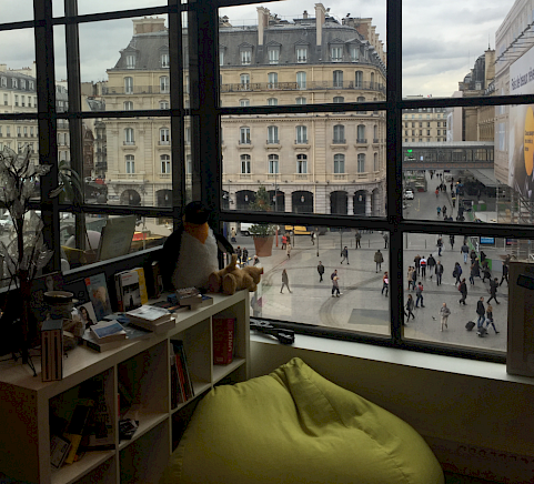
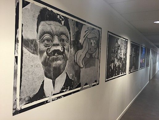
As I walked around the building, I noticed that the walls were decorated with quirky PrestaShop-themed art, with a surprising touch of Star Wars. It was a slightly odd combination – but it worked.
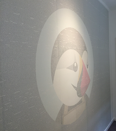
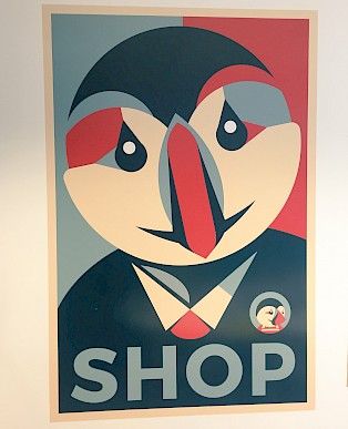
A subtle amount of tongue-in-cheek banter was present all over the office, actually. For example, PrestaShop’s mascot – Preston the Puffin – could be found around the building in teddy form, in wall murals, and as part of some meme-inspired images.
Towards the end of the tour, I was then shown three rooms that were dedicated to the relaxation and recuperation of PrestaShop’s workforce.
The first room was a small, featureless one, with a large couch, some chairs, and a comfortable looking carpet. It’s intended for those who want some silence or some private time. I remember thinking to myself that – in such a busy working environment – this quiet room was a nice touch.
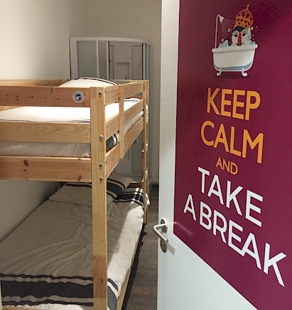
Opposite that room was another, this time with a bunk bed and shower area. Obviously, pulling all-nighters is part-and-parcel of working for PrestaShop.
The third room, which can be found along the same corridor, is the designated relaxation room.
As the name suggests, this room was set aside for PrestaShop’s employees to simply chill in.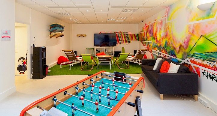
It was a spacious room with couches, bean bags, a wide-screen, and a foosetable. There was a beach theme going on too, with surfboards and sun lounges lined up on the left-hand side. The walls were once again full of color, but this time, the murals gave off a feeling of warmth and serenity – which is no coincidence, I’m sure.
All in all, the PrestaShop office felt incredibly homely and yet intensely energized. It was everything a modern software vendor HQ should be, and then some.
A big thank you goes out to Leah Anathan and the wider PrestaShop team for their fantastic hospitality!
Stick around for more PrestaShop coverage through this PrestaShop featured week.