phpFox Review - Is This The Right Software For Your Social Network?

phpFox is one of the most popular social networking software on the market but is the latest iteration of the software worth using for your social network? In this phpFox review, we'll let you know.
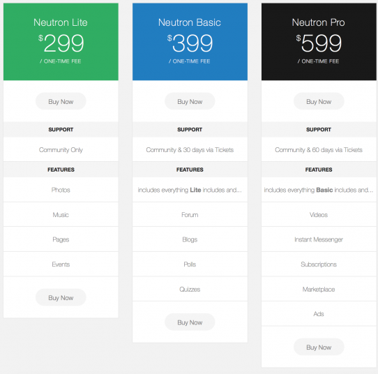
With pricing ranging from $299 – $599, phpFox is definitely not a cheap investment so you'll want to make sure it's 100% the right tool for you before you get started.
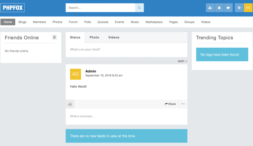
 Fortunately, there's a demo you can use to mess around with the software. The drawback, however, is that the demo does not allow you into the AdminCP (the back end of phpFox) to see what it's like to administer the software, something I find a bit odd.
Luckily, I was given a test account so I could write this review, so let's take a look and see what the admin interface looks like. Once logged in, you'll be presented with the menu for a logged in user (top right) where you can select the small gear icon to enter the AdminCP.
 Once you've entered the admin interface, you'll be greeted with the following screen:
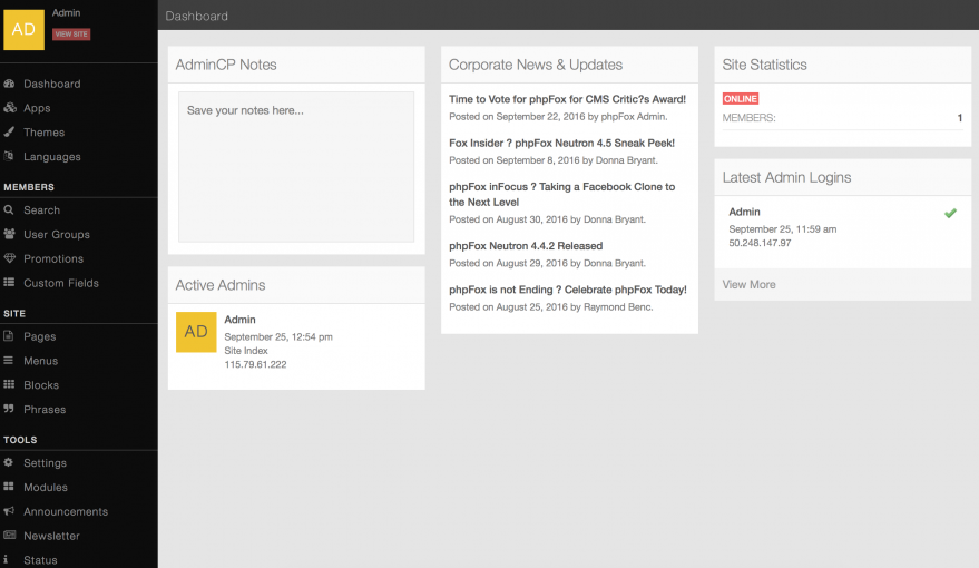 From here, you can administer your phpFox instance. The dashboard link on the left menu gives you the screen you see above, which shows basic information about who is using your site, who is logged in, etc.
Under the Apps menu, you can add new Apps to your phpFox instance, allowing you to expand the functionality for your members.
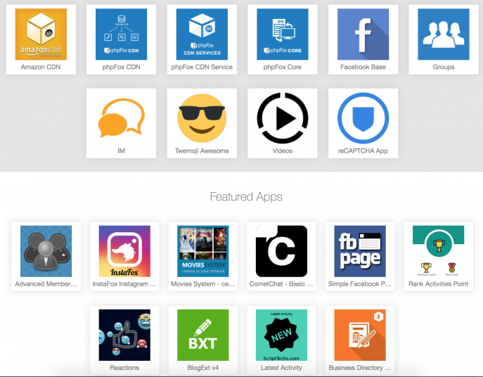 Keep in mind, of course, that a lot of these apps will have costs associated with them as most are commercial plugins and not free.
On the Themes tab, you can choose to apply a free theme or purchase a new premium one from those available.

From the languages link you can change the language of your installation to one of the many available translations. Unfortunately, I'm not versed in anything more than English so I'm not able to tell you how accurate the translations are but perhaps someone can leave a comment and let us know their experiences. Available languages include French, Dutch, Russian, Romanian and Polish.
The user editor allows you to modify user profiles. One thing that I found slightly annoying (from an aesthetics point of view) is that everything is single column all the way down. I would think it would be easier (and make things look cleaner and more professional) if the fields weren't full width for everything like Zip Code, Gender, etc. It just makes it look a bit sloppy and I think some basic work to clean these up would make it look more professional as it currently does not.
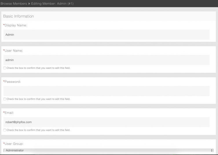 I'm on a 1440×900 screen so seeing these fields stretched the whole width just looks sloppy. I realize this is a minor gripe but still something I felt necessary to point out.
While on the topic of gripes, one thing I found rather distressing was the complete lack of help throughout the AdminCP. Not only are there no tooltips or even a “?” icon to click on for help with an area of the admin but there isn't even a help link in the menu system on the left, which I found rather disheartening. For a system this far along in the development cycle (phpFox has been around for many years) this simply is not acceptable.
Moving on to the Pages component of the Admin, we're greeted with an editor that, sadly, only allows you to enter in HTML code.
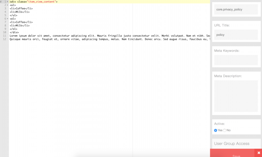 I was personally hoping for something a bit more useful like a WYSIWYG (what you see is what you get) editor akin to WordPress or other CMS but that was not the case. I'm also a bit take aback by the way the interface seems to scale on my Macbook Pro. I'm at a screen resolution of 1440×900 as mentioned before and as you can see from the screenshot, things like even the “save” button seem cut off and not scaled appropriately. Even if I attempt to scroll, the button for Save still does not show fully which I consider unacceptable. (Note: phpFox claims that a proper editor will be present in the upcoming 4.5 release, so perhaps this will change)
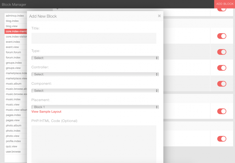
The Blocks interface within phpFox lets you control which components you wish to show on specific areas of the site. For instance, you can create custom HTML or PHP blocks and show them based on specific pages or to only specific user IDs or groups.
 The Phrases area within the admin appears to be a place where you can rename or provide friendly names for specific phrases within your social network. I'm not 100% clear as to how it works because, as mentioned before, there's absolutely no help or even description telling you what this area is for so I'm stating this based on guesswork and common sense.
The bulk of the settings for your installation can be found under, wait for it, the Settings link. Here you can configure everything from server settings to SEO settings and more.
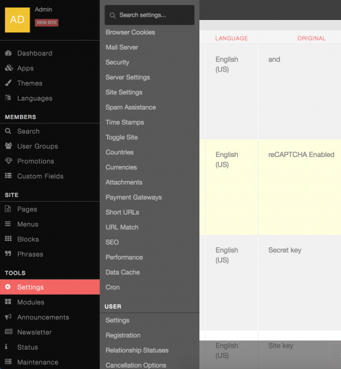 To their credit, there are a lot of settings exposed here and everything from module configuration to payment gateways and more is all listed here and easy to configure. I still, however, am frustrated by the lack of any kind of help while within any of these areas. In most cases, there aren't even descriptors to help enlighten you as to what each of the areas within the Settings are for.
The Modules, Announcements and Newsletter sections are all similar in look and feel. Within the Announcements and Newsletter dialog, you can configure and set announcements and newsletters to go out at certain times.
Under the Status menu, there is a Site Statistics link. Within here, one would expect to see reports or graphs showing statistics for your website. Instead, this is what you are shown:
 I'm not sure about you but I'd have expected that if I clicked on a menu called Site Statistics, I'd want to see some nice, pretty graphs and a decent spread of analytics. This type of stuff is not hard to provide, even if just embedding some basic Google Analytics reporting. All in all, my whole experience with the software seems to echo this frustration.
I'm going to conclude this review here as there's not much else to cover and I think I need to explain why I'm being as picky as I am about the design, implementation and issues I'm encountering here. You see, this software is not just marketed as the best solution for social networking but it's also priced at a level that should reflect well coded, beautifully crafted software. All of these niggling issues and poor design choices I'm encountering make me think that if I had purchased this software, I'd feel upset and like I had not received enough value for my dollar. Furthermore, I'd expect things to be intuitive, come with excellent help and generally be more useful. I find it very difficult to be lenient in instances such as this and rightly so.
When a company is asking for hundreds of dollars of my money for their software, I expect quality of a high level. You don't buy Adobe Photoshop for several hundred and expect it to be sloppy and not scale properly to your screen size nor should you expect the same here. Is comparing phpFox to Adobe Photoshop or any level of similar priced software fair? I think it is. We're talking about software that has been around for over a decade and the level of quality you'd expect from software that has been around for this long simply isn't reflected here.
When it comes to help, nothing is present within the adminCP. There are no quick links to available help resources, no help within any of the sections of the site and no live chat or anything to warrant the cost associated with this software. Even more annoying, support links are buried within the footer on their main website as opposed to being easily accessible and visible.
Note: this isn't to say that support resources don't exist, there are tons of them: https://docs.phpfox.com/ & https://community.phpfox.com for instance but the fact that they are not linked to or highlighted within the AdminCP is still a big miss. Why have no links or method to access any of these great resources evident when using the software? Hiding them away somewhere else without making it easy to find or use them means you miss the “ease of use” mark.
When you look at the pricing, the lack of support is even more evident. Even with the most expensive package ($599 for the Pro edition) you only get help via the community forums and for two months through support tickets. To get support for a longer period, you have to pay a quarterly amount depending on the package you select (screenshot below).
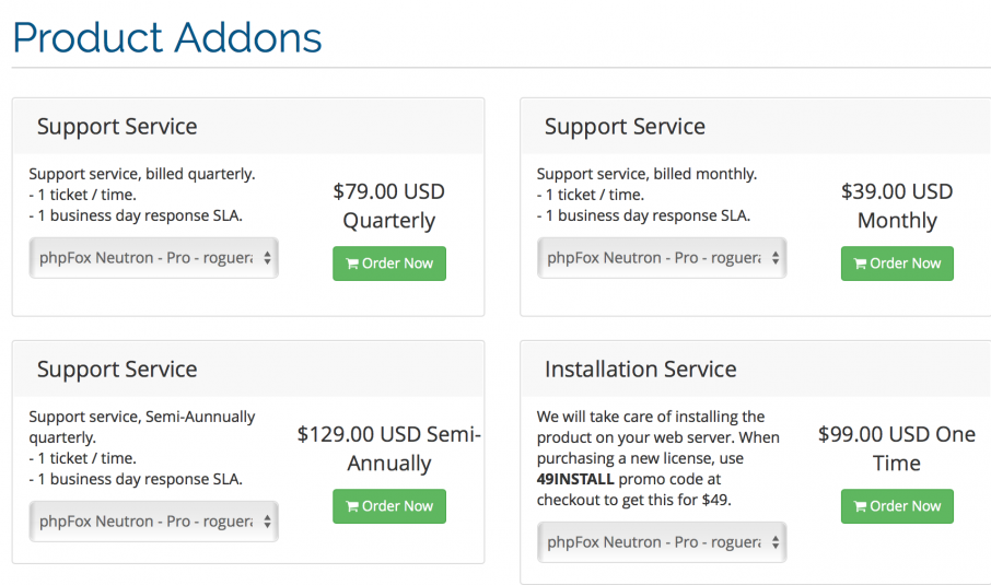 Even with the support packages, you are only allowed to submit one ticket at a time. Overall, I'm generally disappointed with the way support for this software is handled.
I don't mean to be Mr. Negative here but I'm just generally not very impressed. In 2012 when I wrote my first phpFox Review, I was impressed with the way things were put into place because there frankly wasn't much else out there. 4 years later, however, I'd have expected the software to have evolved far further than it has. I'd also have expected support to be far more advanced and complete. Sadly, that's simply not the case.
Would I recommend phpFox?
If you are comfortable doing things yourself and need a leg up, perhaps, but overall, no I would not. This software simply just doesn't feel worth the price they are asking for it. Check it out for yourself at phpFox.com