Pulse CMS Review
According to the Pulse CMS website, “Pulse CMS is the easiest way to build and deploy a responsive, content managed website”.
That bold statement is quickly followed up by a reference to the platform being a flat-file CMS, meaning that it can be quickly downloaded and uploaded to any server with no database setup process standing in the way.
With work on the platform officially starting back in 2009, Pulse isn't exactly new to the CMS scene. At the time of writing, Pulse CMS powers just over 3,700 websites.
The platform boasts WYSIWYG editing, themes, analytics, built-in backups and blogging functionality.
So, does Pulse live up to its own hype, or does it flat line? Let's find out.
Initial Thoughts
The Pulse website is sleek and straightforward.
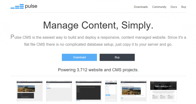
The homepage has a download and buy button, screenshots, feature highlights and some customer testimonials. All good things, all well presented.
Remaining pages are equally clear and simple. I was looking forward to (hopefully) seeing that simplicity spill over into the software itself.
Getting Started
Downloading Pulse takes a matter of seconds. Thereafter, you simply need to extract the files from the .zip folder and upload them via FTP. That's all it takes.
What that then gives you, is a functioning Pulse website right out of the box, with example text and stock images. Not bad for two minutes worth of work.
The default theme is basic, but that's not a bad thing. The design would fit well for most small and medium sized businesses.
To access the admin section, you just need to type “/admin” at the end of your URL.
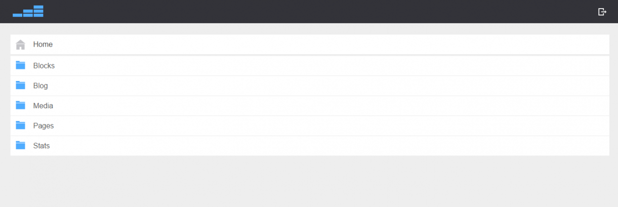
The admin section is yet again highly simplistic. Maybe too simplistic, since there's no actual home page or anything worth looking at other than a menu.
On the plus side, since there isn't a whole host of configurable options or menus, getting lost shouldn't be a problem.
Adding Pages
To add a page, you'll need to head to the admin section, then “Pages” and then “New”.
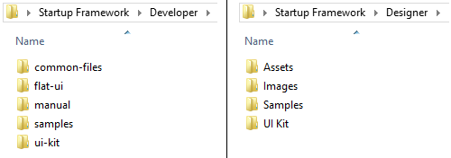
When adding the page name, you'll need to specify that it is indeed a page by adding “.txt” to the end of it. Otherwise, Pulse will assume that you want to create a folder instead. I'm not a fan of this.
There are faster and easier ways of making the distinction, and I think the Pulse team should look into that. Two separate buttons is one way to go; one for a new page, and one for a new folder.
After you do create a page, you can then start adding code in order to populate it.
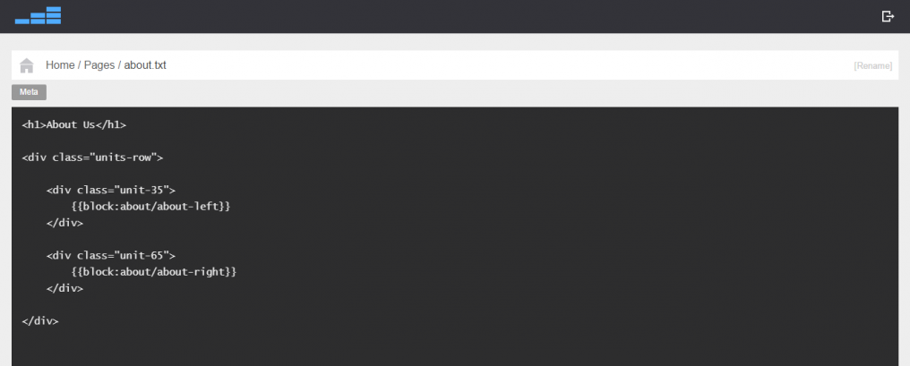
Pages can be made up of “Blocks” which are accessible from the admin home page.
Existing blocks include the homepage template, about sections and contact sections. If you want to make use of an existing block, you'll need to reference it when creating or modifying a page.
New blocks can be created with the help of a WYSIWYG editor. So essentially, you code the finer details of a page via the Blocks section, and then reference them on the Pages section to bring it all together.
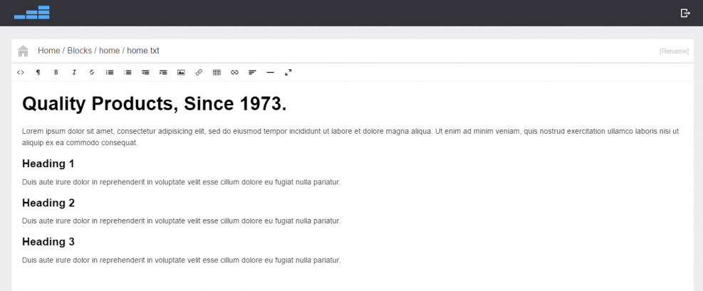 The WYSIWYG editor is fairly basic. You can add HTML, images, files and links. Fonts and text can be formatted too, but not to a major extent. Some further additions like a font color pickers and a spell check tool would be nice.
If you ask me though, I'd rather page creation was more linear. I'm not convinced that dividing the process between Pages and Blocks is all that useful.
A WYSIWYG editor within the page section without the need to reference blocks would be far easier for those who don't know how to code.
But in fairness, if you do know how to code, page building with Pulse a piece of cake.
Extras
There are some useful extras offered up by Pulse.
Blogging
A blog page comes built in with every Pulse CMS. However, you can also embed a blog into your Pulse CMS website by using a Block reference, too.
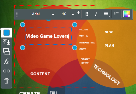
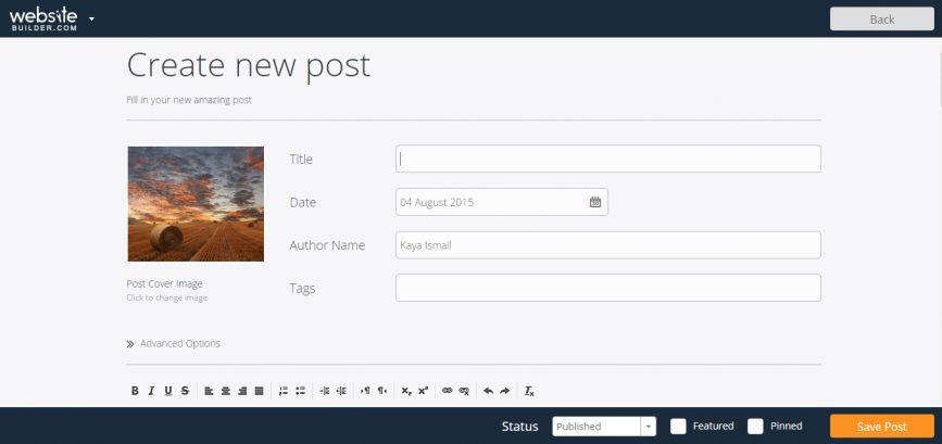
By heading to “Blog” section on the admin panel, you can view your list of blog posts, and click “New” to bring about a new post, which can be done once again using a WYSIWYG editor. Each blog post is able to host comments, too.
Nothing fancy, but it does what it gets the job done.
Backups
As for backups, Pulse has that handled out of the box.
Every time you use Pulse (in other words, whenever an edit is about to be made), it checks if a backup exists for that day. If not, one is created.
Pulse takes a maximum of one backup per day, and stores the five most recent backups in the ‘content/backups' folder. Now that's what I call handy.
Themes & Plugins
Pulse serves up four, free themes and three premium ones. They're all fairly simple looking, which is a good thing, although they aren't going to be winning any web design awards, that's for sure.
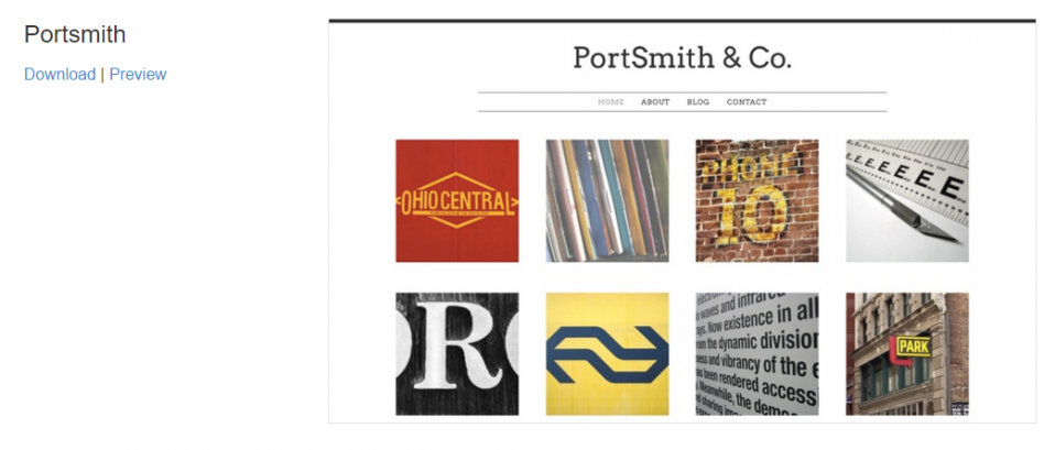
There are six Plugins, including Google Search, Recent Blog Posts and Static Calendar. It would be nice to see some more variation here. Pulse isn't exactly bursting with features, so I'd hope that they're focused on broadening their plugin library.
Stats
Pulse CMS boasts built in statistics. Simply clicking the “Stats” button on the admin panel brings up a small amount of metrics.
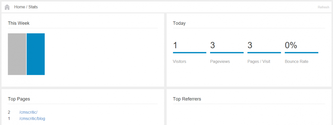
Top pages, top referrers, weekly traffic and daily statistics for bounce rate, page views ans visitors, are all presented. It's not going to rival Google Analytics, but it's definitely a nice feature to have lying around.
Further features include the ability to create a gallery and a form for your Pulse website.
Getting Help
As far as support goes, there is a decent amount of documentation on the Pulse website, plus a community forum. Although, the forum isn't exactly buzzing with activity.
There is a “Help” button on the backend, but it resides at the bottom of the screen, in small, faint font. Plus, it only leads to the documentation section.
The only way to actually reach out to the Pulse CMS team, is through a contact form on their website.
Although Pulse is still a relatively small project, I'd like to see a well populated FAQ section, and perhaps some video tutorials.
Pricing
Anyone can download Pulse and try it out for free, but if you want to use it on a live site, a license must be purchased.
Thankfully, a copy of Pulse CMS will only put you back $29 – and that comes with lifelong free updates, too. A set of five licenses is available for a discounted $75.
Now, I usually like to apply some pressure on vendors when it comes to price. I often bemoan the lack of low-level price plans for those looking to experiment, and for those with startup projects. but Pulse hits the nail on the head with its pricing, if you ask me.
The Verdict
Pulse is a supremely simple CMS. The flat-file platform is incredibly lightweight in more ways than one. The back-end is plain and easy to use, while themes are uncomplicated.
But that simplicity isn't all good news. There's a lack of customization options across the board, meaning that you'll need to rely heavily upon your coding skills to get things looking pretty. That means more effort, and more time.
Handy extras like blogging, stats and plugins help round off Pulse a little more, but there's no doubting that its a product in need of further third-party input.
On the upside, Pulse successfully covers the basics very well indeed. It's quick, responsive, and capable of hosting small and medium sized websites for a range of uses. For its price, it's a very stable solution.
Pros
- Pulse boasts a speedy and uncomplicated setup process.
- Generally quite easy to use, the backend is extremely quick.
- Coding pages and blocks can be done quite easily from the backend.
- Four free themes & six free plugins.
- Backups made automatically every time Pulse is used.
- Blogging functionality.
- Built-in analytics.
- Seems to be a platform with a small but growing community.
Cons
- Only four themes to chose from, none of which are spectacular. Plugins are similarly few and far between.
- If you don't know how to code, you won't be able to customize much at all.
- Relatively minor usability issues, like having to manually add “.txt” to a filename in order to tell Pulse you want to create a page and not a folder.
- Support options could be better.
Final Thoughts
I like Pulse, but it bugs me that I don't love it.
And actually, that lack of love is less to do with general usability and functionality, because overall, Pulse does a good job on both those fronts. It defines itself as a small and simple CMS, and that's what it is. I get that.
But such products are usually bursting with personality in one way or another. A quirky admin panel home page would be one example, perhaps with some site stats on display, a welcome message, or something along those lines. Pulse doesn't offer anything of the sort.
Instead, I feel like Pulse is rigid. It does exactly what it says on the tin – and absolutely nothing more.
My advice to the Pulse team would be to focus on streamlining every-day processes on the back end (like page creation), and then think about adding a human touch to what is currently a very robotic platform.