StatCounter now including Mobile Device stats

So you have put all this time and effort into creating a mobile version of your website. Good job! More consumers are purchasing tablets instead of macs, laptops, and PCs when it is time for them to purchase a new computer. Smartphones also come into play even more so because of their portable nature. Most who have a smart phone will most likely see your site on its screen first before they view it on their computer. The web is no longer just to be viewed on a traditional “computer.” You have done your job and made your beautiful site mobile friendly. Is it working?
Are mobile users viewing my site?

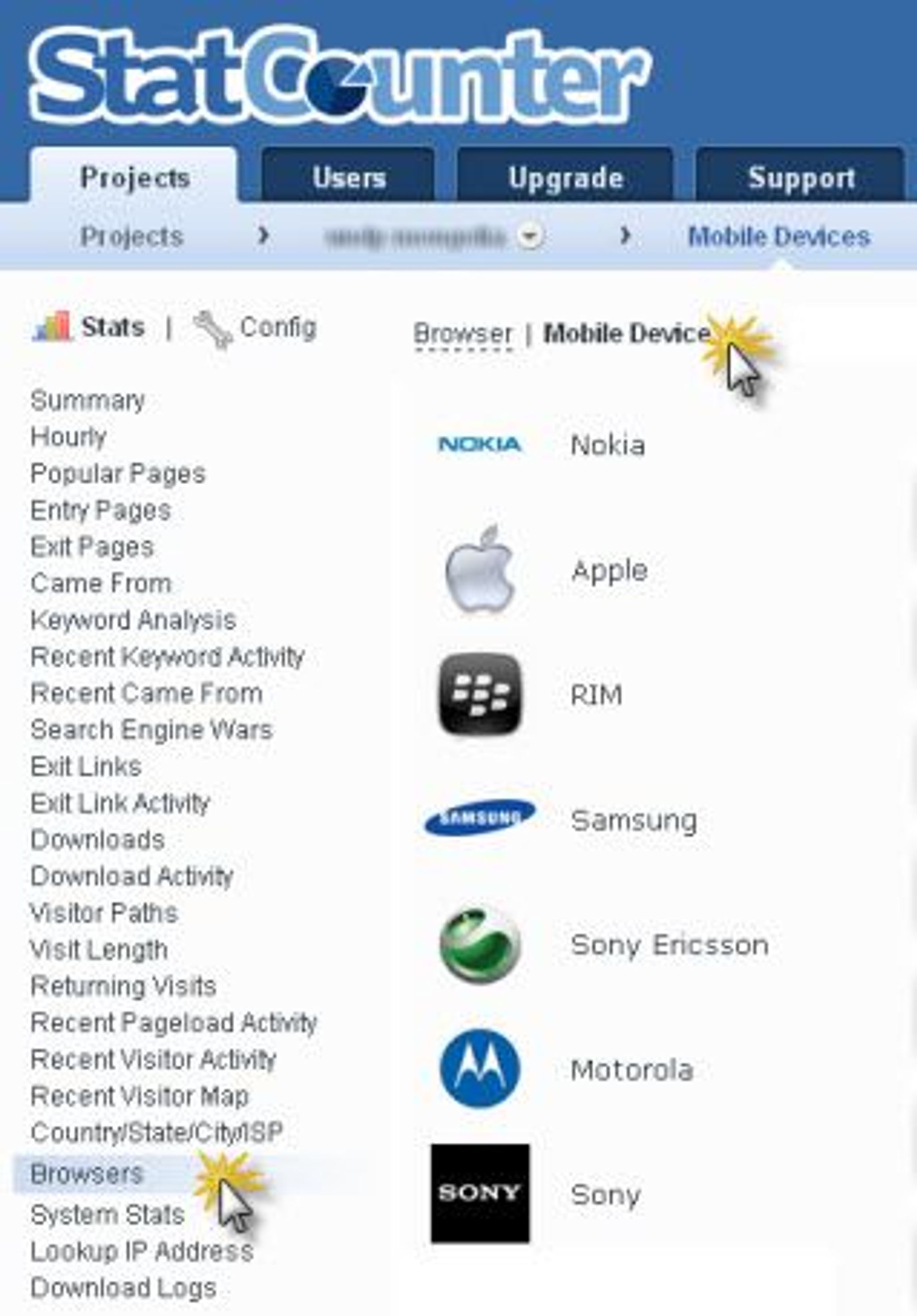
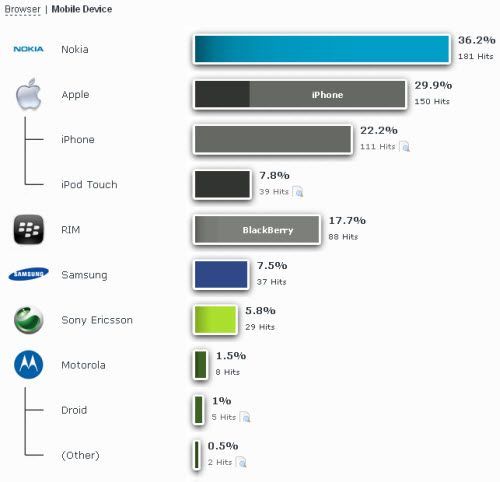
Great question? Thankfully StatCounter now has a mobile device stat metric for their members. They have made it easy to activate so you can get started right away. Not only will this statistic tell StatCounter members if mobile users are using the site, but also will identify issues with mobile access. As you make style changes you can tailor the layout and viewing experience to the mobile devices accessing your site most often. This is just one more way that web analytics can help companies make web design decisions base on sound visitor data.

Learn more at: http://statcounter.com/