Strikingly Adds Custom Colours & Extra HTML Support


Strikingly, the sleek one-page website builder, just rolled out some small but noteworthy features.
The cloud-hosted platform boasts a number of nicely crafter templates to help get businesses off the ground in just a matter of minutes, and also boasts a native LinkedIn app to streamline the process of making a personal website.
Let's take a look at what's new with Strikingly.
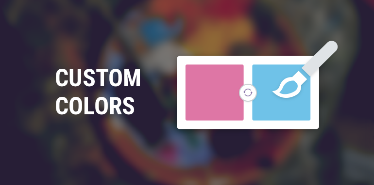
Custom Colors
First up, Strikingly users can now change the colors of their templates.

Previously, themes came with a set color scheme (or in some cases, a set of color schemes), and there was no easy way to change that.
Now though, under the Styles menu, you can modify the core colors of any Strikingly template.

I tested the feature out, and interestingly, you can upload your logo as a shortcut, since Strikingly can automatically extract the two primary colors and apply it to your template.
However, although the feature allows you to insert any color hex code you like, there's no actual color palette to help you choose. Unfortunately, Strikingly users will have to keep waiting for that particular feature.
HTML Support & New Footers
Furthermore, Strikingly Pro users can now add HTML or App store embeds into their blog posts.
And finally, Strikingly team have replaced the old footer with a new one that looks better, and also has new social media boosting functionality.

Like I said, these are small but noteworthy features – on top of an already impressive platform. Having said that, I still want to see more from Strikingly in terms of templating options.
To try Strikingly out for yourself, check out their website.