Superdesk Digital Newsroom Review
The Superdesk website says that the company is “more interested in saving journalists from being used as robots than we are in the fantasy of robots becoming journalists.” That’s a bold goal given the demands placed on journalists, news agencies and media organizations in the current environment.
But Sourcefabric, the team behind Superdesk, are very close to making this happen with their headless CMS and news management system that purports to be a creation, production, curation, distribution and publishing platform built for journalists by journalists.
Will they make it? Read on to find out.
Key Features
The Personal Tab
Confidentiality and private space management are essential for journalists. With a modular system like this, Superdesk knew that they had to provide this functionality to users and it’s the first thing that stood out to me.
The Personal Tab on the homepage allows journalists to store private audio, image, video, composites and text files, that are kept completely separate from any search function and the other “desks”. This desk element of Superdesk’s CMS is a key part of the product.

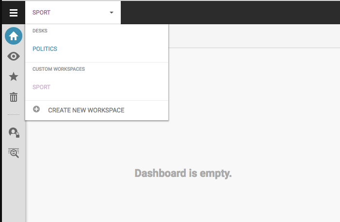
In a physical news organisation, journalists and other content creators work in specific areas of the newsroom. Sourcefabric have tried to recreate this collaborative nexus in a digital environment with the “desks” function, which allows for easy jumping between a sports desk, a politics desk, a features desk, etc.
If a story intersects between sports and politics, different news writers can collaborate in the same newsroom, regardless of their physical location; whether they’re in just across the hall or an ocean away. Using these desks, journalists can manage and control their work practice according to the needs of the story.
Superdesk Search
An editor can also use the Superdesk Search function to capture a wide range of stories with a detailed, exhaustive query system that allows you to narrow in on as many specific stories as you need. Using this function, users can then reuse these stories. Essentially users can search stories and then repurpose them in production
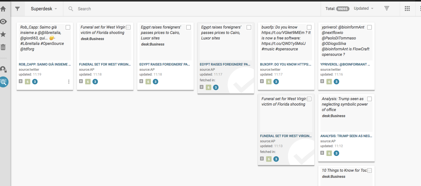
You can filter the search terms under a number of different criteria and clicking on each result brings up a well laid out tab with the full story easily visible.
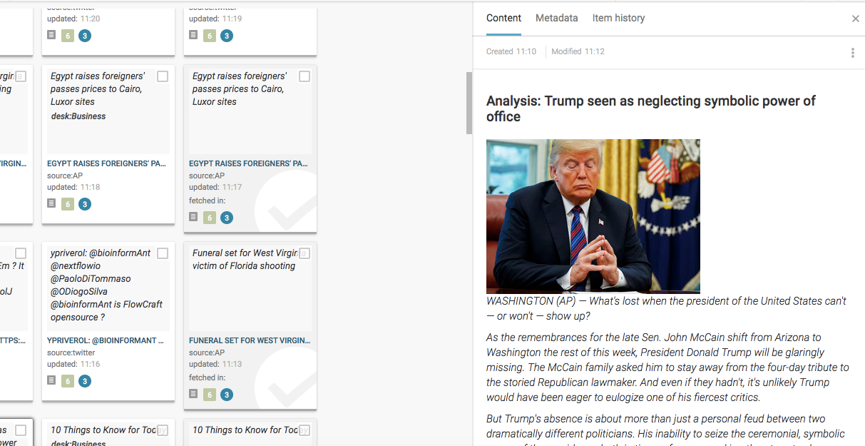
Dashboard
The first page you’re greeted with is the Workspace page, which is the area from which all other parts of the site are accessed. The design immediately strikes you as being clean, fuss-free, and easy on the eye for the most part – albeit a little monotone at times.
From this page, you can easily click into most of what you need – even if the Publishing and Setting pages are hidden behind a blind tab. Once you get to grips with the system, the home page becomes a nexus of information. You can access other workspaces, track stories and easily access your personal tabs, but getting to grips with that system is the thing. It’s easy to use once you know how, but getting to that point is the issue.
In my opinion, the Dashboard area of the platform could be improved with some tips for using the various tools or even just a visible help section to ease the user into the system. The detail of the Superdesk system means that busy journalists will need a little hand-holding initially, especially because the page is so cleanly laid out. Once you know what the Personal Tab does and how the Monitoring system works it’ll become second nature, but getting to that stage without a walkthrough takes a bit of time.
Monitoring
The Monitoring tab is where Superdesk really flexes its muscles from a journalist workspace perspective.
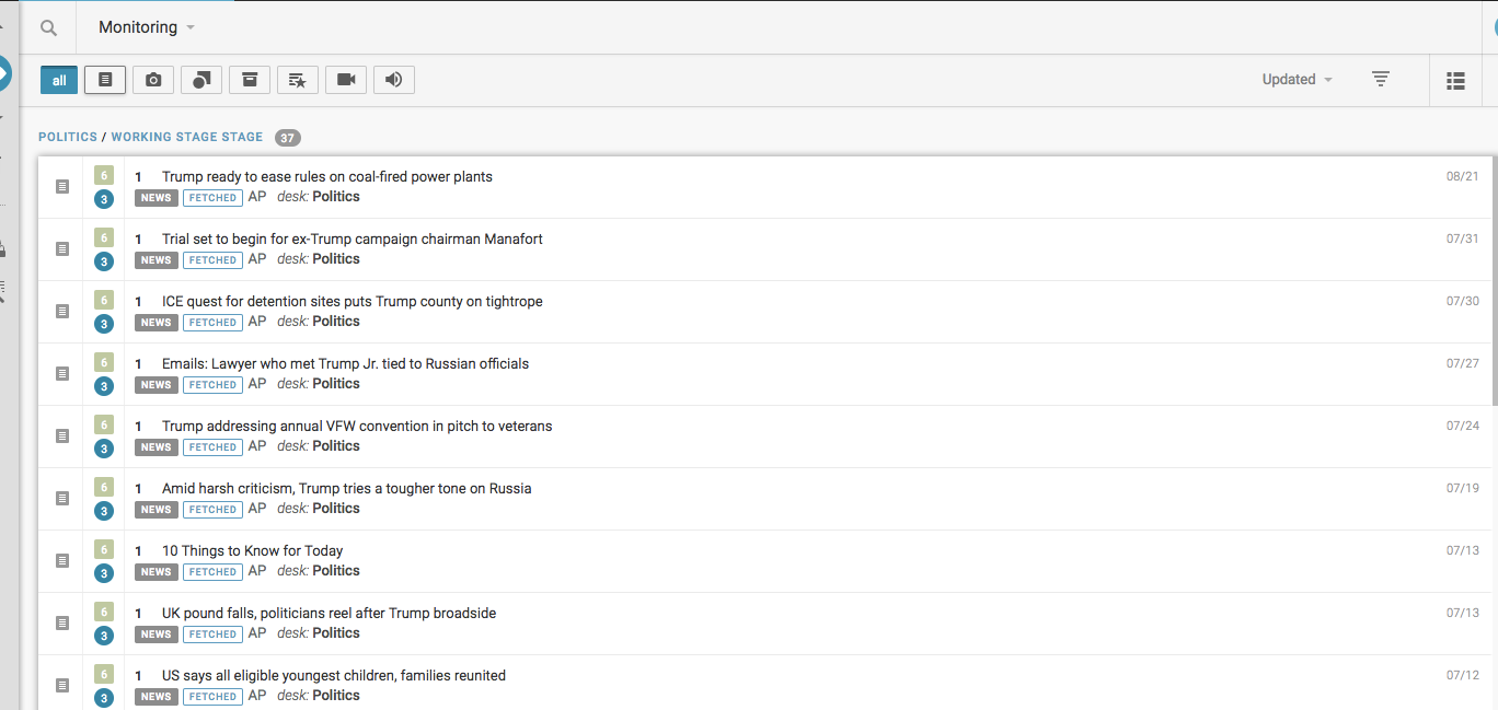
In this tab, you can track stories and topics, and edit stories and other assignments right next to the items that you’re tracking. You can write copy, assign urgency, and add other important metadata right next to the content as it tracks.
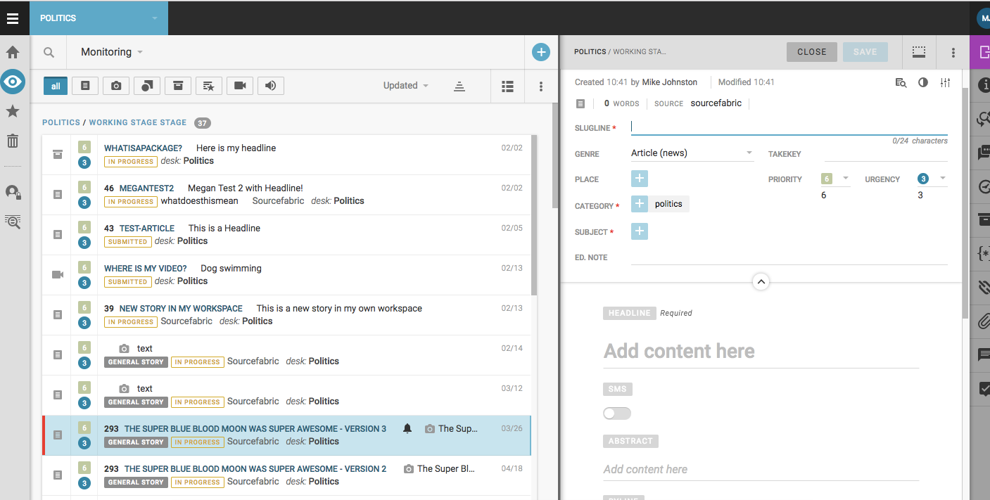
Automated News
In addition, there is a type of Newsroom Automation that allows journalists to create templates to speed up reports or stories that have similar content week to week, which is a great idea in practice but I found it a bit difficult to work out. The learning curve on the CMS seems to be a little steep and that might make initial uptake quite time-consuming, especially when it comes to creating content on the platform.
User Interface
My one criticism of the Superdesk interface is the colour scheme of the Dashboard area and the effect this has on user experience. With the current colour scheme, it’s difficult to determine one area of the page from the other. While everything is perfectly clean, precise, and excellently put together from a layout perspective, the default colour scheme is a little off-putting when engaging on a certain desk or story.
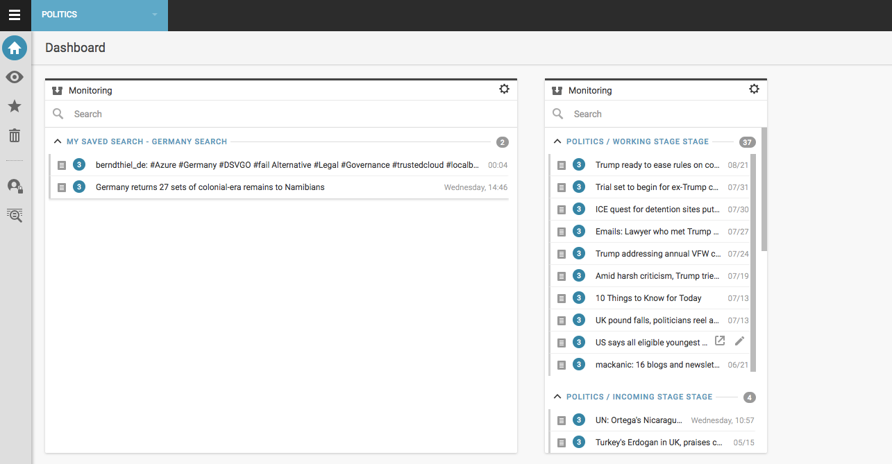
That colour issue becomes especially prominent in the Monitoring part of the Dashboard, which makes it difficult to keep track of what stories you have and have not interacted with. As I stated earlier, the lack of support available was also an issue for me and this impaired my use of certain sections, such as Monitoring and Content Production.
This issue is all the more confusing given that Superdesk do know how to use colour to distinguish text and freshen up the visuals of a page. Superdesk’s Copy Editing System is based on just that concept and is absolutely fantastic for journalists in that it addresses a common problem: proofreading and word blindness. In the screenshot below, you’ll see that after creating a document, I was able to copy edit and proofread the text by changing the colour scheme.
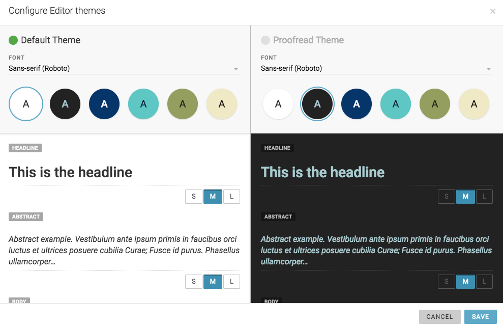
That micro-change and the new colour made the text seem like a different set of words compared to what I had written just minutes prior, which made error spotting much easier.
Overall, the User Interface is very clean, very fast and is intuitively laid out once you get to grips with the general concepts.
Pricing
Right now, it’s hard to find what the starting price for Superdesk actually is. Their website writes that it is “developed with new agencies and independent contributors as an open-source newsroom CMS”. And while they state that there is no license fee or a vendor tie-in, it isn’t 100% clear.
I reached out to SourceFabric and found out that there are in fact 3 pricing options for using Superdesk. As it is open source, users with technical know-how can download it for themselves for free. The second option, for smaller operations, is the pro package, and for larger scale organisations Superdesk offers an enterprise package. To find out more about these packages and request a demo, those interested can click here.
Design
Once you navigate to the Templates section, the clean design allows you to progress through the stages of creation quite well without tripping you up in relentless click back error loops, which I liked. The presentation of the platform is ultra clean, smooth and performed very well on all the contemporary browsers I tried it on.
I really appreciated the integration with WordPress and their own API-based Superdesk Publisher, which fits into any newsroom software. Superdesk Publisher also has a number of excellent themes that can be easily edited and put together by editorial staff with no need for coding or back-end developers. You can add as many channels as you want, and even publish directly to RSS feeds.
Superdesk has plugin integration for other publishing sites – as you might expect for a platform of this nature – but they also have output settings of their own, which are sleek, easily customisable and are comparable with other bespoke news templates.
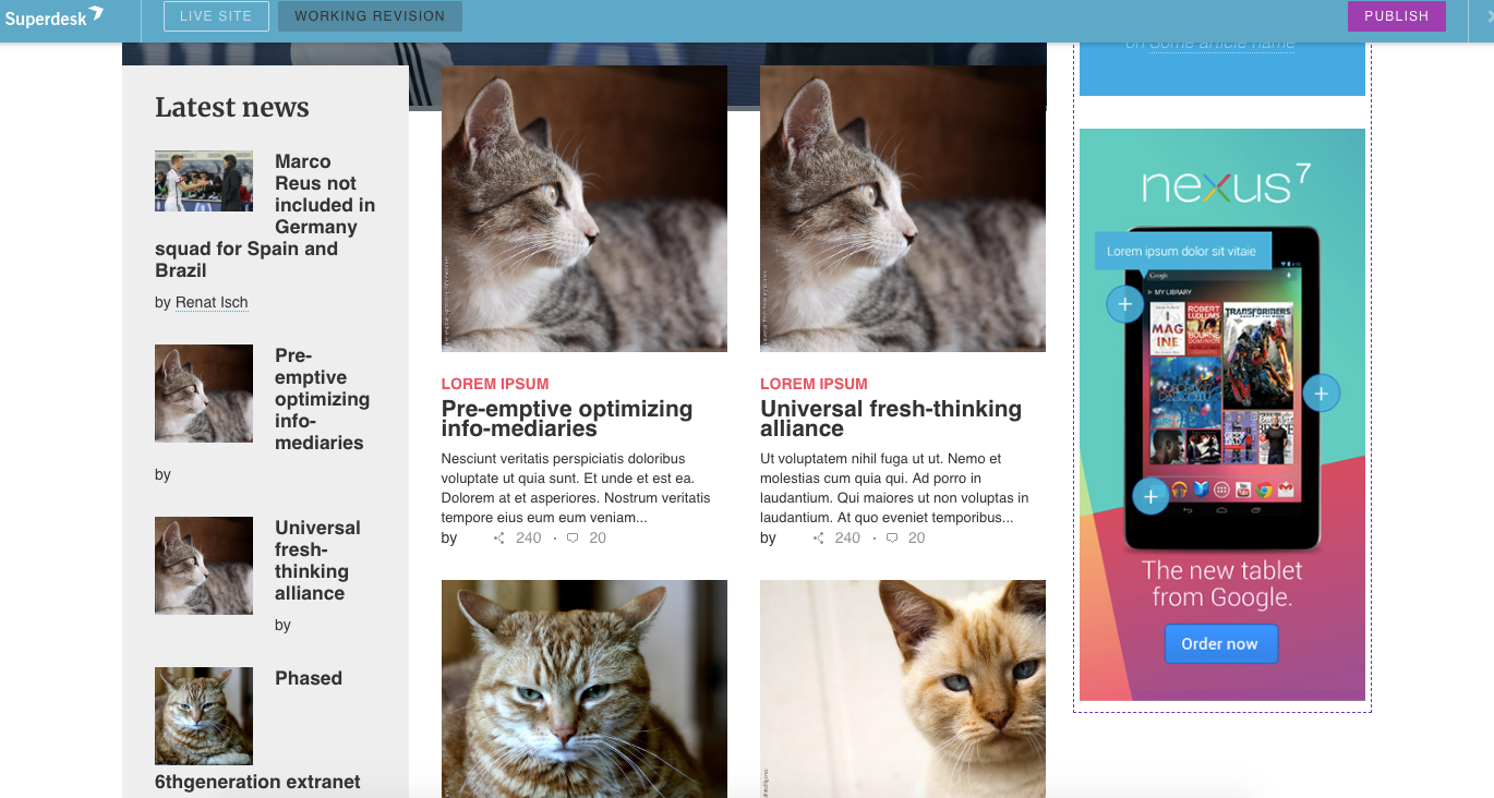
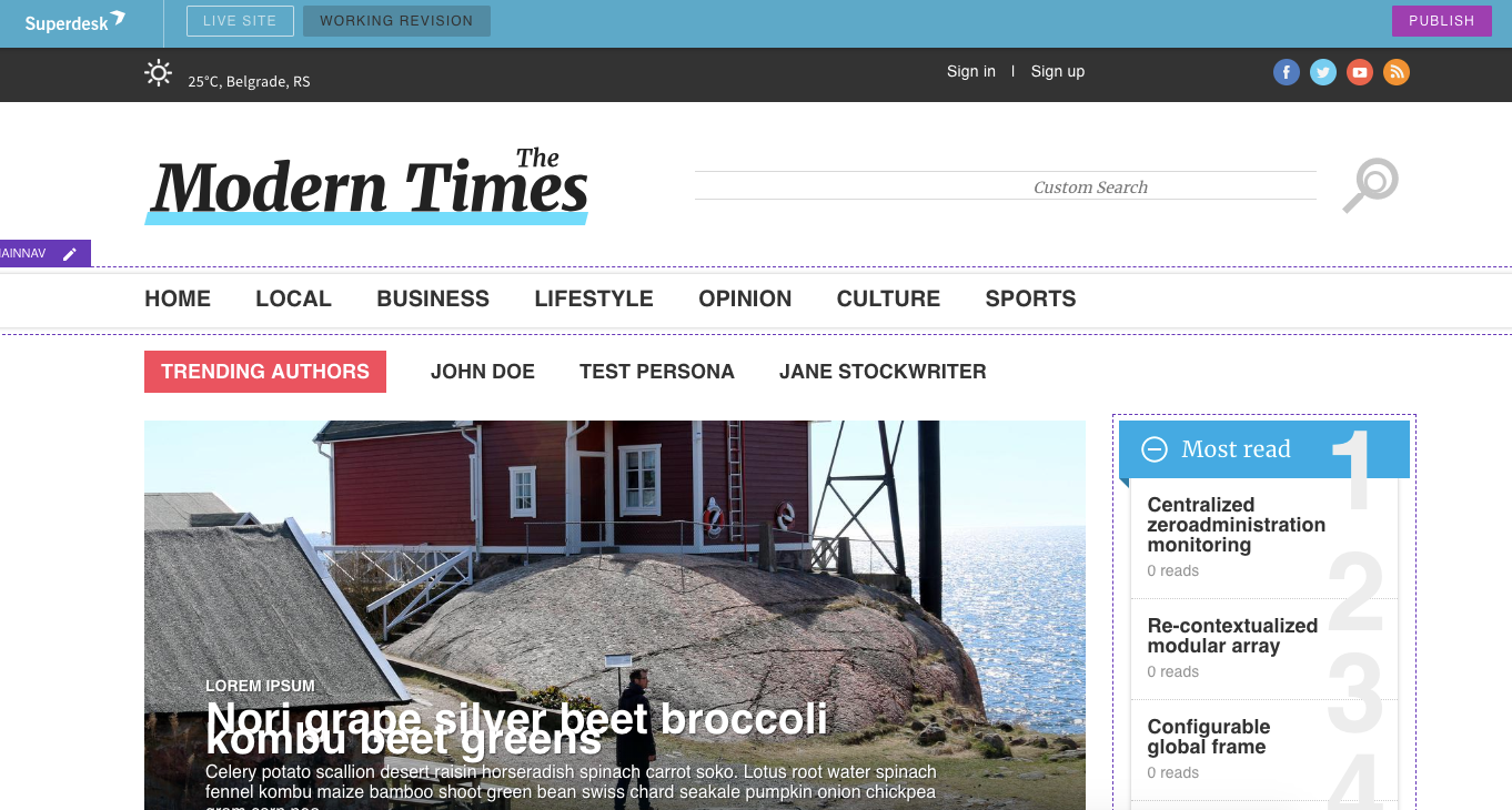
The way they’ve integrated video and imagery into the input system and made it easy to export to publishing is particularly useful, especially for journalists and editors who may be under time pressure. I found it quick and seamless with zero lag.
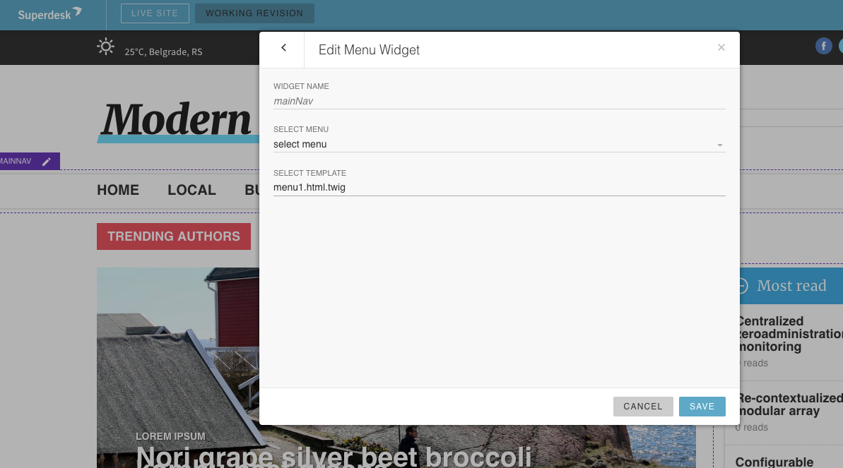
The main page can be further customised by editing widgets. Although this is slightly more complex than editing text, it isn’t too hard to grasp. This element really shows the potential of Superdesk as a publishing platform.
Help and Support
Superdesk might not have many help options in the workspace but they certainly do aim to make their platform as easy to use as possible, with various training options and videocasts to help upskill users to the site's systems.
At the moment though, their help and support sections seem to be a reference to their user manual and user forums, which isn’t very personable and may seem like too much effort to users. However, it’s worth mentioning that they do offer personal support to commercial clients under a Service-Level-Agreement (SLA).
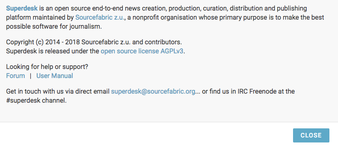
A system as complex and powerful as Superdesk will need a more comprehensive help section to bring along potential users who might be intimidated by its scale.
Pros
- Extremely flexible and powerful layout.
- A detailed and extensive search and capture feature for news stories.
- Very end-user focused with features and widgets such as colour optimized spell checking, world clock widgets.
- Perfectly suited for journalist and newsroom specific collaboration
- Multiple language options
Cons
- There is a very steep learning curve that may throw off busy editors and journalists from investing time in fully utilizing the systems.
- A lack of tool tips or an easily accessible help section adds to this learning curve.
- The design is a little monotone, which can hurt readability at times.
Overall
Once you get past the initial complexity of Superdesks’ setup, you’ll find an incredibly powerful Content Management System and creation tool that really does live up to the idea of being created for journalists by journalists. Little touches like the ability to attach a physical paper trail of attachments to stories in production, publish in multiple languages, and even a projected read time feature on created text show that they’ve spent a lot of time thinking about everything a journalist and newsroom might want.

That blend between journalist and publisher is what makes this such a powerful system. After you’ve progressed through the initial learning curve – which is an unavoidable result of the complexity and power of the system – you have a site that can stitch together content production on a massive scale but is also specific enough to serve a local newspaper.
Its clean design might be a little too stark at times but it makes for a pleasant working environment that is flexible and powerful in equal measure. Superdesk has the potential to be the next big thing in media content management circles.