The Best Practices for Designing a Magnolia App

After discussing the many ways in which Magnolia CMS makes things like content creation easy, it's time to focus in on one of these features in particular – Magnolia Apps.
Magnolia Apps allow you to focus on one particular task at a time. Apps come in a variety of forms. Magnolia CMS is shipped with Apps like Pages, Assets and Contacts – but the true potential of Magnolia Apps as a whole lies within the Magnolia community.
Using Magnolia's App framework, individuals and enterprises alike can create Magnolia Apps of all types, with the option to share them with the Magnolia community. So, with a little imagination, the Magnolia community can produce all kinds of different Apps at will.
Since that's the case, lets take a look at some of the most important guidelines for building Magnolia Apps.
Choose the Right App Type
Magnolia's App framework provides ready-made App types, giving your App some functionality right out of the box.
There are two App frameworks available; the Content App and the Custom App. Both of App types have their differences, and so it’s vital that you select the best option for your App.
Here is a quick breakdown of both App types.
Magnolia Content Apps
A content App is a specialized App type that manages custom data sets. The content App provides a user interface that consists of a browser subapp and a detail subapp.
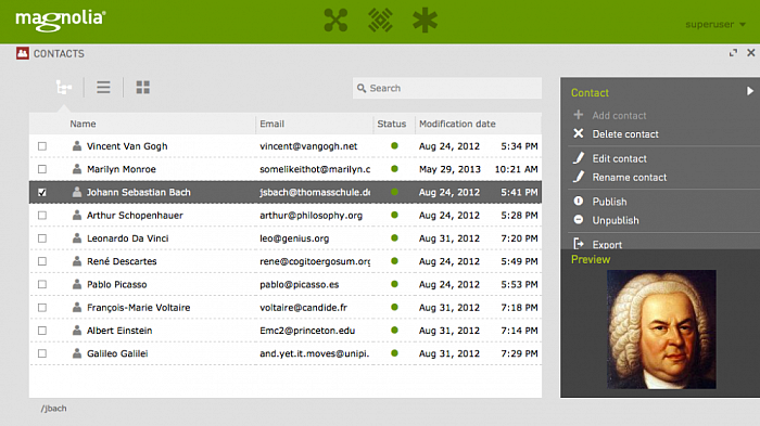
Content Apps make it easy to organize items such as contacts or products. Many native Magnolia 5 Apps such as “Pages” and “Contacts” are good examples of content Apps. Because this App style is used often, the framework provides convenience classes to make building a content App faster.
Magnolia Custom Apps
If you need to implement things like graphs or charts into your App, you will find the content App framework is too rigid. Instead, you can use a custom App.
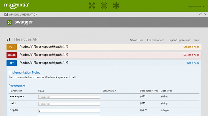
A custom App is also the right choice building certain types of simple Apps, such as displaying some system information or providing a simple configuration tool. However, while you can still configure a lot right out of the box, you will need to write custom App program code yourself. So, if you need flexibility to build your App, selecting a custom App type would be the right choice.
Find out more about choosing Magnolia App types.
Highlight Important Actions & Features
An App’s user friendliness is hugely important, so your App’s most commonly used features should be easy for the user to see and select.
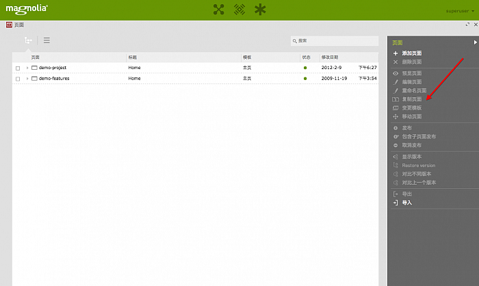
With Magnolia 5, the action bar – the grey menu found on the right-hand side of App interfaces – holds all the key features and functions. It’s wise to organise these features in a way which is helpful to the user.
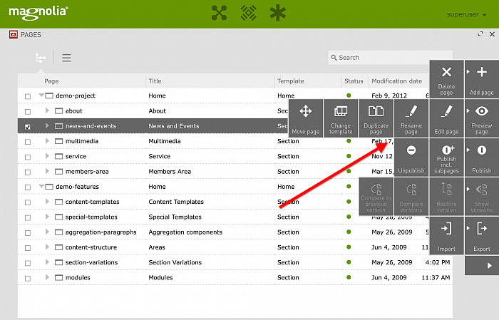
One simple yet effective way to achieve user friendliness in this sense, is to put commonly used actions at the top of the action bar. If they are to be used often, they must be available quickly.
Also, constructive options such as “Add Page” should be placed above destructive actions such as “Delete Page”.
Find out more about how to highlight important actions.
Give Users a Full Screen Option
Sometimes, users want to minimize distractions and focus in on certain tasks. Giving your App full screen functionality allows that to happen.
For example, writing site copy is creative work that requires concentration. Magnolia’s rich text editor helps the publisher in this case, by expanding to cover the entire dialogue width and height. This leaves only the white canvas in focus, allowing the text to take centre stage.
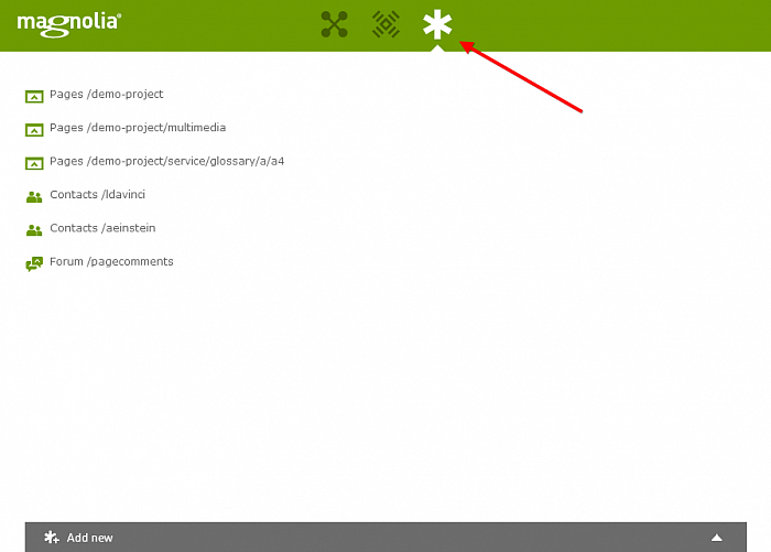
Users will also benefit from a full screen mode when working on tasks which require long periods of time to complete. After all, nobody enjoys spending hours working within a small windowed interface.
Find out more about full screen Magnolia Apps.
Take Care With Colors
Within the Magnolia App Launcher page, Apps which have something in common are grouped together as boxes, with colours helping to differentiate them.
Each App group box can be assigned a specific color, and those colors have a big impact on the way users first experience Apps. Poor color contrast in the App group can make an otherwise great App appear unprofessional.
For example, white text on a yellow background is a colour pairing which you should avoid, as such colors make text difficult to read.
Instead, opt for safer colours like red or dark purple which won’t clash with text or other page elements.
Find out more about selecting safe Magnolia App colors.
Don’t Forget About Mobile Devices
Magnolia 5 is a mobile-optimized content management system, which is something you should consider when you design your App.
Providing the same functionality for both tablet and desktop users is therefore important, although there will always be slight differences in the user’s experience.
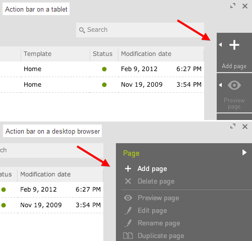
For example, only the first action in an action group is displayed right away on tablets via the action bar. The remaining actions are displayed only after a long press. Make sure that the first action in every group is an action that users need often.
Other useful differences, however, such as drag and drop functionality, can actually improve tablet user experiences, so use such features well.
Find out more about designing Magnolia Apps for mobile devices.
Using these simple practices as a guideline, you can create some truly excellent Magnolia Apps that are not just useful, but also user-friendly.
For even more guidelines on how to create a brilliant Magnolia App, check out Magnolia's “Designing an App” guide.
Also, be sure to check out Magnolia CMS via our CMS Directory.