ucraft Review: Simple, Efficient Website Building with a Beautiful Interface
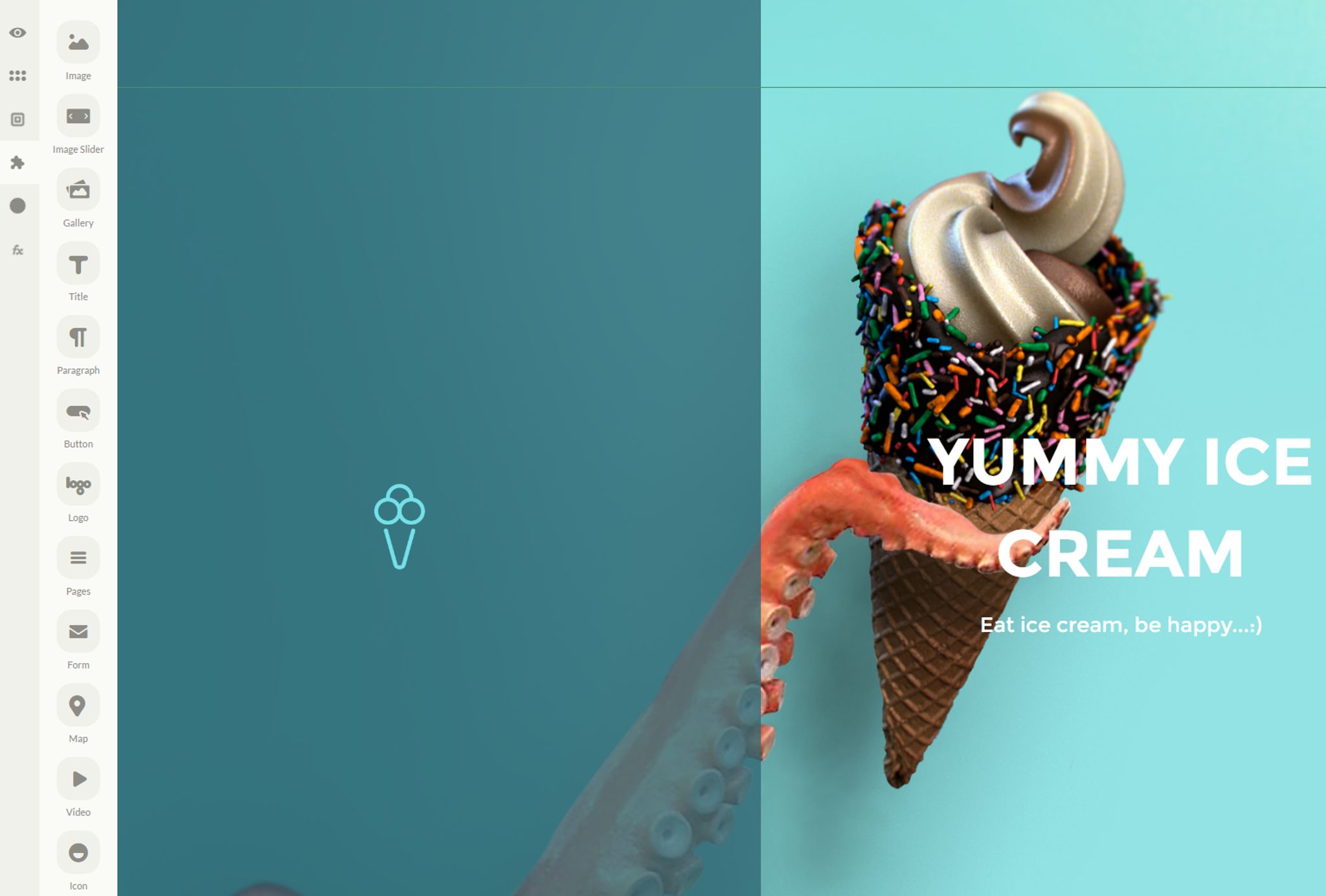
ucraft is a new entry in the website builder market. It's touted as being simple and easy to use with a user interface that is unique. Today, I'm going to take a look at it in this Ucraft Review.
Before we begin, I'd highly recommend watching this quick video which gives an excellent overview of the interface and how easy it is to use. It's not a long video but well worth the time to watch and I'm going to assume you've watched this before you start reading below:
You can get started for free as ucraft also offers a free plan for those in need of a simple 1 page website.
ucraft Pricing

ucraft offers a host of features including:
- 1 Website
- Unlimited Pages
- Edit Content
- Add Content
- Custom Domain
- Articles App
- SEO App
- Call your team
- Free Hosting
- 24/7 Support
- Your Brand
When you first log into ucraft, you'll be greeted with your homepage. Along the left side of the browser is the menu which consists of a number of icons that expand to display menus as you click on them.
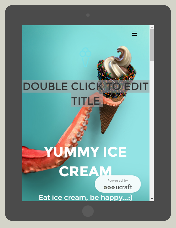
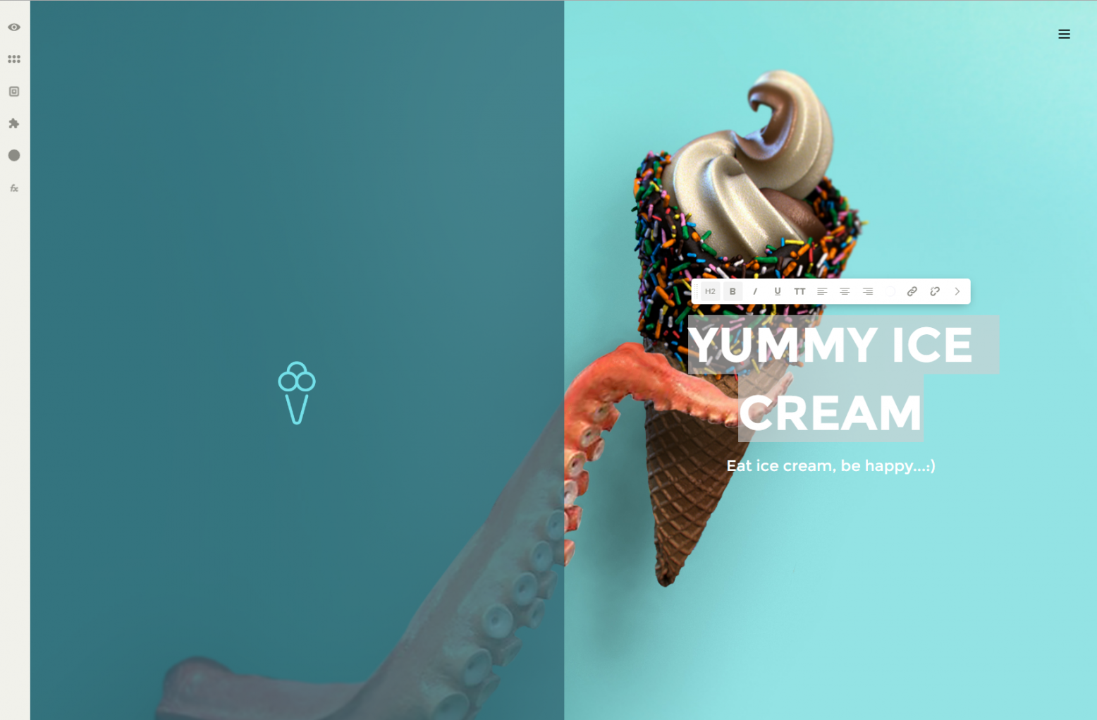 Let's take a look through some of them now. The first menu item lets you preview your website as it would appear on desktop, tablet and phone.
Moving down, the next icon allows you to launch new apps:
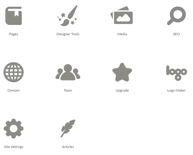 Pages allows you to manage and add pages to your website, designer tools lets you design and create buttons, typography and layout options, media lets you manage your media library and so on.
Next in line is the blocks icon which allows you to drag and drop predefined blocks of content (sliders, hero content, etc) into your website to make building something out incredibly quick and efficient.
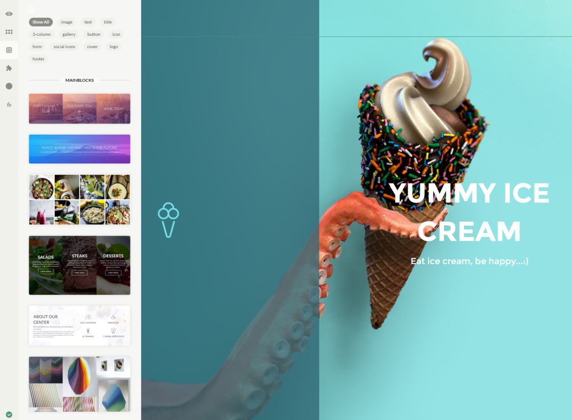
The blocks of content that are available are pretty extensive and should serve the majority of users. I found the experience of adding them to a page pretty seamless and they were all quite easy to edit.
Next comes elements. Elements are things such as images, titles and other chunks of content which can be quickly dragged and dropped wherever you want on your new site. There's a very solid selection of options here that you can work with.
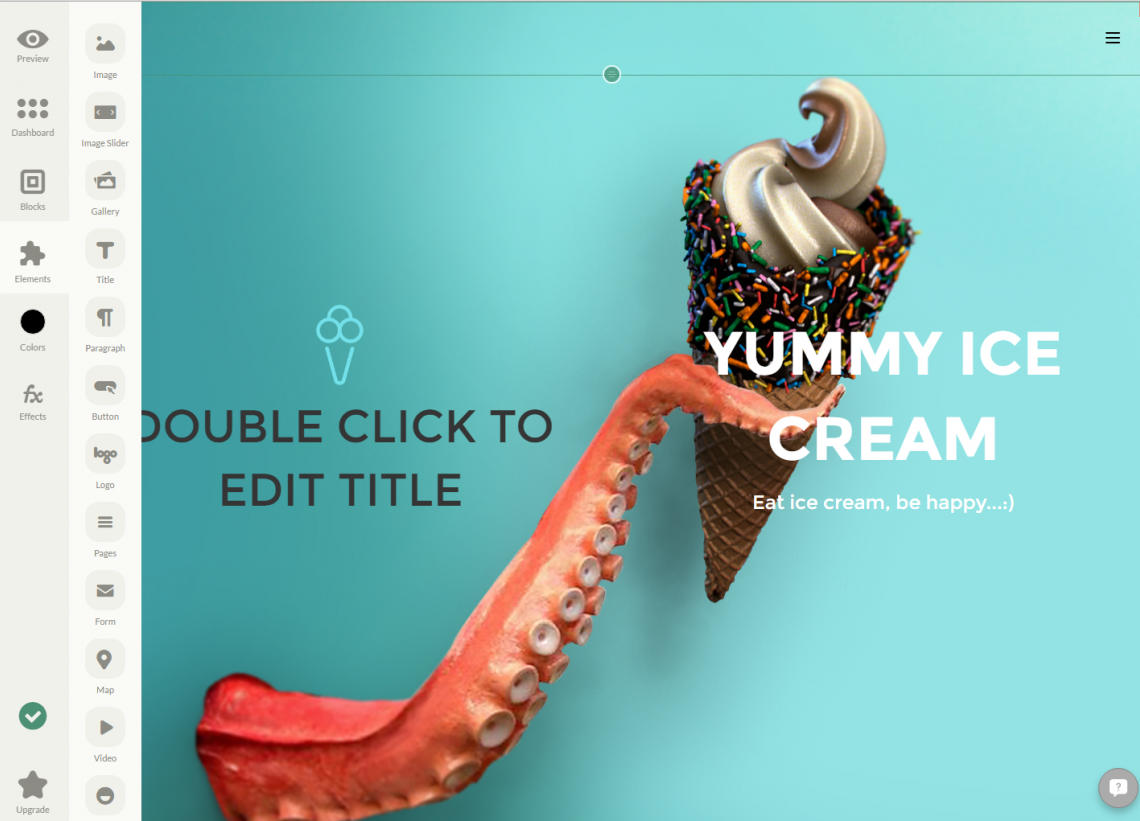
It's funny how if you make something simple, it makes it more fun to use. For some reason, I'm in love with the simple drag and drop color icon which is next in line on the sidebar. The fact that you can pre-select a bunch of colours to match your scheme and then simple drag and drop them onto any element to change it instantly is simply brilliant and one of my favourite features of ucraft.
Last but not least is the FX button which lets you drag and drop special effects onto your content blocks such as fade in and other animations.
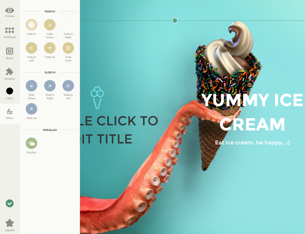
UI wise, the developers have done a great job of giving the system powerful capabilities without overwhelming the user. The entire experience of using ucraft screams ease of use and somehow, makes building your website fun to do. Sure, this isn't something you'd use for an insanely huge website but that's also not the target audience of most website builders. They are there to give you all of the tools you need to get online efficiently and at a low price point and ucraft does just that and more.
Conclusion
My experience with ucraft just in writing this review and going through the various elements of the builder was nothing but positive. This is truly an excellent tool and I'm very excited by how simple and easy to use it is. Things feel like they were put together given a lot of thought and the user interface is one of the best I've seen to date. It's quick, easy and fluid while at the same time staying out of your way so you can get what you need done.
In fact, given how simple it is, I was surprised by how extensive the features are. The logo design tools that are integrated do the job nicely and the ability to use UiKit to build out buttons very easily is brilliant.
I highly recommend checking out ucraft and giving it a try for your next website, I'd be surprised if you didn't fall in love with it like I have. If I was going to give this a rating out of 10, I'd probably give it a 9 which is not something I do very often and the only reason I'd give it a 9 is because there isn't an easy way to get to their knowledge base from within the interface. To access it, you have to go to their home page and then to their menu to find it. While there is a live help feature, it makes more sense to have the knowledge base easy to get to from the interface. In my opinion, it should be linked as one of the icons within the left menu.
Aside from this small gripe, I think this literally is one of the best tools and interfaces I've seen in a long time and I've been reviewing these things since 2008. It's just that good. Give it a try for yourself, I'll be surprised if you don't end up falling in love as well.
Check it out for yourself here: ucraft.com.