Best Scanning Tools for Digital Accessibility

Over the last decade, digital accessibility has become one of the most important and talked-about issues in the web and digital industries. As part of the tenth annual Global Accessibility Awareness Day (GAAD), we wanted to do our part to help elevate awareness across our community.
Let's start with the most basic tenant: everyone deserves an equitable digital experience. Delivering on that promise has, unfortunately, been a struggle.
While the physical world has made significant progress thanks to sweeping laws like the Americans with Disabilities Act (ADA) of 1990, the digital world has failed to keep pace. Thankfully, organizations like the W3C have drafted guidelines that help guide website and app designers to understand and achieve digital equality.
To better serve people with disabilities and provide a more inclusive experience, many technology solutions – including CMS and DXP platforms – have been developing innovative tools and practices. While they've made great strides, most platforms still require third-party scanning software to provide an accurate snapshot of accessibility issues and to track their overall progress towards remediation.
In honor of GAAD, we thought we would share a few insights about digital accessibility through the lens of CMS. We've also featured a few of our favorite scanning tools for achieving and maintaining accessibility. Any one of these would be a great addition to your accessibility strategy.
GAAD and the current state of accessibility
Global Accessibility Awareness Day is dedicated to promoting digital accessibility and inclusion for more than one billion people with disabilities and impairments. It's designed to get people thinking and talking more about accessibility – and what can be done to make the digital world more inclusive.
Even though there's an increased sensitivity around digital accessibility, we still have a long way to go. For many organizations, accessibility is still an afterthought and continues to be overlooked. This is not only tragic in our capacity to be inclusive, but it's also a missed opportunity for brands and businesses: customers that aren't being served by an accessible website will choose to spend their dollars elsewhere.
In a rush to meet deadlines, web designers and developers can often skip the process of checking for accessibility issues. And why not? Historically, there have been few consequences for missing an ALT tag or providing an unchecked PDF on a page.
All that changed in 2017, when the first ADA web accessibility lawsuit went to a federal court. Since then, numerous suits have been filed, and the impact of these decisions will be felt for years to come.
Of course, on the public sector side, accessibility has been a hot-button issue for much longer. In the US, only federal agencies and companies that do business with the federal government are required to comply with accessibility laws. These are governed by a policy known as Section 508, which covers a number of compliance issues. State and local governments are also subject to accessibility requirements and have frequently been the target of legal action for accessibility failures.
WebAIM, a non-profit consultancy focused on accessibility and education, conducted an accessibility evaluation of the home pages for the top 1 million websites. According to their research, the most common accessibility failures are:
Low contrast text 86.4%
Missing alternative text for images 60.6%
Missing form input labels 54.4%
Empty links 28.9%
Empty buttons 26.9%
According to WebAIM, "over the course of three years, home pages with low contrast text, missing input labels, and empty buttons have generally increased, whereas home pages with missing alternative text, empty links, and missing document language have generally decreased."
Obviously, we're making progress in areas that have provided greater automation (such as ALT tags). This may be due in large part to the structure of some CMS platforms and the ability for modules and components to provide an accessibility "checklist" before publishing. Tools that automatically check links and other resources are helping to fortify a content ops team with more confidence around their accessibility.
But on the other side, it's clear that modern designers still struggle to understand the fundamentals of accessibility, particularly when it comes to basic concepts like contrast. An all-too-common example of this failure is the use of gray text on light backgrounds. While it may look good to most people, it doesn't create enough distinction to render the text legible for people with impaired vision. Also, input labels are increasingly minimized or removed for aesthetic reasons, making it more difficult to see or for a screen reader to interpolate.
The good thing is that addressing just a few of these types of issues could significantly improve accessibility on a single website – and across the web.
What is WCAG?
As noted, the physical world has much more guidance when it comes to accessibility. Each country also has its own flavor of governance, from ADA in the States to AODA in Canada to the European Accessibility Act. The bottom line is that digital accessibility continues to operate without any uniform laws or the teeth to back them up. That's changing, albeit slowly.
Until we see parity between the physical and digital realm, we have industry organizations like the World Wide Web Consortium (W3C) – the main international standards board for the Internet. In 1999, they published the first Web Content Accessibility Guidelines (WCAG), a tableau of directives that provide the most structured governance for digital accessibility.
The WCAG provides four key principles or "guidelines," helping websites and digital experience to be:
- Perceivable: ensuring that alternatives for text or images can be rendered in different formats and sizes, including speech and sound.
- Operable: enabling all functionality is available from a keyboard, navigation is clear, and cognitive issues are not exacerbated (like seizures).
- Understandable: making text readable, minimizing errors, and delivering a predictable page structure.
- Robust: maximizing compatibility with assistive technologies such as screen readers.
As technology has evolved, so too have the definitions and charters of these principles. That's part of the reason why there have only been periodic updates to the WCAG guidelines, particularly in 2008 (2.0), 2018 (2.1), and most recently in 2021 (2.2).
Don't let all the version numbers intimidate you; these are not three separate sets of guidelines you need to follow. As the web changes, new details are added. All requirements ("success criteria") from 2.0 are included in 2.1. The 2.0 success criteria are exactly the same (verbatim, word-for-word) in 2.1.
What was included in WCAG 2.0?
WCAG 2.0 was groundbreaking – and aimed at making content even more accessible to a broader range of people with disabilities, including blindness and low vision, deafness and hearing loss, learning disabilities, cognitive limitations, limited movement, speech disabilities, photosensitivity, and combinations of these. To learn more about these fundamentals, read a quick reference on how to meet WCAG on W3C's website.
What was added in WCAG 2.1?
There were 17 additional success criteria in WCAG 2.1, including updates for:
-
- mobile accessibility
- people with low vision
- people with cognitive and learning disabilities
You can learn more about these additions in What's New in WCAG 2.1.
What's coming in WCAG 2.2?
The Accessibility Guidelines Working Group (AGWG) is planning to publish the final standard of WCAG 2.2 in the summer of 2021. While the structure and content is essentially the same as 2.1 and 2.0, the update will include new accessibility requirements called "success criteria." You can review the proposed additions via the in-progress "Editors' Draft" of WCAG 2.2.
What Are the Best Scanning Tools for Accessibility?
For most websites, it would be impossible to open the WCAG guidelines list and manually check for accessibility failures. That's why some very innovative technologies have been created to automate the heavy lifting. These tools are referred to as "accessibility scanners," but they are often part of more robust platforms that feature a wide range of capabilities. What's great about most of these is that they're free, easy to install, and do an awesome job of accurately scanning your website.
There are many tools that are great at identifying errors and pointing out exactly what and where the fixes need to be made. But even the best platforms still require people to identify false positives and address deeper code issues.
Here are some of the best scanning tools for accessibility:
1. WAVE – Web Accessibility Versatile Evaluator
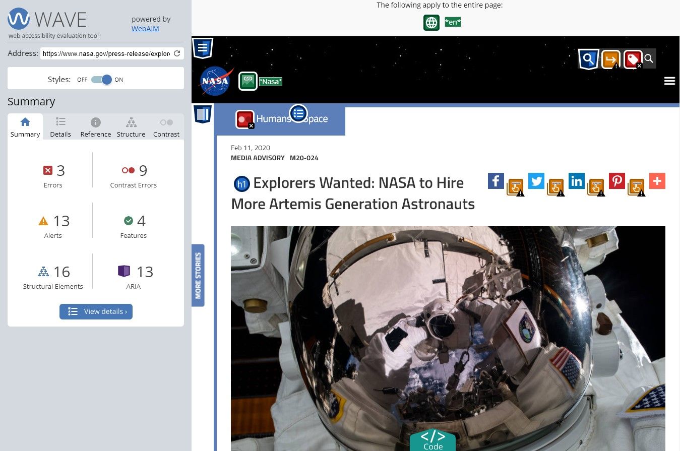
WAVE can identify many accessibilities and WCAG errors, but it also facilitates human evaluation of web content. You can use the online WAVE tool by entering a web page address (URL), and it will not only list all the errors but show you where they are on a page as well. The icons will be displayed in different colors, such as orange for alerts and red for errors, and you can click on the icons to see exactly what the issue is, i.e., low contrast, unordered list, etc., as well as what WCAG guidelines it violates. This is what makes it one of our favorites.
WAVE Firefox and Chrome extensions are available for testing accessibility directly within your web browser – handy for checking password-protected, locally stored, or highly dynamic pages. They also have a WAVE Runner service, subscription WAVE API, and a stand-alone WAVE API for easily collecting data on multiple pages. If you need enterprise-level reporting and tracking of accessibility, WAVE powers the Pope Tech accessibility tool.
2. Siteimprove Accessibility Checker
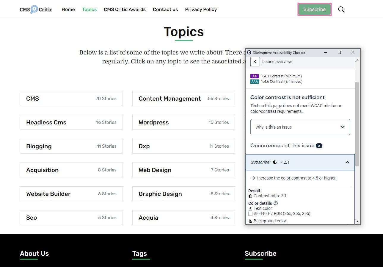
Siteimprove has built a strong reputation around its industry-leading accessibility scanning and monitoring solution, and it also boasts some powerful SEO scanning tools to enhance search performance. Their Siteimprove Accessibility Checker is a free tool and is available as a browser extension to check any webpage for accessibility issues at any given time. It's also available for Chrome, Firefox, and Opera.
The Siteimprove Accessibility Checker uses the same checking engine as the Siteimprove Accessibility platform product, giving you the power of their enterprise-grade solution. It provides you with:
-
- An immediate overview of your page's accessibility issues.
- The location of where the issue appears on the page.
- Code examples of how to fix the issue so you can copy the code and quickly test it using your browser's dev tools.
- Specific recommendations on how to fix issues, including links to the relevant WCAG techniques.
3. Tenon
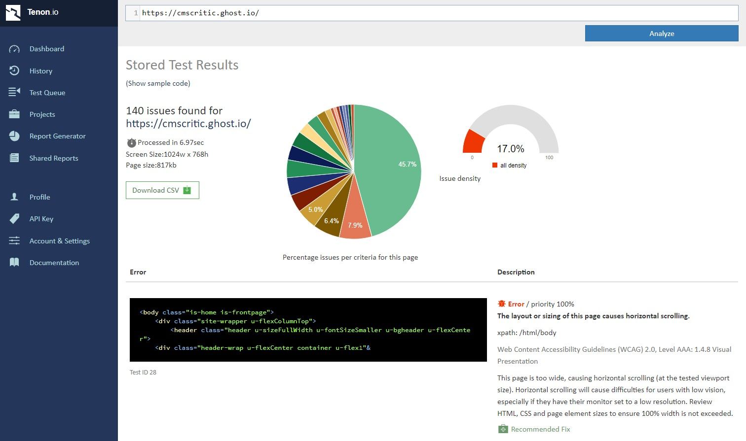
Tenon is an "accessibility as a service" platform that is truly comprehensive. Its dashboard provides you with a quick overview of the performance of the pages you've tested. You can switch between different projects and even just test code to see if it has any accessibility issues.
In addition to displaying errors, Tenon gives you:
-
- Graphs: You get two – a line chart that shows the number of issues per KB of source code and a bar chart that shows the distribution of density across all pages.
- Worst performing pages: Get details on pages with the most errors, listing the number of issues, error density, warning density, and the date the test was conducted.
- Issues by content category: Tenon has several categories such as images and other non-text content, cascading stylesheets (CSS), forms, navigation, document structure, language, typography, content, keyboard accessibility and focus control, and custom controls. The total number of issues is displayed for each category, along with the issue percentages.
- Issues by WCAG Success Criteria: This lists all of WCAG's 61 success criteria. It tells you each one of those success criteria, how many issues were found, and what the percentages of those issues were. This is important for those who may be working in an environment where they are required to comply with WCAG.
Furthermore, Tenon integrates with IDEs, Jira, Git, Grunt, and other tools via API.
Tenon offers free and paid plans. The price depends on the number of API calls. If you test an entire web page at a time, that is one API call. There is a "pay along" option, where you pay $0.02 per API call with a $5 monthly fee. The "Small" plan is $82 per month with 3,000 API calls. If you need to go higher than that, you can choose Tenon's other pricing plans.
4. Google Lighthouse (Chrome Extension)
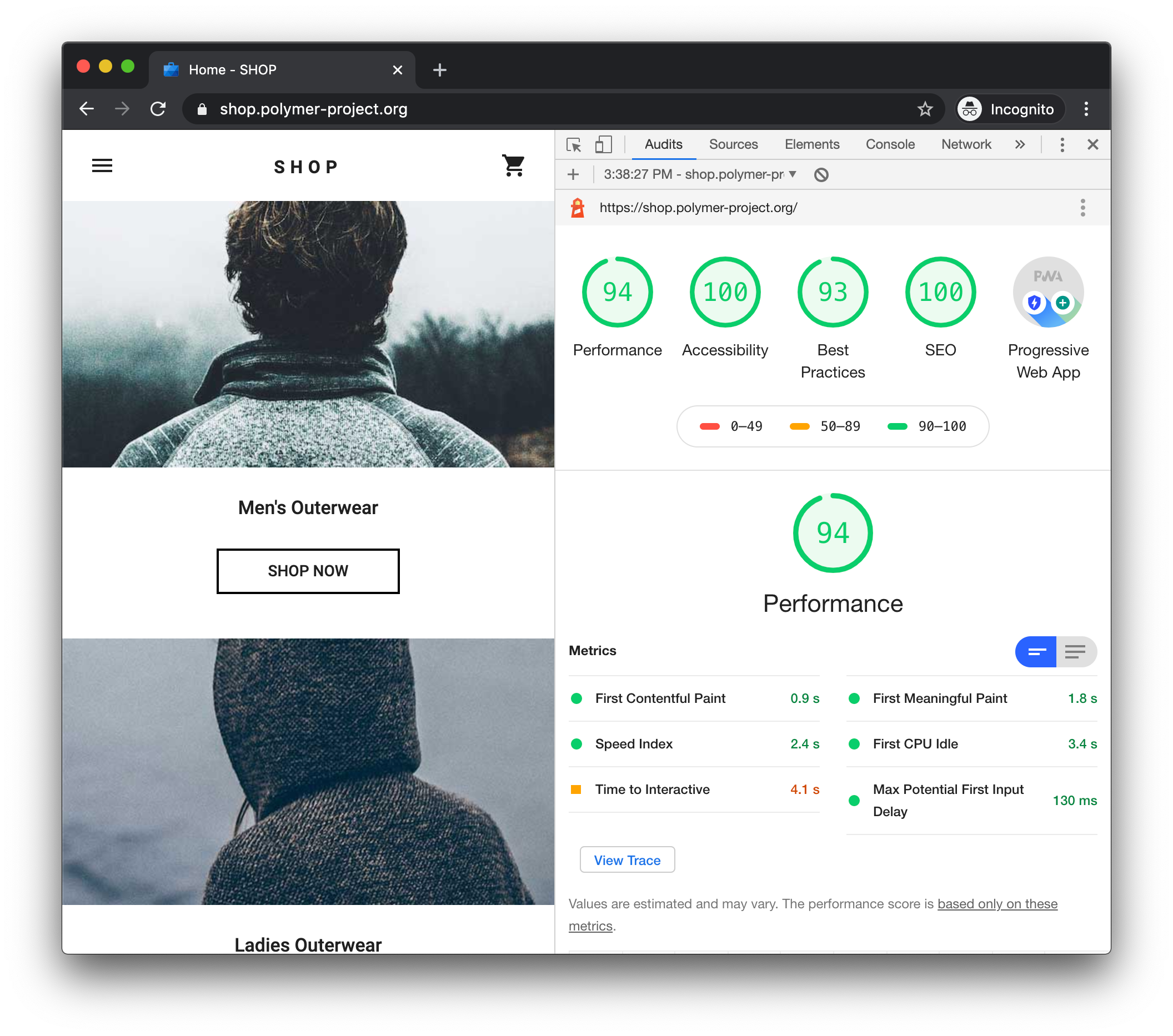
Of all the tools listed, Lighthouse is the easiest to use since it's already inside the Chrome Dev Tools. There's also no sign-up required. To run a report, you simply open the Chrome DevTools and click the "Audits" tab.
Lighthouse has a very simple and intuitive interface. In addition to analyzing accessibility, you can measure performance and SEO as well, all in one place. Once you scan a page, four categories will show up: Performance, Accessibility, Best Practices, and SEO. Each category has a score out of 100 and is color-coded. A red color indicates poor (0-49), orange indicates needing improvement (51-89), green indicates good (90-100).
The report will list all the accessibility errors and warnings, along with a highlighted image of the element that is causing the error. The best part is since you're working inside the DevTools, clicking on the element that is causing the error will take you to the location of the code in the Elements tab.
You can also print the scan results or save them as HTML or JSON.
5. aXe Browser Extension
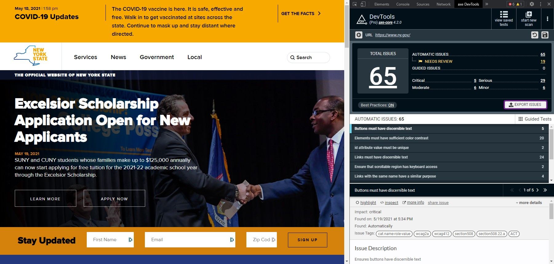
aXe is a free, open-source accessibility tool by Deque Systems for Chrome, Firefox, and Edge. The extension runs inside your browser's developer tools, just like Google Lighthouse. Once you download the aXe browser extension, it will show up in the aXe DevTools tab – and from there, you will have two options: scan your entire page or scan just part of your page.
aXe is very fast to analyze and pretty straightforward. It shows you the total number of issues and they are categorized as critical, serious, moderate, or minor. You can click on each category to see the list of issues. With the highlight feature, clicking on an issue will automatically scroll to the element on the page so you can easily see it.
aXe is free, but in order to use some features, you need to pick one of two paid plans:
- Pro: Includes automated testing, intelligent guided testing, testing individual components, saving and exporting results, and machine learning capabilities. The Pro plan is $34.08 after the trial.
- Enterprise: Includes everything from Pro, plus native Android and iOS tools, CI/CD integration, CLI, custom rules, and enterprise security and support. Contact the Deque sales team to get a customized pricing plan.
Other niche tools
These are not full scanning tools, but they specialize in specific accessibility functions such as screen readers and color contrast checkers.
JAWS
JAWS (Job Access With Speech) is a screen reader developed by Freedom Scientific. It's specifically designed for computer users with vision loss that prevents them from seeing screen content or navigating with a mouse. It's one of the most popular tools for visually impaired users, providing speech and Braille output for a multitude of computer applications on a PC.
Some features include:
- Two multi-lingual synthesizers: Eloquence and Vocalizer Expressive
- Talking installation
- Convenient OCR feature for image files or inaccessible PDF documents
- Supports PEARL camera for direct access to print documents or books
- Built-in free DAISY player and a full set of DAISY-formatted basic training books
- Works with Microsoft Office, Google Docs, Chrome, Internet Explorer, Firefox, Edge, and much more
- Supports Windows 10, Windows 8.1, and Windows 7, including touch screens and gestures
Colour Contrast Analyser
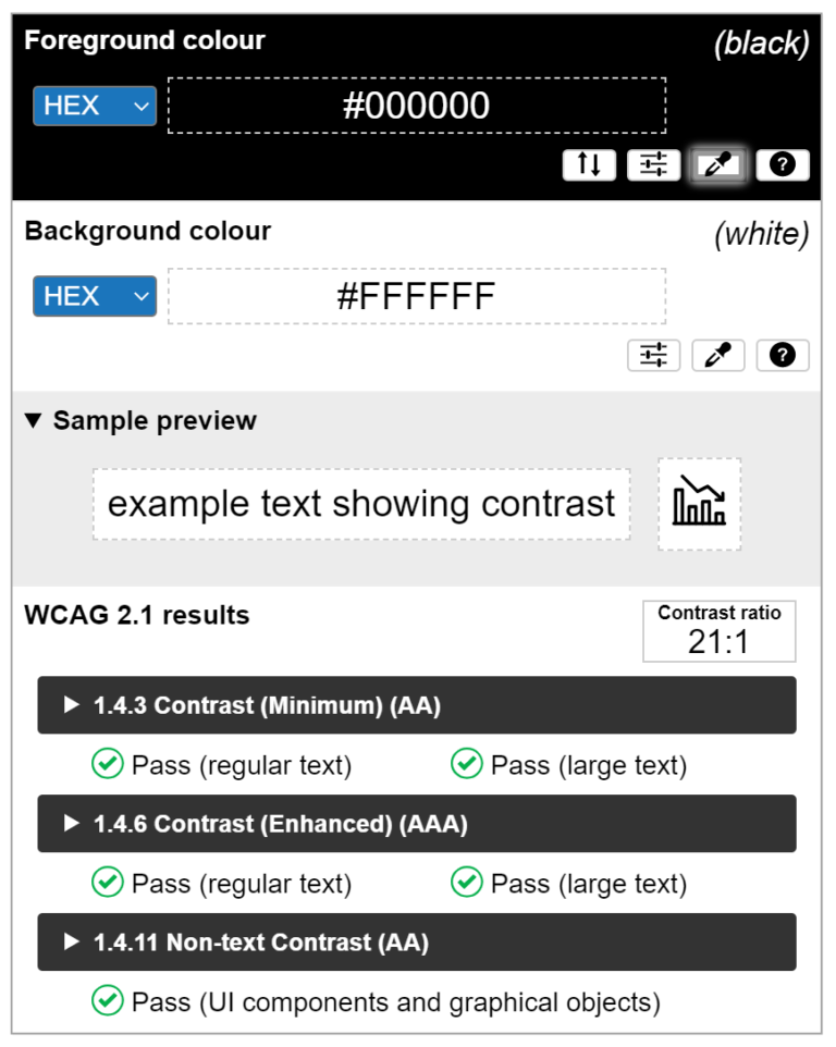
TPGi's free color contrast checker tool allows you to easily determine the contrast ratio of two colors simply using an eyedrop tool. It enables you to optimize your content – including text and visual elements – for individuals with vision disabilities like color blindness and low-vision impairments. It's available as a desktop application for both Windows and Mac.