Flodesk Review - Email Marketing at an Unbeatable Price
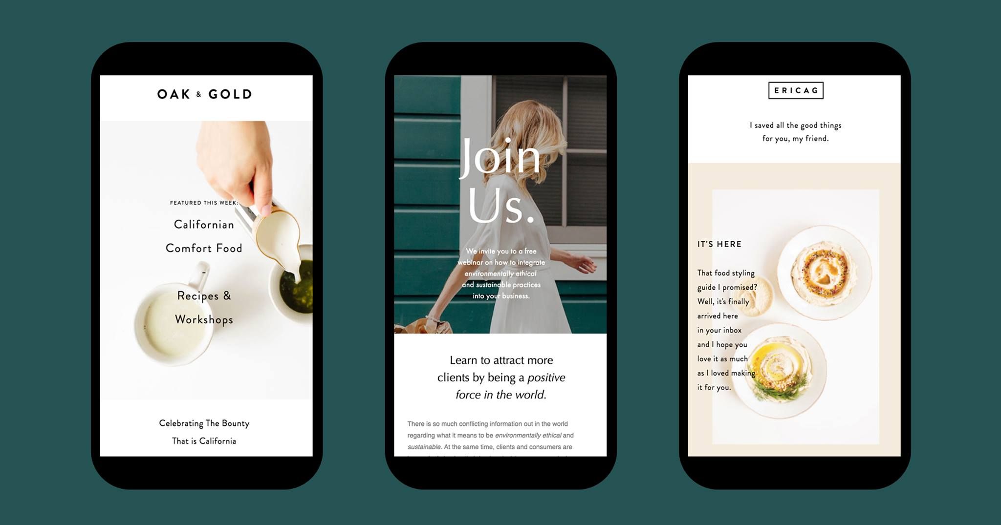
Flodesk says they’re “the world’s most intuitive email builder,” and they’re not exaggerating. With Flodesk, you can create beautiful emails that match the overall style of your brand in minutes, even if you have no technical, design, or marketing skills. But because Flodesk is still so new, it can’t quite match its competitors in terms of power. Read our full Flodesk Review below.
Getting Started
Setting up an account with Flodesk is easy. Every new user gets a 30-day free trial, which is available via the homepage. Once you fill out the sign-up form, Flodesk sends you an email verification link. Click on the link — and you’re in!
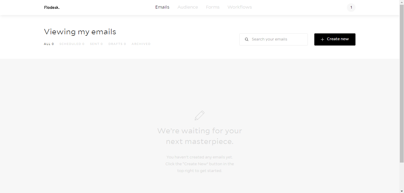
The dashboard is clean and extremely easy to navigate. However, you still might not necessarily know where to start, especially if you’re new to email marketing.
Luckily, Flodesk understands that mastering a new site takes time, which is why it sends you a helpful email telling you how to make the most of your account. The email comes with instructions on how to:
- Set up your logo and brand.
- Design a welcome email.
- Embed a form.
- Put it all together with a workflow (a series of automated emails).
Design
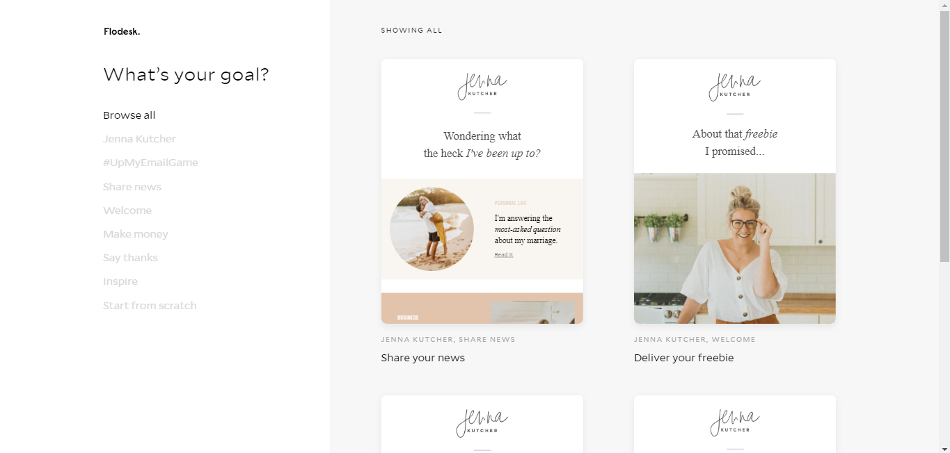
Flodesk uses a visual builder, so you don’t need to know HTML code to craft an eye-catching email. In fact, the best thing about Flodesk is the variety of stunning email templates available. You can choose a pre-formatted template based on your “goal,” such as “Share News” or “Make Money.”
Customizing your chosen template is a breeze. Simply click on any part of the email to duplicate and delete blocks and tweak things such as:
- Email layout
- Backdrop and canvas color
- Font type, size, and color
- Line height and letter spacing
- Link color
- Border color and thickness
- Padding thickness.
You can save your brand’s logo and colors, further simplifying the process of adjusting templates to suit your needs. You can also upload PDFs, as long as they’re under 10 MB, and include your real-time Instagram feed at the bottom of your emails.
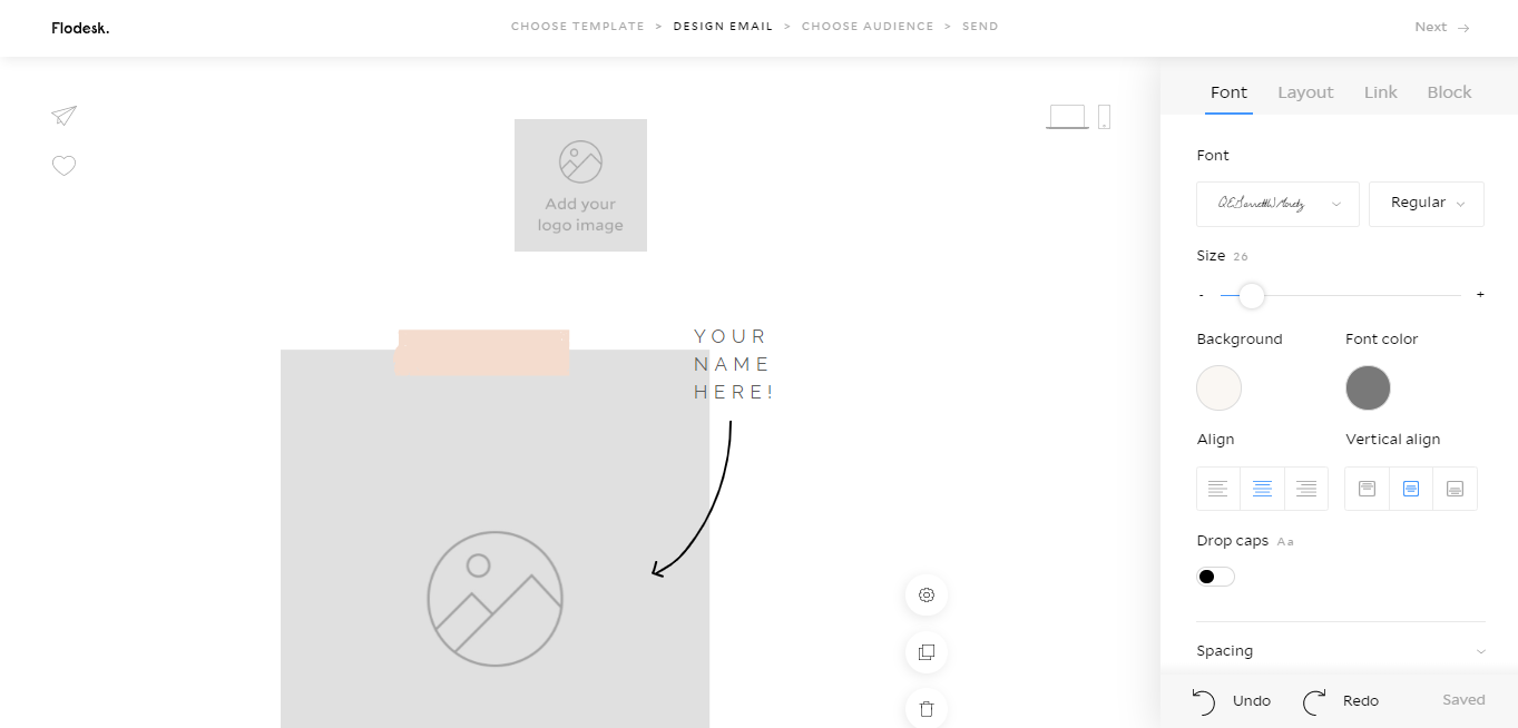
If none of the templates do it for you, you can start your email from scratch, adding text (Flodesk has more than 100 fonts available, but doesn’t let you upload your own) and images as you see fit. Flodesk integrates photos seamlessly, without asking you to compress or resize them.
Before you send an email, you can preview it on desktop and mobile, ensuring that it displays smoothly across all devices.
Usability and Support
Flodesk has a minimalist user interface. At the top of the page, you have four categories: “Emails,” “Audience,” “Forms,” and “Workflows.” These are the four features that you’re most likely to use daily.
More functions, including domain authentication and brand preferences, can be found under your username icon on the top right-hand corner of the page.
Flodesk has an extensive Help Center with detailed answers to commonly asked questions as well as technical how-to’s. A search button ensures that you don’t have to sift through countless articles to find a solution to your problem.
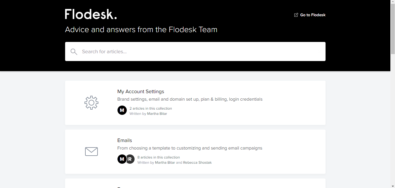
If you can’t find an answer to your question using the Help Center, you can message Flodesk on Facebook. I got a response to my query in less than three hours on a Sunday. Alternatively, you can join the Flodesk Insiders Facebook page to start a discussion with other users or email the customer support team, which promises to respond within 48 hours.
Key Features
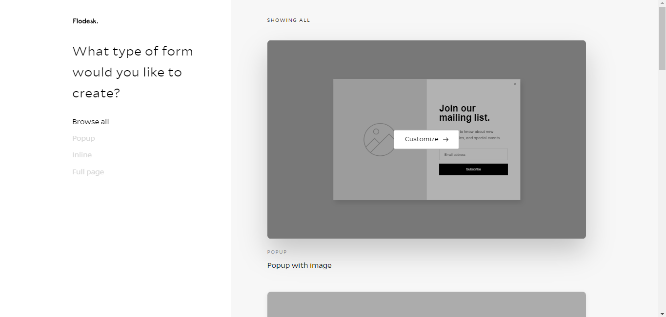
In addition to pre-made emails, Flodesk is also great for making forms. Flodesk offers its users a range of form templates, from pop-ups to inline forms to full-page landing pages. Embedding the code into your website is straightforward, but you can also publish the form URL directly to the web.
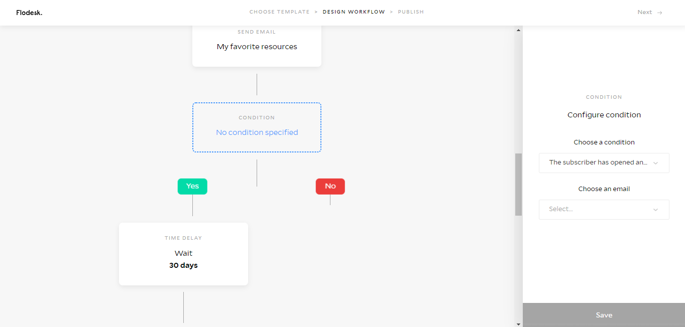
Flodesk’s “Workflows” feature lets you send a series of emails to your subscribers automatically. You can set a “Time Delay” specifying the amount of time (whether minutes or hours) that should pass before Flodesk sends the next email, but there’s no option to choose a specific date or time.
You can also set a “Condition.” In this case, Flodesk will only send an email if a subscriber opens a previously sent email.
Segmenting your email list is simple, perfect for those who have several sign-up lists.
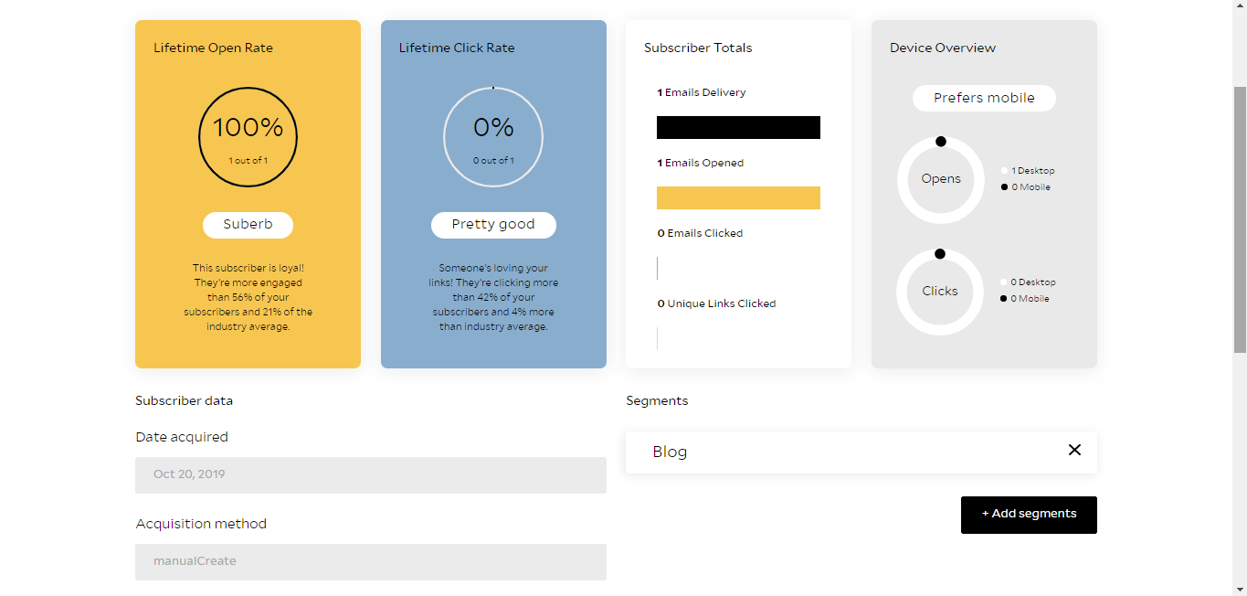
Flodesk has a comprehensive statistics area, with details on each subscriber, including when and how you acquired them and their device preference. You can also see how many emails they opened, but not which ones. Also, you can’t resend an email to a subscriber that didn’t open it the first time. (Editors note: I reached out to Flodesk via Facebook to comment on this as it seemed like an odd thing to restrict. Here's their response:
We do offer workflows that allow you to send to unopens after a period of time you specify—so we do offer it, just not in the one-off campaign area.)
Email statistics are available via the “Email” section. Here, you can see the open rate, click-through rate, and the number of email addresses that bounced among other things.
One big feature that Flodesk is currently missing is A/B testing. There’s no way that I could find to test several subject lines or email types. Other email marketing services, such as ConvertKit, Mailchimp, and Mailerlite, include this function.
Another negative is Flodesk’s lack of integrations. At the moment, it only supports Shopify integration, although Zapier should be added within a month as well.
Pricing – This is where Flodesk Shines
Flodesk’s pricing is simple. There’s just one plan which costs $38 per month. It gets you unlimited emails and subscribers, as well as access to every feature. This is unusual as most email marketing platforms increase your bill as soon as you grow your subscriber list. The ability to scale up without extra cost makes Flodesk great value for fast-growing businesses.
Editor's Note:
“As you no doubt know, email marketing can get incredibly expensive as you grow in subscribers. Flodesk's model of one flat (and reasonable) price regardless of how many subscribers you have is not only excellent, it's the best value out there in my opinion.” ~ Mike Johnston
Pros
- Price doesn’t change even if your subscriber list grows
- 30-day free trial
- Gorgeous templates for emails, pop-ups, inline forms, and landing pages.
- User-friendly interface.
- Great customer support.
- Email automation.
- Email segmentation.
- In-depth statistics.
- Coding knowledge isn’t necessary.
- Easy Instagram integration.
Cons
- No way to perform A/B testing.
- You can’t resend an email to a subscriber that didn’t open.
- Lacking in integrations (although Zapier is due within a month) but this can be attributed to how new the platform is.
Final Verdict
Flodesk has a lot going for it. It has an intuitive user interface, a vast range of stunning templates, and friendly customer service. While it’s a little behind its competitors in terms of features — it doesn’t have A/B testing and integrates with Shopify only — it’s still in the early stages of development. If you’re a small business owner with growing ambitions but no coding knowledge, then using Flodesk is a no brainer.