Gutenberg, 2 Years Later: Is WordPress Better Off?
Reid Hoffman, the serial tech entrepreneur and founder of LinkedIn, once said: “If you are not embarrassed by the first version of your product, you've launched too late.”
Of course, in the world of open source software like WordPress, it’s hard to know exactly when anything will launch. And when it does, there’s certain to be a lot of bugs.
That was the case with Gutenberg, the long-awaited upgrade to the WordPress visual editor that was first introduced in late 2017. At the time, the WordPress editing experience had grown stagnant, and content managers were hungry for new page building capabilities. There’s no question that the impetus to develop a more robust editor was a reaction to the rise of authoring platforms like Medium and easy page-building competitors like Wix and Squarespace.
But as is often the case in software, things don’t always go according to plan. And when they don’t, end users are the first ones to let you know.
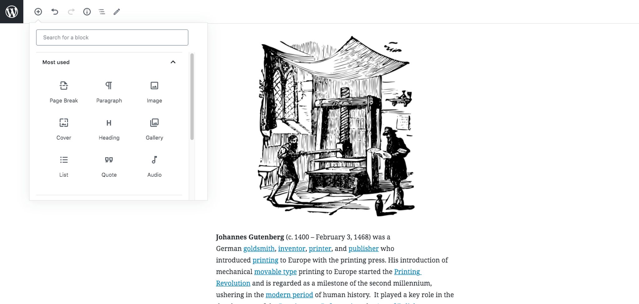
Time flies, and it’s hard to believe that it’s already been over two years since Gutenberg’s launch. Much like the printing press of its namesake, the first edition was fraught with issues and drew a lot of negative feedback. Nonetheless, it brought the promise of more modular page building capabilities within a modern, React-based UI. This helped circumvent some of the massive tech debt and backward compatibility challenges that exist with WordPress, favoring a more forward-leaning solution over fixes to the core software.
Over time, users have adapted to the good, the bad, and the unpredictable. Now, Gutenberg has graduated to a core role in the WordPress platform. In fact, the WordPress 5.0 release in 2018 featured Gutenberg as the default editor, cementing its place in version history. But fear not: the WordPress Classical Editor is still available and supported, although it should be officially sunset on December 31, 2021.
Change is always scary – especially for long-term users. While some of the early adopters have grown to prefer (or even love) Gutenberg, the general reaction continues to be tacitly negative. So far, Gutenberg has amassed more than 3,000 reviews with an average rating of 2/5.00. Considering two years have passed since Gutenberg was released, the reviews indicate the major issues with Gutenberg – specifically the UX – have yet to be resolved.

When it comes to WordPress reviews, users seldom hold back (just read a few of the posts and you’ll see more rants than raves). While Gutenberg hasn’t garnered a lot of stars, the picture isn’t all bad. The most common reactions are that it’s slow, not intuitive, and requires a lot of extra mouse clicks to get where you’re going. But many users agree that it’s heading in the right direction and addressing persistent issues like accessibility.
After two years of pressure-testing in the real world of web development and CMS, we’ll look at what Gutenberg gets right – and where it misses the mark.
A Brief Overview of Gutenberg
If you’re not at all familiar with Gutenberg for WordPress, it’s a visual editor with a dynamic drag-and-drop interface. It fully replaces the WordPress TinyMCE editor (aka the Classical Editor) as the default editor within the package. Most of this is being spearheaded by Automattic, the open source development company behind WordPress.com
Unlike the Classical Editor, Gutenberg uses “blocks” rather than text fields to manage content. In fact, everything in the experience is represented as a block: the paragraphs, buttons, images, quotes… everything. By using the inherent drag-and-drop functionality in the editor, you can arrange the order of your blocks around your specific content needs.
The block-based model is nothing new. Visual editors such as Wix and Squarespace are similarly designed, helping users create and manage content faster and easier. In addition to these platforms, there are also page builder plugins for WordPress such as Divi, Elementor and Beaver Builder, which use drag-and-drop functionality with a simplified UI. All of these feature embellishments have empowered content editors to be more productive with less coding.
With more than 74.6 million websites using WordPress, including major brands like Disney, TechCrunch, BBC America and more, the platform’s pervasiveness is undeniable. But this level of market penetration is understandable: content managers and editors want to focus on content, not code – and from the beginning, one of the main selling points of WordPress has been its low-code/no-code experience. It abstracted most of the complexity with building and managing websites by relying on libraries of pre-programmed themes and plugins. These widgets, both diverse and abundant, enabled any user to add functionality to their website – from schedulers to lead forms to shopping carts – with just a few clicks.
There was, however, one big exception: the TinyMCE editor. It still required editing HTML for deeper customizations.
Open source platforms struggle to provide a roadmap that is both complete and reliable, and WordPress is no exception. While the market waited for improvements to the visual editor, other plugins emerged to address the challenges. When assessing the pros and cons of Gutenberg, it’s easier to compare it to these alternatives to see where the opportunities and issues exist.
How does Gutenberg differ from the Classical Editor & How it Compares to Page Builders
So how does Gutenberg stack up against the Classical Editor and other page builder plugins? Well, the rise of these new block-based options has certainly stoked innovation. That said, it’s important to keep in mind that while Gutenberg is quite similar to these other WordPress page builders, it’s currently not a good replacement. In fact, WordPress doesn’t even classify Gutenberg as a “page builder” per se. While it might evolve to one in the future, WordPress more appropriately refers to it as a “block editor.”
Let’s compare just a few of the more notable features between Gutenberg and other page builders:
1. Drag & Drop Capabilities
Traditionally, to type text, insert content, or write code using the Classical Editor, you would have to manually shift your content around by cutting and pasting. With Gutenberg, you can assign each content component as its own block – such as a paragraph – and re-arrange the order of your blocks by simply dragging them up and down.
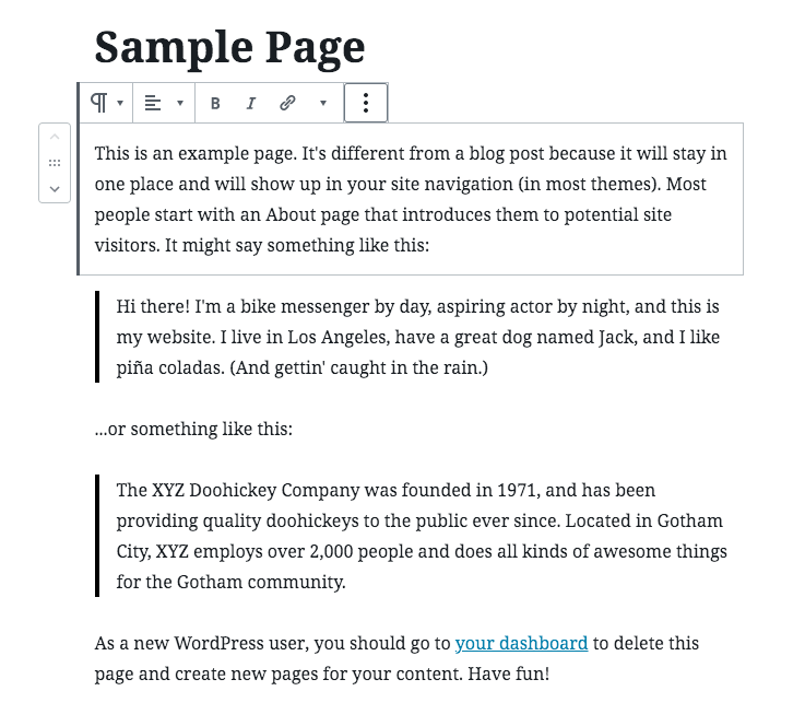
Paragraphs aren’t the only content blocks types. With Gutenberg, you can define headings, rows, columns, images, buttons, symbols, custom boxes, and even templates as blocks – and use the same drag-and-drop features to reorder your content.
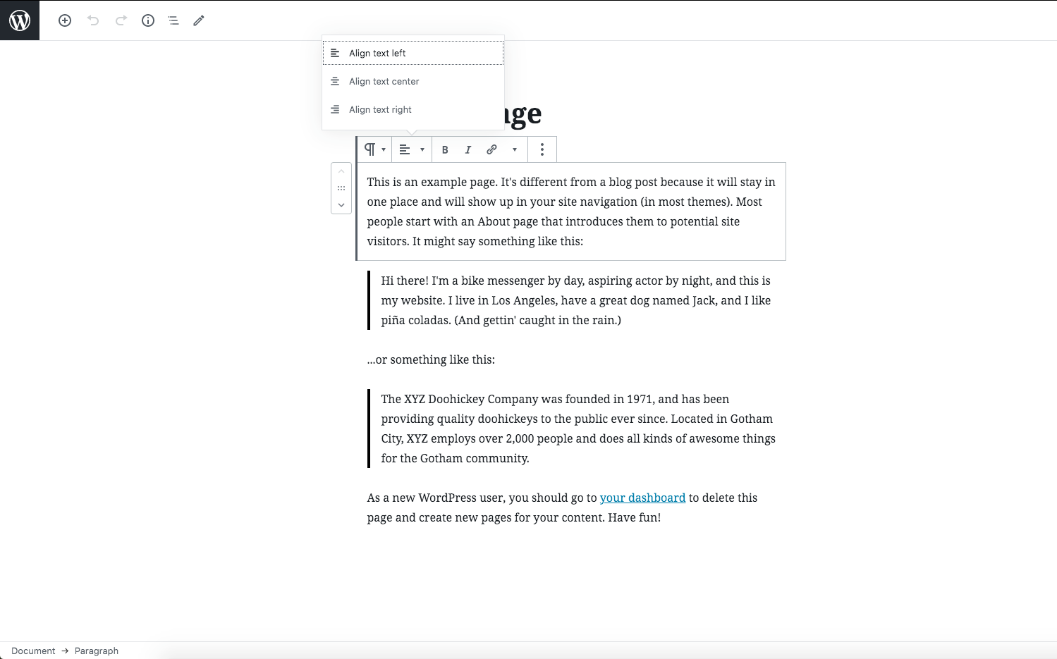
Although Gutenberg offers this slick drag-and-drop block feature, you’ll be compromising on customizations. For example, you can’t adjust the height and width of elements or add custom margins and padding, and elements can only be aligned to the left, right, and center. You can get around some of these limitations with additional CSS classes, but that means more coding and complexity. It all comes down to how much control you want over the details.
2. Front-end Visual Editing
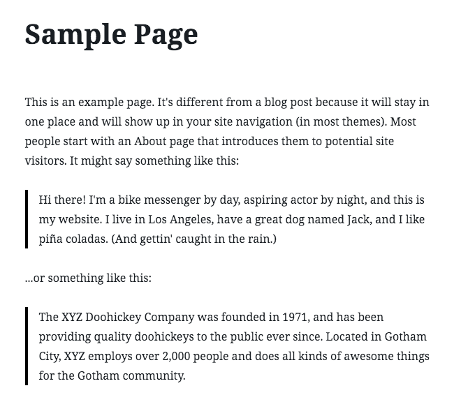
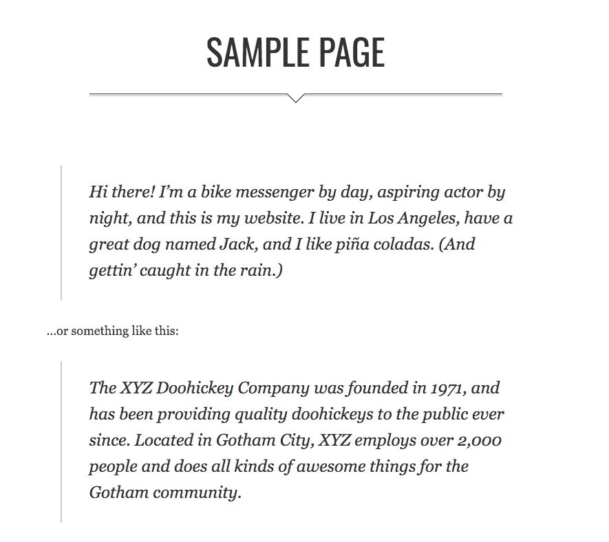
There’s no question that Gutenberg does a better job than the Classical editor of displaying your front-end styling within the visual editor. That said, it doesn’t provide the same level of accuracy as when you’re using a page builder like Elementor or Divi. With other page builders, you can see all of your changes rendered in the back-end – so you know exactly what your page will look like when published. With Gutenberg, you still need to manually click on the “Preview” button to see a draft page, which can be limiting from a content management perspective. For example, here is how a page looks in back-end editor versus in the preview mode:
3. Design and Styling
While Gutenberg is a big step up from the TinyMCE Classical Editor, it still falls short of page builder plug-ins when it comes to customizing styles. The Gutenberg editor will reflect any specific theme you’re using, which is quite useful – but that’s the extent of it. Page builder plug-ins not only offer complete control over styling from the ground up, but you also have the ability to override your theme’s visual settings.
We’re just scratching the surface on the pros and cons, but does this mean you should ditch Gutenberg for a page builder? Not necessarily. It all depends on what you want to accomplish. If your website has a simple layout and you want your content to fit harmoniously into a theme, going with Gutenberg might be a good idea. But if you crave more control over your page layouts and styles, a page builder is likely your best bet.
To Gutenberg… or not to Gutenberg?
That is the question! The answer? Well, that’s a little more complicated…
The real Gutenberg could never have imagined the evolution of his printing press. If only he could marvel at the invention of four-color digital presses that can instantly print thousands or even millions of impressions – all with a few mouse clicks. Sadly, innovation is sometimes slower than we would like it to be, and mistakes are all part of the process.
Much like these digital presses, the Gutenberg editor is a milestone in the evolution of the WordPress platform. It continues to demonstrate the commitment of the open source ecosystem to serve the needs of millions of web developers and content creators, each with their own set of goals – from managing a basic blog to crafting a custom experience.
Making things more “user friendly” is key to any software’s growth, and that’s where Gutenberg is endeavoring to shine. Unfortunately, it’s still not at a point where page builders like Divi or Elementor compete. But that’s the beauty of WordPress and its ecosystem of plug-ins: there’s an incredible amount of choice, and that only seems to be expanding.
Custom is always the costliest commodity, and even the real Gutenberg knew that. That’s why his first books were simple and limited in their scope. But over time, the block components became more elaborate and decorative, and font styles more abundant. Eventually, it all felt “custom.”
The same might happen for the modern digital incarnation. The real question is: when?