My visit to Magnolia's Offices in Basel, Switzerland

This month, I had the pleasure of visiting the head office of the popular open source enterprise CMS, Magnolia in beautiful Basel, Switzerland.
Their offices are situated on one of the longest rivers in Europe, the Rhine River, which runs over 1200 kilometers through Switzerland, Germany and the Netherlands.
It was an absolutely gorgeous view from the balcony outside their offices.

When my wife and I first arrived, we were greeted with a smile by Boris Kraft, CTO & Co-Founder, and Ben Price, Marketing Communications Manager for Magnolia International. Of course, we did the obligatory pose for the camera (that's Ben on my left and Boris on my right).

We had a tour of the offices, which were really well set up in a beautiful old building that, according to Boris, were previously a dorm for students. For your viewing pleasure, here are some pictures of their head office and their awesome team.
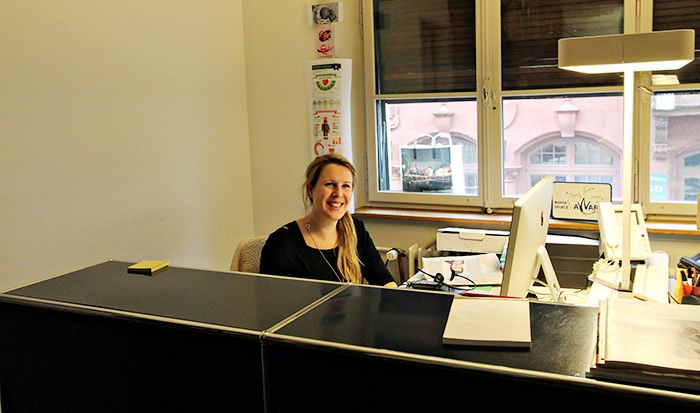
Natascha Natum, Management Assistant and HR Coordinator.

(left) Ben Price, Marketing Manager, (centre left) Isabelle Dubach, Marketing Manager, (centre right) Gavan Stockdale, Technical Writer, (right) Laura Gambell, Marketing Assistant
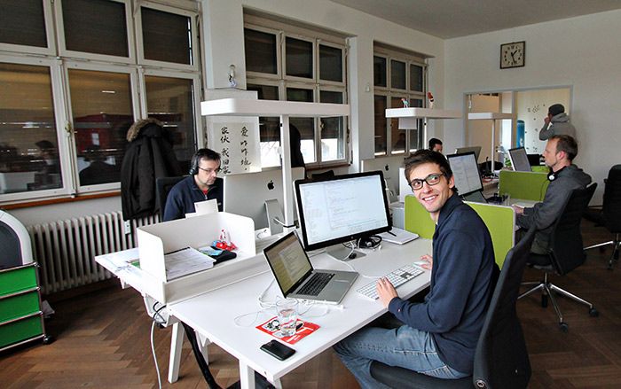
Magnolia CMS Core Developers
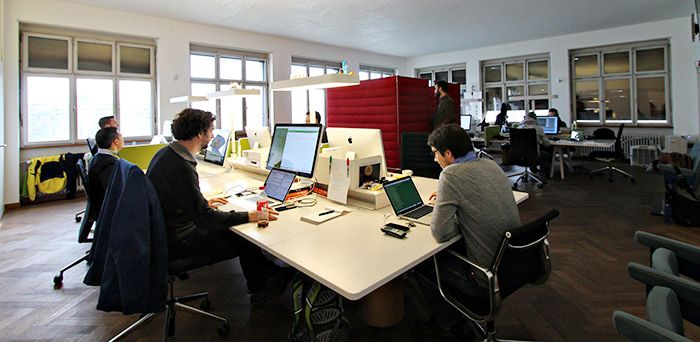
Magnolia CMS Core Developers
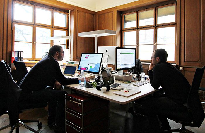
(left) Sebastian Stang, Senior Sales & Partner Manager and (right) Samuel Schmitt, Technical Account Manager.

Alain Kugelmann, Head of Finance
After my tour, I had a chance to sit down with Boris while he gave me a tour of the latest release, Magnolia 5.2.2 on both iPad and Desktop:
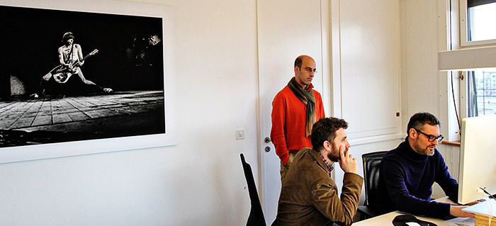
What makes this release unique is the amazing new interface they developed for it. The entire backend and CMS has been redesigned from the ground up to be completely functional on mobile devices such as smart phones and tablets. There's even a beautifully designed touch interface.
Here's a great video showcasing the interface on the iPad:
And here is another showing content authoring from the desktop:
As we walked through the interface, I couldn't help but be impressed with the slick implementation. I know, I've said before in my “How to Find the Perfect CMS” article that you should always be careful about being “wowed by the interface” but in this case, it's not just a pretty face with no functionality. Not only is the interface one of the best I've seen, it truly is amazingly simple yet functional on all devices.
As Boris explained during our discussion, their goal with Magnolia 5 was to offer a CMS that actually doesn't just manage your content but rather provides a framework where users can build their website quickly and easily using a flexible system that is expandable through apps. They also wanted to ensure that this same system worked on the latest technologies such as tablets like the iPad.

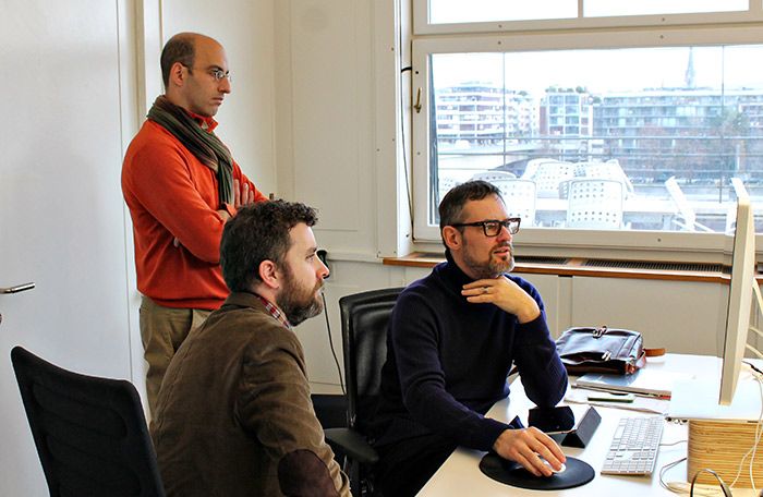
They were so concerned with the interface being functional but not overwhelming that they went through three major redesigns before finally feeling like they hit the nail on the head with the Magnolia 5 interface. I have to agree. It truly is an amazingly slick interface.
If you haven't had a chance to play with it yet, I strongly suggest you head over to their site and try out the free demo (scroll down and fill in your details, it takes about 1 minute and it's well worth it to see what they've done here).
Want to learn more about Magnolia? Check out the Magnolia CMS page in our CMS directory.