UXPin Merge Review: Sync Your Design Libraries with React Components in Git

We've all seen a "merge" sign on the highway, letting us know one road is about to combine with another. It's also a signal to be extra cautious as drivers narrowly squeeze their way across disappearing lanes.
Merging isn't always an easy feat when you're pushing a ton of metal 70 miles per hour or faster. But most people do it successfully, checking their mirrors and (hopefully) using their signals. Miraculously, traffic keeps moving.
In the development realm, the word "merge" has a very similar connotation. For example, in GitHub, a developer might work on a branch of code, create a pull request, have it validated, and merge it into a master. This pipeline behaves a lot like a highway: it requires careful attention to prevent a pile-up of broken software.
But when done right, it keeps things flowing.
Speaking of merging, there's one layer of the digital experience stack that's finally stitching together disparate worlds: UX design. Leading this wave of change is UXPin, a dynamite wireframing and prototyping tool we've written about in a previous review.
Today, we'll be exploring their innovative new offering called UXPin Merge, which we had an opportunity to sandbox with our team.
Before we merge with our evaluation, let's take a quick detour on some of the core concepts.
What is UX design?
This is a great definition from Caroline White on CareerFoundry. It's simple, but spot-on:
UX design focuses on the interaction between real human users (like you and me) and everyday products and services, such as websites, apps, and even coffee machines.
OK, maybe that bit about the coffee machine was a great selling point. But you get the idea: it's all about mapping the connective tissue between people and products, and how to best design an intuitive and meaningful user experience. The reality is, good UX design is often overlooked because we don't think about any friction. But bad UX design? That's a one-star review in the making.
A bit of history: the modern term was first coined in 1993 by cognitive psychologist and designer Don Norman when he worked at Apple. But the most basic tenants of UX design can be traced back to the ancient Chinese philosophy of Feng Shui circa 4000 BC. So this "art" of designing experiences goes way back.
For the purposes of this article, we're focusing on the modern digital chapter – the one where designers and developers have struggled to find common ground. Both are focused on creating great experiences, but the rift has always persisted.
The rise of modular components
On the design side, a lot of new tools have made prototyping and ideation much easier by creating reusable, component-based library elements. At the same time, new frameworks have changed the development process in a similar way. If you look at CSS with SASS, LESS, and the various range of pre-processors – and later on with CSS and JS – you can see the steady rise of modular development components.
While modularity has been a staple with past versions of Javascript, React.js has embraced it more than any other framework or library. It enables users to build UI/UX solutions faster, with better quality and consistency. Developers and engineers are down with this rapid, reusable, component-based approach, and they've begun the "modular migration" towards design systems built for this purpose.
What is a design system?
When it comes to building websites and apps, having a design system has never been more important. It acts as the central foundation for maintaining control and cohesion over the user experience, particularly for sites with lots of pages.
According to UXPin, a design system is a comprehensive set of core design standards, which includes the relevant documentation and governing principles to achieve and maintain those standards. It typically includes a toolkit or library with UI patterns and code components.
UXPin conducted a survey a few years back, asking 3,157 companies if they used a design system. Here's what the respondents said:
Yes or Building One 69%
No 26%
I don't know 5%
While many companies are embracing the concept of a design system, the vast majority are using code-based solutions that don't utilize the principles of a modern solution. What this data tells us is that most organizations are still nascent in their adoption of these toolkits and component libraries – and in many cases, they're still struggling to understand the value.
The disconnect between design tools and code
If web designers have just one dream, it might be that anything they create in a prototyping or design app "magically" becomes a fully functional project.
No coding. No development. Just a finished website that looks and behaves exactly like their design.
And that's the problem with most modern design tools: they don't connect with a modular development strategy. Whether you use Sketch, Figma, InVision, Framer, Photoshop, or AdobeXD, what you visually render doesn't always match the final code output – and the design elements are out of sync with the production code.
Here's where the battle lines are drawn. Designers blame developers for incongruency, demanding pixel-perfect results. Developers blame designers for being too "esoteric" and not drawing inside the lines.
A lot of the problem originates with the design tools, which define components and interfaces in static artboards. More often than not, last-minute changes are made on the development side, leaving design assets out of sync. Designers are then forced to bring their design assets up-to-date... if they remember.
Can the designer-developer workflow be more efficient?
Yes – and the answer rests with code-based design tools. They provide realistic fidelity and ensure parity between design and development. They use HTML, CSS, and Javascript to render everything on the screen, so the interactivity is extensive. You can create forms with validations, tables with sorting, whatever you can imagine. Like in code, elements can have a state and even morph between states, and the components can maintain their interactions.
This is where UXPin Merge is changing the game. We had members of both our design and development team test-drive aspects of the platform, and we've broken down our feedback below.
What is UXPin Merge?
Merge (as we'll refer to it henceforth) is a modular addition to the core UXPin toolset. If you're not familiar with UXPin, you can check out our most recent review here.
One of the best things about UXPin is that everything you design in their system can be turned into a component and stored in a sharable design library. These library components used to be available in only HTML and CSS. But with Merge, you can import React.js components from Git repositories to the UXPin editor and keep them all in sync. All components are identical to the ones used on a production server, and they're fully interactive.
With Merge, designers can access components that already exist in the code repository without needing any coding expertise. They can also test advanced use cases with data and interactions available in the production code. Meanwhile, engineers can accelerate their workflows by assuring that designers use components that have already been coded, thus minimizing the potential for a designer to go "off script."
Some of the key features of the Merge design system include:
- A single source of truth: With Merge, designers and developers can work with the same assets and objects on either side. Designers can use production code to design experiences even if they don't know how to code, and developers can optimize and refine without disrupting the design layer.
- Version control: Maintain versions of the design system and coordinate releases via GitHub for both designers and developers.
- Instant synchronizations: Whenever something changes on your production servers, it automatically synchronizes with the components. Designers are always up-to-date.
- Shared context: All design or experience-based decisions are now shared across both sides of the fence, allowing for more frictionless collaboration between engineers and designers – so they can deliver the best user experience.
How UXPin Merge Works
Before we get to Merge, let's briefly mention how UXPin works. Again, you can go deeper in our previous review.
OK. Let's say you want to draw something in the UXPin design editor, like a rectangle. Starting out, you'll find that the tools are intuitive and familiar, especially if you've used other prototyping and design apps.
Once you have your rectangle on the pasteboard, you add some basic styling like rounded corners or a border. Super easy.
While your creation might look like an Adobe Photoshop or Illustrator element, it's actually not a vector or a raster graphic at all – it's a piece of HTML styled with CSS. In fact, when you go to the Spec tab in UXPin, it will display all the properties and CSS code:
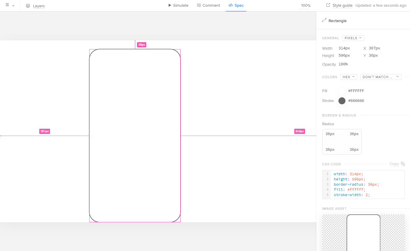
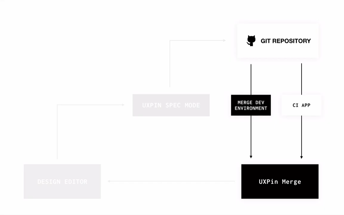
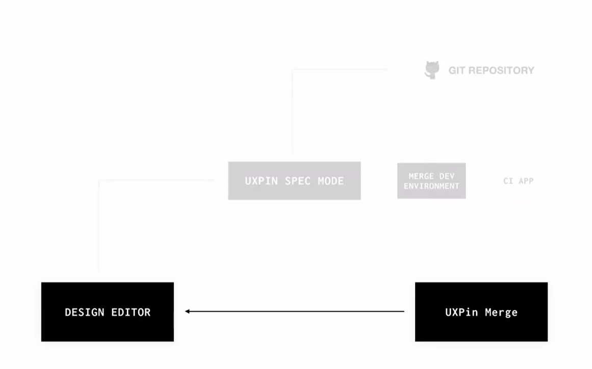
With Merge, the flow is a little different. For starters, you would begin the process in your Git repository, not the design editor. All the components come directly from your repo, meaning they're not created inside UXPin. Instead, they're imported from Git and synchronized.
The chart below shows the basic workflow with Merge. You can see the connection between the Git repo code, Merge, and the UXPin design editor:
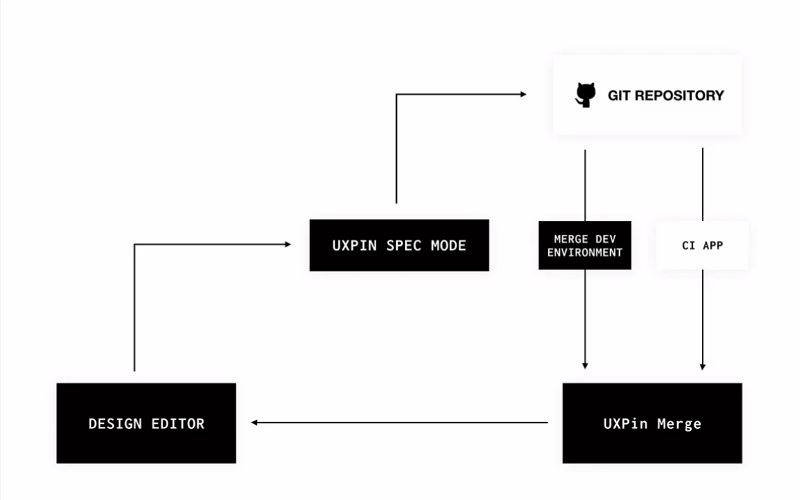
We'll get into more detail about the process of creating React components and importing them to UXPin. But first, let's take a look at the UXPin dashboard once your components have been imported.
On the left, you can see a collection of components coming from a Git repository. A designer can simply drag and drop those components onto the canvas area:
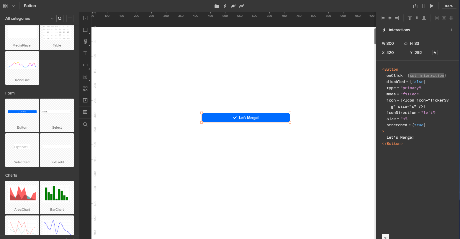
As you can see, the Button component has the React code displayed on the right.
When you switch to the Controls mode, you can edit all sorts of properties. For example, in this Button component, the label is passed from the property "label." If you modify the label, it will modify the component in real-time:
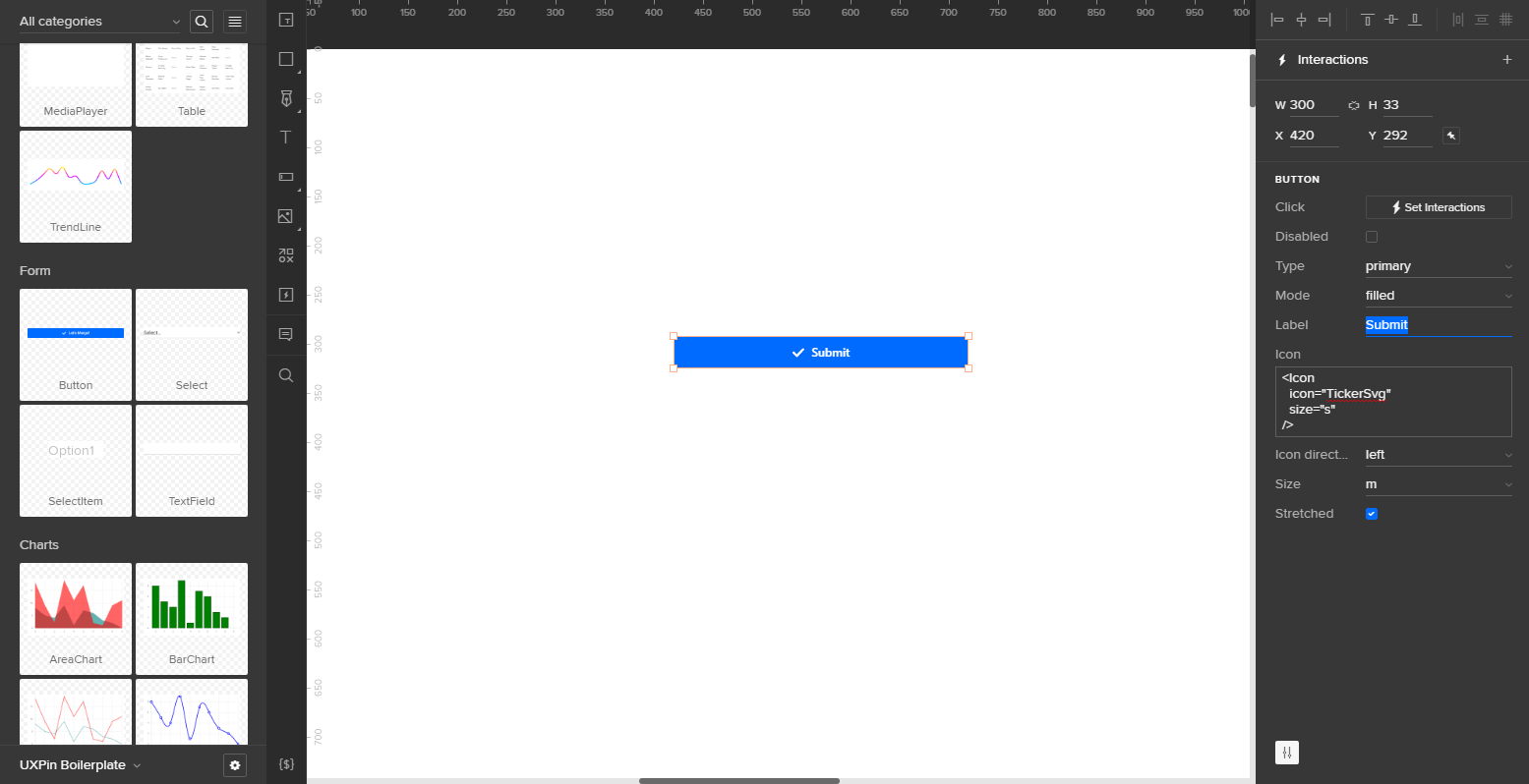
These properties are coming directly from the code, and in UXPin, they're automatically synchronized.
Normally in the Spec mode, UXPin displays CSS. But in this instance, it's showing JSX code with React components. This JSX is the code that engineers use in the implementation of their production code.
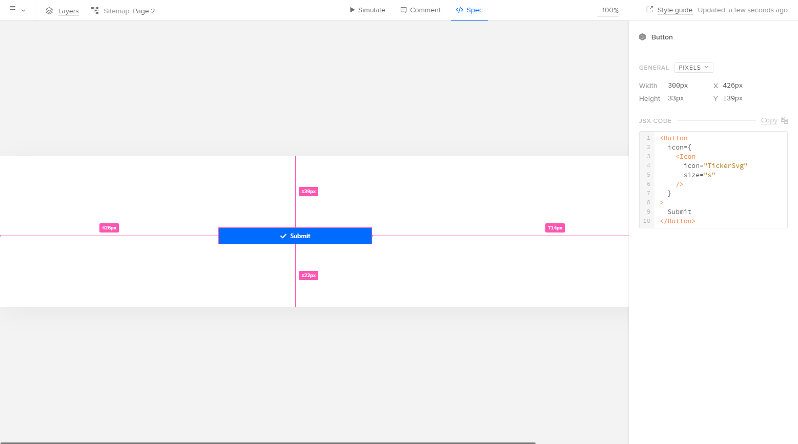
Pretty neat, huh? This is actually where the component is coming from:
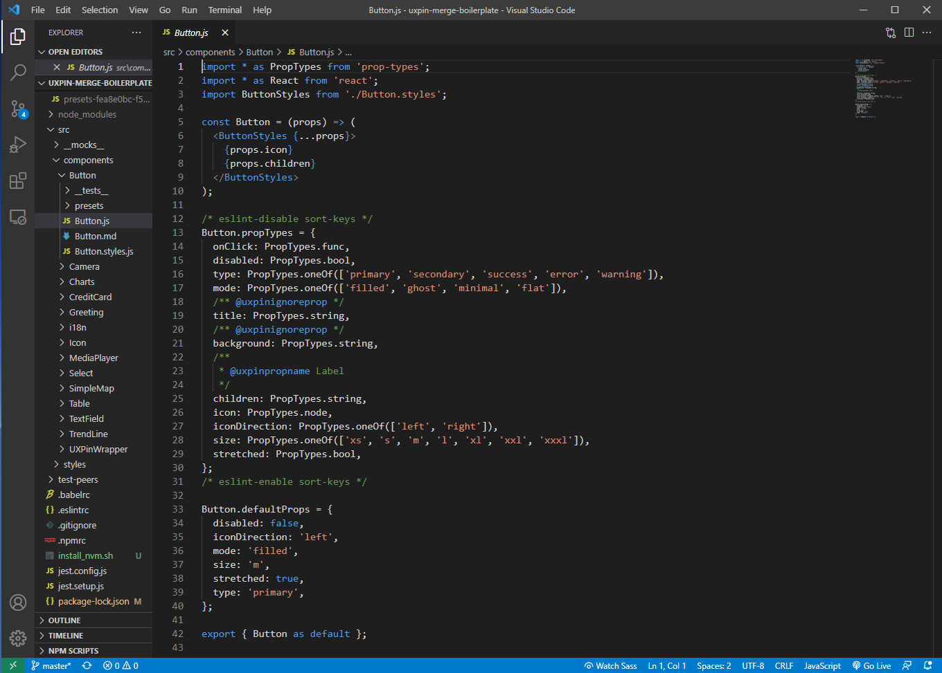
Let's explore how this all works.
The developer experience
In Merge, there are essentially two experiences: one for people who create code, and one for people who don't.
For developers, the process of working in repos and creating source components means going deep with code. For designers, using components that sync with a repo means never touching code.
Remember the chart above showing the entire Merge workflow? Here, we'll explain the development and integration side of the process. Here's how you get started:
Fork a UXPin Merge repository to your Git account
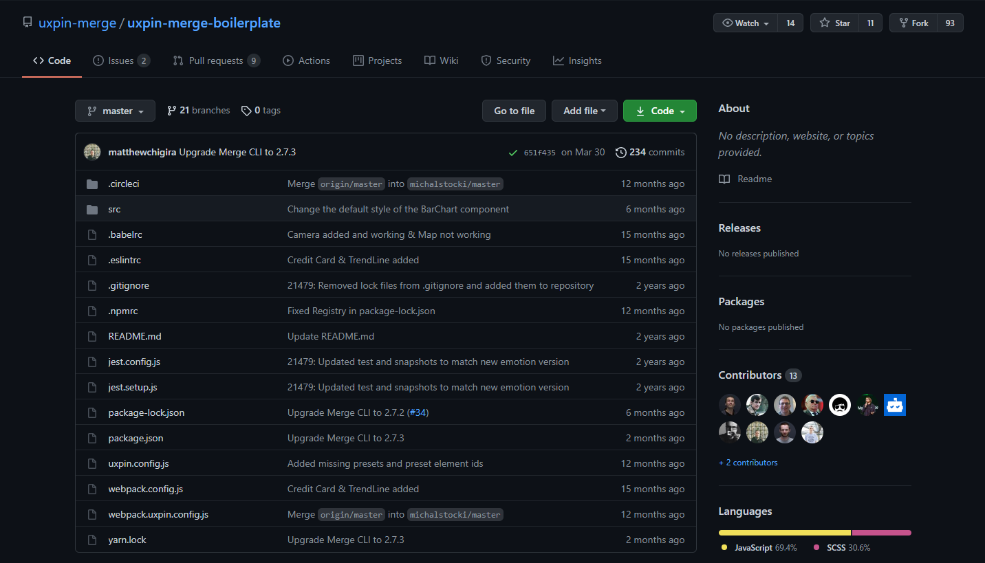
First things first: you'll need to fork UXPin's Git repo to integrate your React code with Merge.
UXPin Merge Boilerplate repository is an excellent place to start. UXPin created this repo to help test their own system, but it includes 10 different components, including a button, greeting, icon, media player, table, and various charts.
There are many other repos that provide pre-made components – such as the Material UI library and Grommet, a popular design library – and you can fork any of those to your own repo as well (more on that later).
Next up, find a good place on your computer to put the UXPin repository. You can use a terminal window for this:
Ensure that you have Node (v8 and higher) and npm on your computer to install all the necessary dependencies.
Once you install npm via npm install, you'll also need to add the Merge CLI. Once those are in place, you're ready to go.
The Merge command-line tool is responsible for preparing all the code to be sent to the UXPin editor, and it can also run the UXPin Dev Environment Editor.
Once you run npm start, your terminal will display the Merge Experimental Mode, and a new window will automatically open. This window will have the Dev Environment Editor. This is a vastly simplified version of the UXPin Design Editor where you can view and test your components:
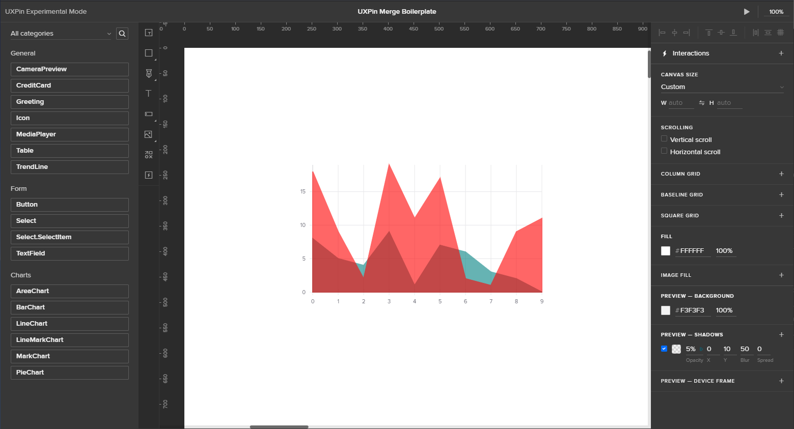
All the components imported from the repository are listed on the left, just like in the full version of UXPin. You can also drag and drop them onto the canvas – also mimicking the full version.
Remember: this environment is only for testing, not for designing a full product. But it's perfect for determining if the components and properties you've coded are rendering correctly.
UXPin automatically builds the interface on the right based on properties defined in the component file:
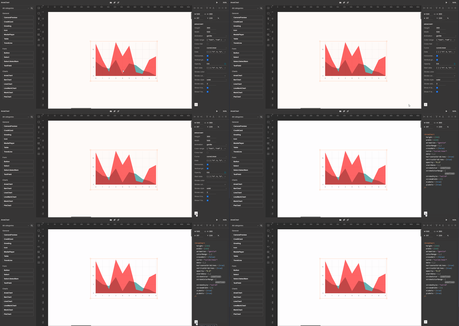
If you find anything that needs to be fixed, you can always go back to the code in your repository and make changes. When you save your file, it will automatically compile, and you can see the updated version when you refresh your browser.
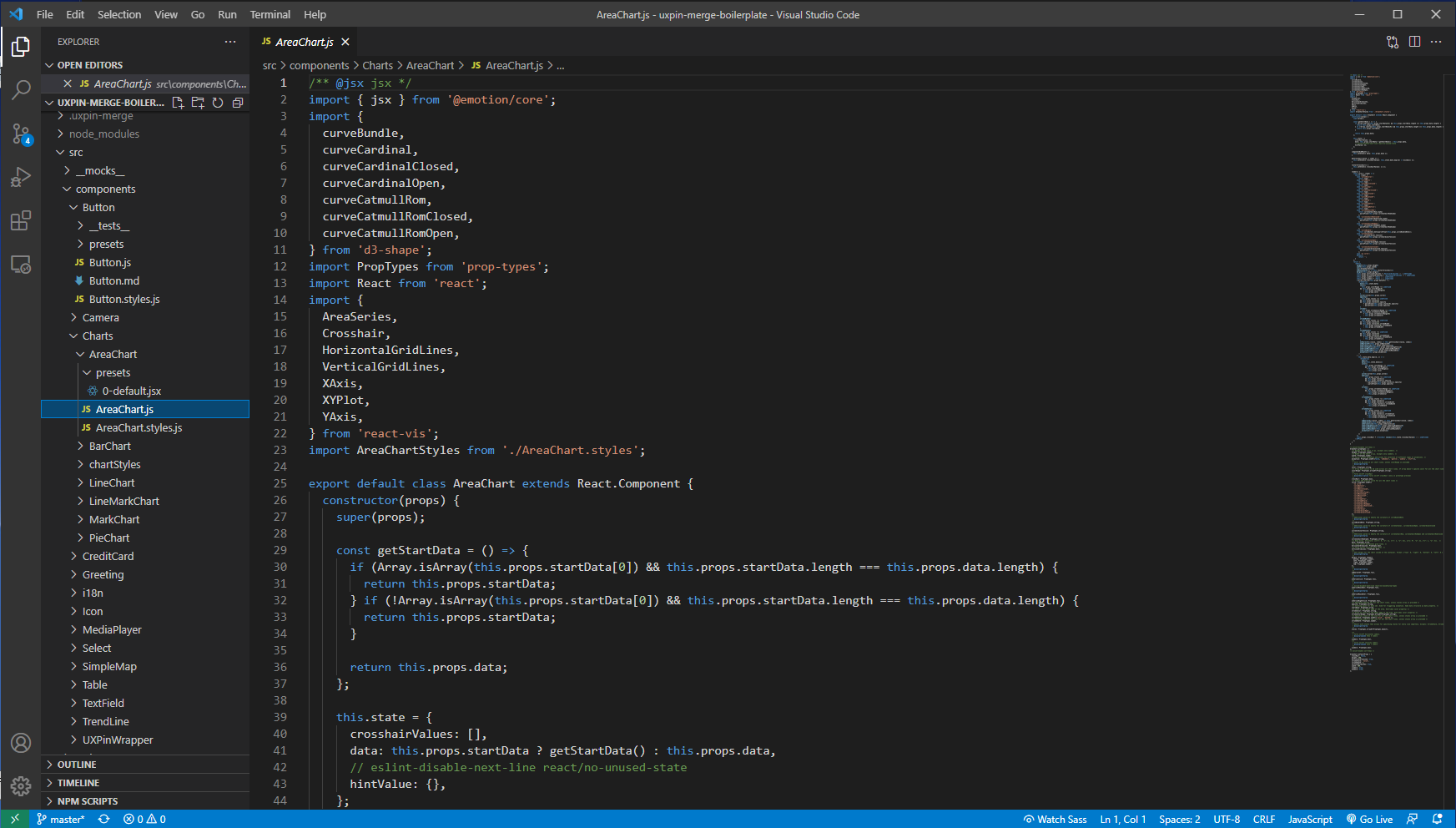
Syncing Coded Components
As mentioned before, the dev environment is for developers to test their components and properties. Several steps are required to integrate with the UXPin Design Editor, but it's not overly complicated... for a developer. If you're not super technical, you might need some assistance.
Once you fork the repo from GitHub, you'll see a .circleci directory inside the main directory. UXPin uses CircleCI for continuous integration, but Merge is agnostic – so if you prefer, you can use other integration tools like Travis CI, GitLab, or Bitbucket.
To integrate your components with the UXPin Design Editor, just add your libraries right inside the Design Editor. There will be two options:
- Design components visually in UXPin: This allows you to create components, save them as symbols, and share them with your team.
- Import React components: This brings your components over from your Git repository so you can begin importing them into your UXPin Editor.
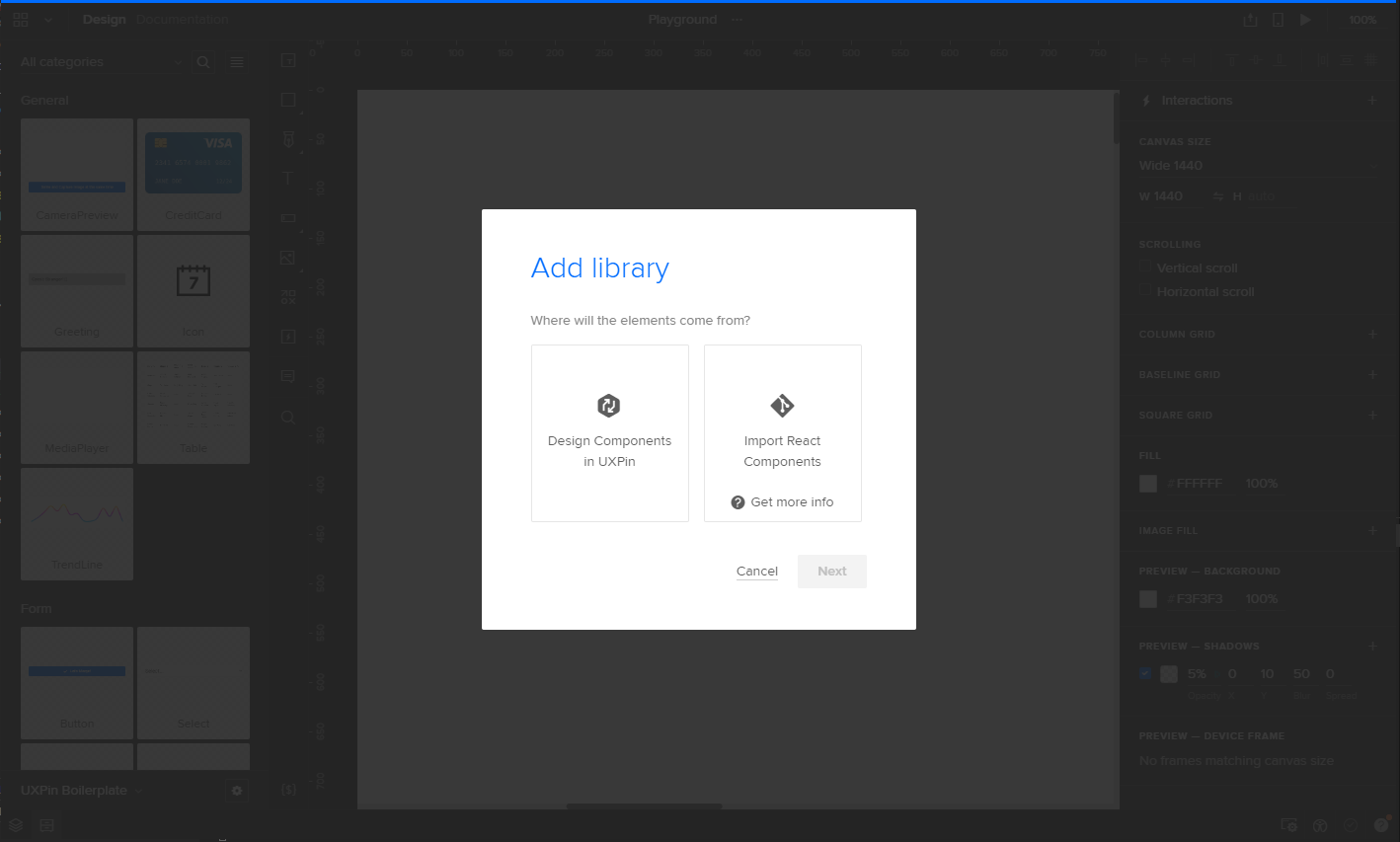
From here, give a name to your library. You'll also have the option to select team members who can access your components:
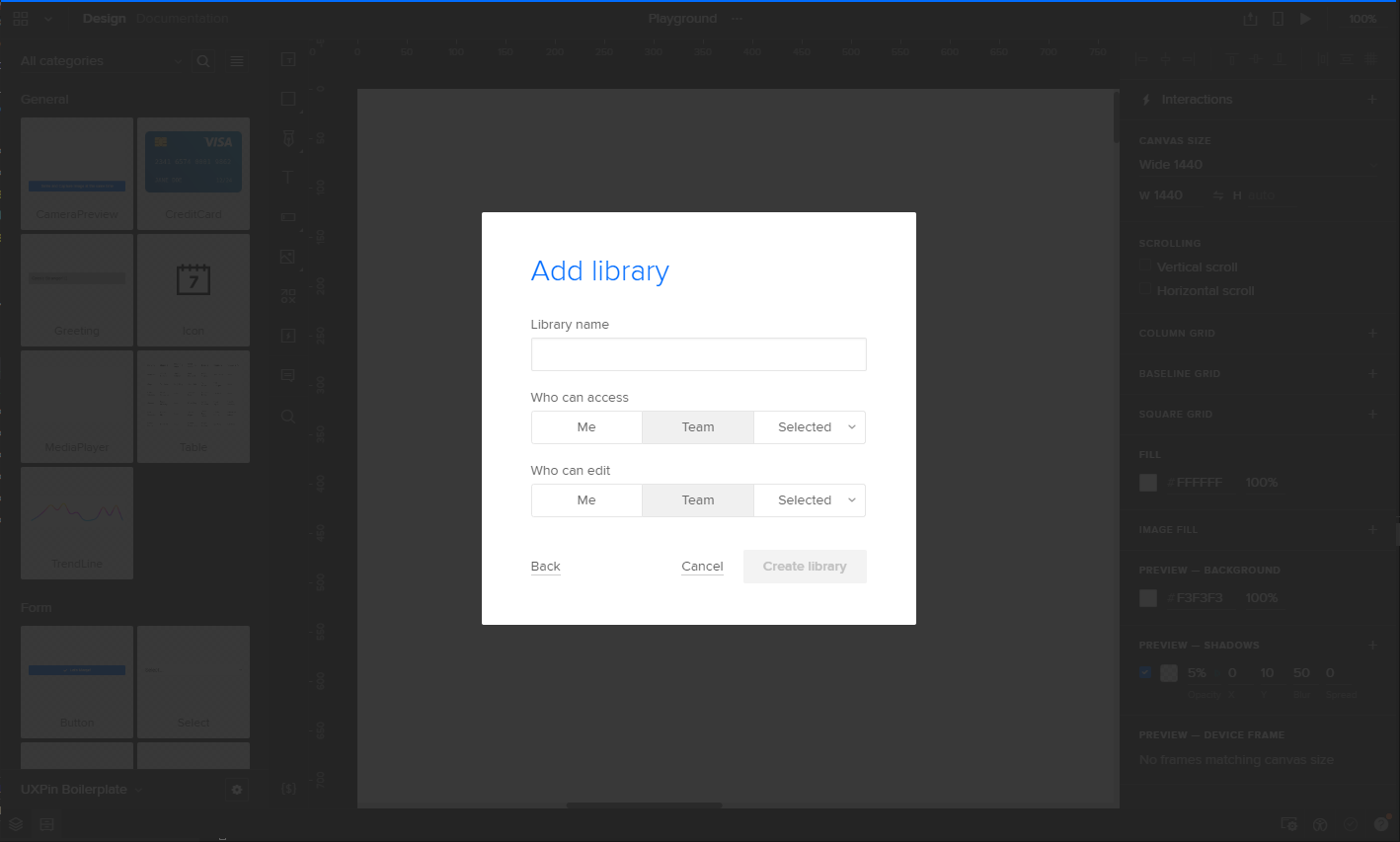
Once the library is created (and still empty), you're going to see a generated token that gives Merge direct access. When you log into your CircleCI account and pick your UXPin project, you're going to use that token in your Environment Variables to add it as the auth token - allowing you to push your coded components through CircleCI to your UXPin Design Editor.
Now, every time you modify a piece of code and commit the change to your Git repo, CircleCI – or whatever CI/CD tool you're using – will detect the changes automatically and update them in the UXPin Editor.
Other Libraries
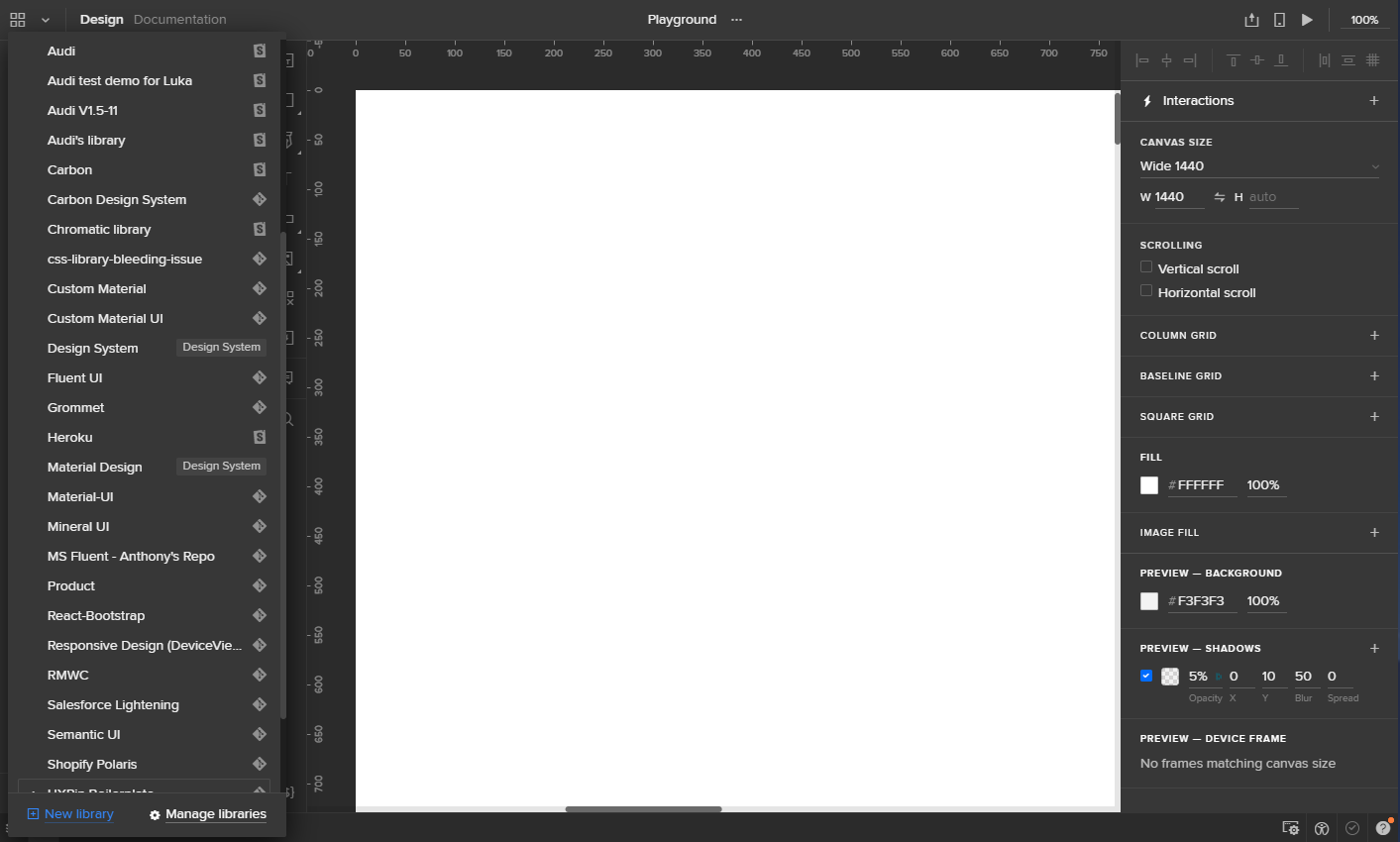
UXPin has multiple libraries integrated with Merge, meaning you don't have to create every component from scratch. In addition to UXPin Boilerplate, you'll have access to Carbon Design System, Fluent UI, Grommet, Mineral UI, Salesforce Lightning, Semantic UI, and many more.
The designer experience
After you integrate your React components with the UXPin Design Editor, it is time to bring the designers to the sandbox. In this section, we'll talk about how components can be used to build dynamic design solutions, and how Merge helps maintain cohesion.
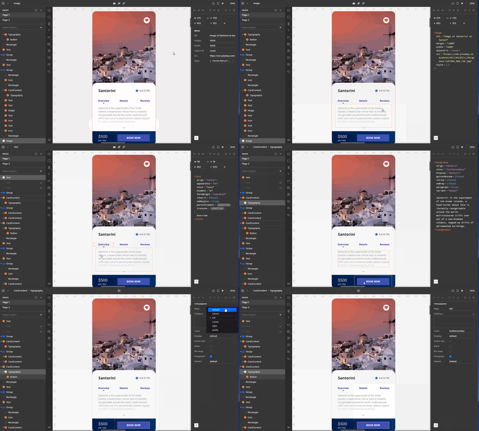
Let's look at an example of a customized React component using Material UI's library. In this case, we have a main card component, card media, card content, and card actions components.
The image is in an <Image /> component with all the essential properties. The text is in a <Text /> component with attributes respective to various heading types (such as h1, h2, h6, etc.).
While the components are structured, it's important to note that the content inside can be modified entirely:
Technical constraints
Merging the design and development worlds is no small feat. That said, there are a few technical constraints – particularly with integrating your own repository of React.js components. Merge requires strict compliance with its code standards, making it difficult to venture too far off the highway.
For example, the directory structure should be created to only have only a single component per directory, and component files have to contain an export default. You also need to create a uxpin.config.js file at the root directory and document the configuration of the component files as such:
module.exports = {
 components: {
  categories: [
   {
    name: 'General',
    include: [
     'src/Button/Button.js',
    ]
   }
  ],
  wrapper: 'src/Wrapper/UXPinWrapper.js',
  webpackConfig: 'webpack.config.js',
 },
 name: 'New Design System'
};
If any code falls short of these standards, your components won't be compiled or rendered correctly in the editor. In a sense, it's exactly like any software: it has the propensity to break if you're not careful.
Also, since the components are all coming from code, the freedom for designers to modify them – such as changing the size and colors of elements – depends on the configuration of the preset files. If such properties and configurations are not provided in the source code, designers won't be able to modify components. This may cause back and forth exchanges between designers and developers to make further adjustments. More importantly, it underscores the need to really plan your design and development integration before you start with Merge.
Finally, if you're working on Windows, you'll need to set up the Windows Subsystem for Linux (available for Windows 10), a feature that allows the Linux system shell to run on Windows. This shell, like Ubuntu Bash, lets you run Linux commands and CLI tools. Without it, you won't be able to use the CLI from Windows, which is essential to the Merge flow. Fortunately, UXPin provides on how to do it.
Integration advantages and disadvantages
UXPin provides two types of integrations. Both come with their own advantages and disadvantages:
Clean Integration
Clean Integration is a direct connection between Merge and your GIT repository. No extra code, Wrappers, or code changes are necessary. It's fast, but you need to follow all the technical requirements and code standard requirements for it to be successful. UXPin recommends trying the Clean Integration first. If it doesn't work – or changes in code are impossible to reconcile – they recommend going with their Wrapped Integration.
Advantages:
- Well-integrated and simple workflow connecting designers and engineers
- Effortless maintenance with no extra work needed to update the components in UXPin
- Fast integration
Disadvantages:
- Requires strict following of Merge technical and code standard requirements
- Doesn't allow modification to the component code by designers
- Designers can't modify code to fit their individual needs
- Whatever you have in your production code is reflected in UXPin
Wrapped Integration
Wrapped Integration happens when you're importing your components to Higher-Order Components (HOC). With Wrapped Integration, Merge works with Wrappers for your components. This is the most flexible integration model, as you don't have to have a code repository that strictly follows the Merge requirements.
Advantages:
- Flexible integration (fewer problems following Merge technical and code standard requirements)
- Ability to modify coded components to meet the requirements of designers
Disadvantages:
- Complicates the process of code maintenance and may require manual updates of code of components
- Integration may take more time with the need to create a special Wrapper for every component in your repository
Conclusion
We'll be honest: we already love UXPin, and believe this level of prototyping is essential to delivering great user experiences. More companies should embrace design systems, and UXPin is writing the book for best practices in this category.
There's no question that React has become one of the most popular frameworks for websites, so it's only logical that more tools are emerging to help simplify the creative process. UXPin is no exception, so we jumped at the opportunity to see how Merge works.
As noted earlier in our review, we had both design and development members of our staff test-driving Merge, and the consensus is pretty clear: it's a versatile experience. It has the potential to unite teams by integrating code and design with components that are incredibly easy to use. We weren't sure what to expect, but it delivered on its promise.
One thing we would say about Merge is that it's still "early days." The onboarding is a bit uneven, and it feels like there's more technical support needed in the setup. For any company interested in making the journey, there's an investment in time, resources, and treasure to link things up – and that might prove too ambitious for some. But if you're ready to make the cultural shift around your design and development processes, UXPin is absolutely moving in the right direction. And fast.
The real question is: are you ready to merge?
If you'd like to take this new platform for a basic spin around the block, you can request access here.
About UXPin
UXPin is a design platform for building mockups and wireframes, interactive prototypes, UX document creation, and collaborating with both design and development teams. Features include variables, conditional interactions, expressions, interactive states, and a data generator integrated with Unsplash to get free stock photos directly in UXPin. Unlike other image-based design tools, anything you create in UXPin is based on HTML, CSS, and JS code. Since it's the same technology developers will work with, their code will match your design perfectly. Since 2010, UXPin has been on a mission to enable the best user experiences by merging design and engineering into one world of better, faster product development.