Faster & Cleaner: TYPO3 CMS 7 Released

The latest version of TYPO3 CMS has arrived, and it's a big one, both technically and visually.
TYPO3 is a free and open source web content management framework based on PHP. The Swiss software company was founded in 2004.
Let's take a look at what TYPO3 CMS 7 brings to the table.
Speedier & Far Better Looking

According to the TYPO3 team, their main focus with this release was to clean up the back end – both technically and visually.
First of all, it’s the fastest release in TYPO3’s history. It now features twice as many merges in the same time frame into the current codebase than previous releases did. This has been achieved thanks to TYPO3 replacing their previous combination of PHP, HTML and CSS, simplifying Javascript and optimizing PHP.
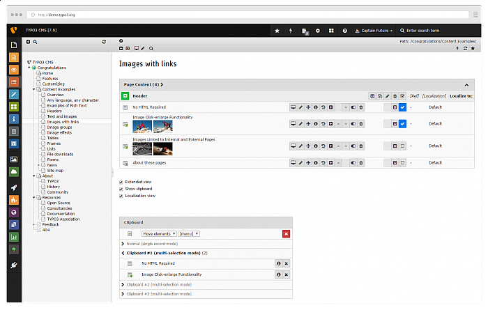
Also, TYPO3's “new” core now runs Twitter Bootstrap under the hood. Not only does this make everything look a little better, but it also gives TYPO3 more an “app style” appearance.
Buttons that initiate actions are now clearly marked as such, the color scheme is more streamlined, and comes with less distraction in general. By using this new icon set, all icons look ultra-crisp even when scaling up the back end or using hi-dpi or retina displays.
Speaking of scaling, the first important steps have been made to make TYPO3 CMS’ back end mobile ready, which is something TYPO3 want to introduce at some point in the future.
A HTML Crusade

The TYPO3 team also started what they referred to as a, “crusade to make the HTML markup of the backend more clean and semantically ready.”
What sounds rather technical at first is in fact a very big deal for editors – simply because the aim is to get the back end to behave more organically.
The same thing goes for all forms in the back end. A new, better markup for form fields (which will pave the way for adding a lot of accessibility features in TYPO3) is also being laboured over.
For more information on TYPO3 CMS 7, check out their website, and their blog announcement.
Also, you can explore more of TYPO3 via our CMS Directory.