Percussion CMS Review
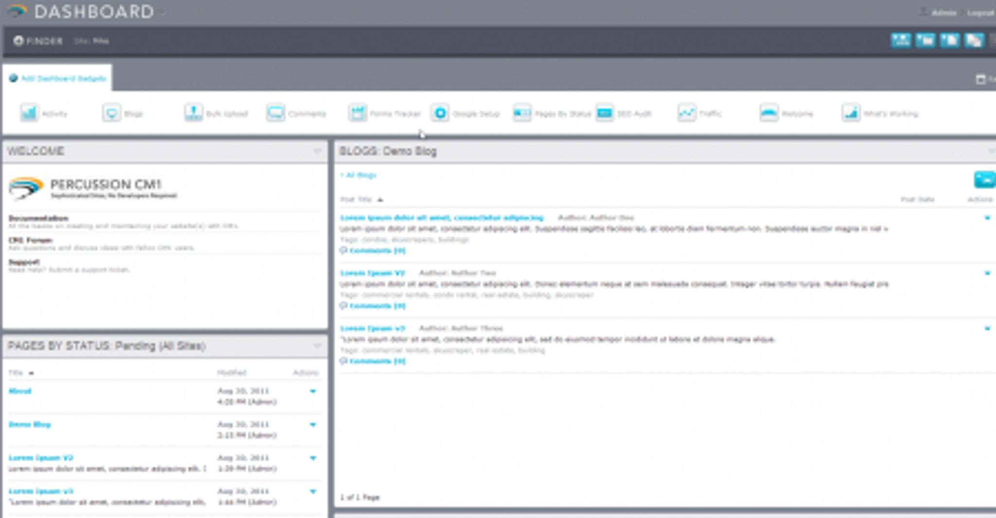
Percussion Software announced the release of version 2 of their popular Percussion CM1 WCM today and I thought I'd share my Percussion CMS Review, having recently had an opportunity to test it out.
One of the first things I noticed, having never had an opportunity to explore CM1 before, was the slick look and feel that their interface offers. CM1 is beautifully laid out with an attractive dashboard that features a number of modules that can be added with drag and drop functionality. This allows the user to quickly build a high level overview of their site(s) complete with analytics and more.

Not only does it look good, it's snappy and responsive as well. Almost everything is drag and drop enabled and adding and modifying content, navigation and widgets is incredibly easy (and fun) to do.
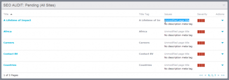
There are a number of highly useful widgets that can be added to your dashboards. Once specific one I am fond of is the SEO audit module. As you can see in the screenshot below, it gives you a quick list of issues that should be corrected to attain maximum SEO value from your content.
Another great dashboard widget is the “What's Working” widget. This one allows you to set targets and goals for your various content (ie: number of visits, etc) and keep an eye on how well your content is performing with regards to those metrics. This is great for a quick high level overview of how well content from various editors is performing, for example.

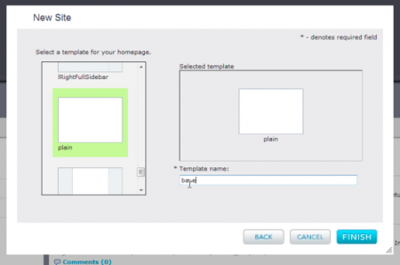
Ok, so we've established that the dashboard is slick and offers a number of great options. What about the rest of the system? Well, let's say you are looking to add a new site. First off, you are prompted to select a template with an easy to use interface (shown below).
To modify or select a template for your page, you simply scroll through a list of available options and choose one:
These templates can, of course, be modified at a later date or the code edited as well if you choose to add your own capabilities. Once you've got the template selected, there is a wide array of widgets available that you can add to your pages to allow extended functionality. Adding widgets and modifying the layout is as simple as drag and drop designing.

To modify the widgets once you've added them, simply double click to activate the edit window and you're off.

Looking to change the site's navigation? It's just as easy. Take a look at how simple it is to modify. You select your site:
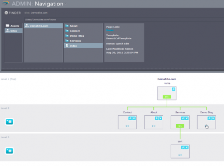
Then you drag and drop your pages wherever you wish them to appear within the navigation tree:
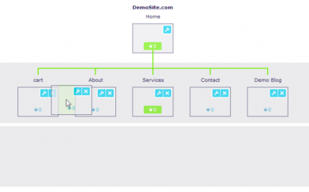
Simply using drag and drop, the site will rearrange the menus automatically and ensure that all links work as they should.
Percussion's system is without a doubt, one of the most attractive interfaces I have seen with a slick combination of speed, simplicity and beauty that makes it a pleasure to work with.
The system comes with plenty of other functionality such as unlimited content revisions (versioning), excellent media management and multi-site support.
So where does it falter?
Honestly, I've yet to find anything about the system that I didn't like. For the price point, Percussion is an excellent system.
The only caution I would throw out is to ensure that you understand the market that it is targeted towards. This is a WCM, and as such, it's designed to allow you to put your organization online. There is a distinct difference between a WCM and a CMS and it's important to understand what that difference is before you make your selection. I've put together an article to assist: CMS or WCM – Which is Which?
You can learn more about Percussion from their website: http://www.percussion.com