WebStarts Review - The CMS for Anyone
WebStarts calls themselves the #1 website builder. After our experience, we're almost ready to agree — as long as you're looking for a WYSIWYG editor with easy-to-use power tools. WebStarts has already built and hosted 2.6 million sites, and that number is getting higher by the hour. We gave WebStarts the once-over — clicking every feature and testing every widget. Here's our WebStarts review
The Skinny
Here's everything you need to know about WebStarts in sixty seconds or less:
- Overall Look and Feel: WebsStarts provides a drag-and-drop editor that is extremely simple to use. It's customization city, and you don't need to know a bit of code. Advanced website features such as having a shopping cart or forum are as simple as one click.
- Who It's For: Programmers aren't going to like WebStarts, but it's a dream come true for non-tech-savvy business owners who want to get a solid web presence. We recommend WebStarts specifically for small-to-medium brick-and-mortars that want to take their business to the next level, using features such as online shopping.
- What's Good: The sheer level of features and the simplicity of these features is WebStarts biggest selling point. The help site and customer service were outstanding. Design and customization is a breeze.
- What's Not-So-Good: Like we said, if you're crazy about HTML, WebStarts is not for you. Beyond that, WebStarts obviously needs to make money, but we felt a bit nickel-and-dimed when we're seeking additional services such as email or web stats. Only once did we encounter a site malfunction that forced us to log in again.
Now on with the full review. To give you the most thorough possible review of WebStarts, we're going to walk through the site — from signing up to creating our site's home page. If you'd like to skip to the end to get our “Final Thoughts” and see the site, feel free to go ahead.
Signing Up
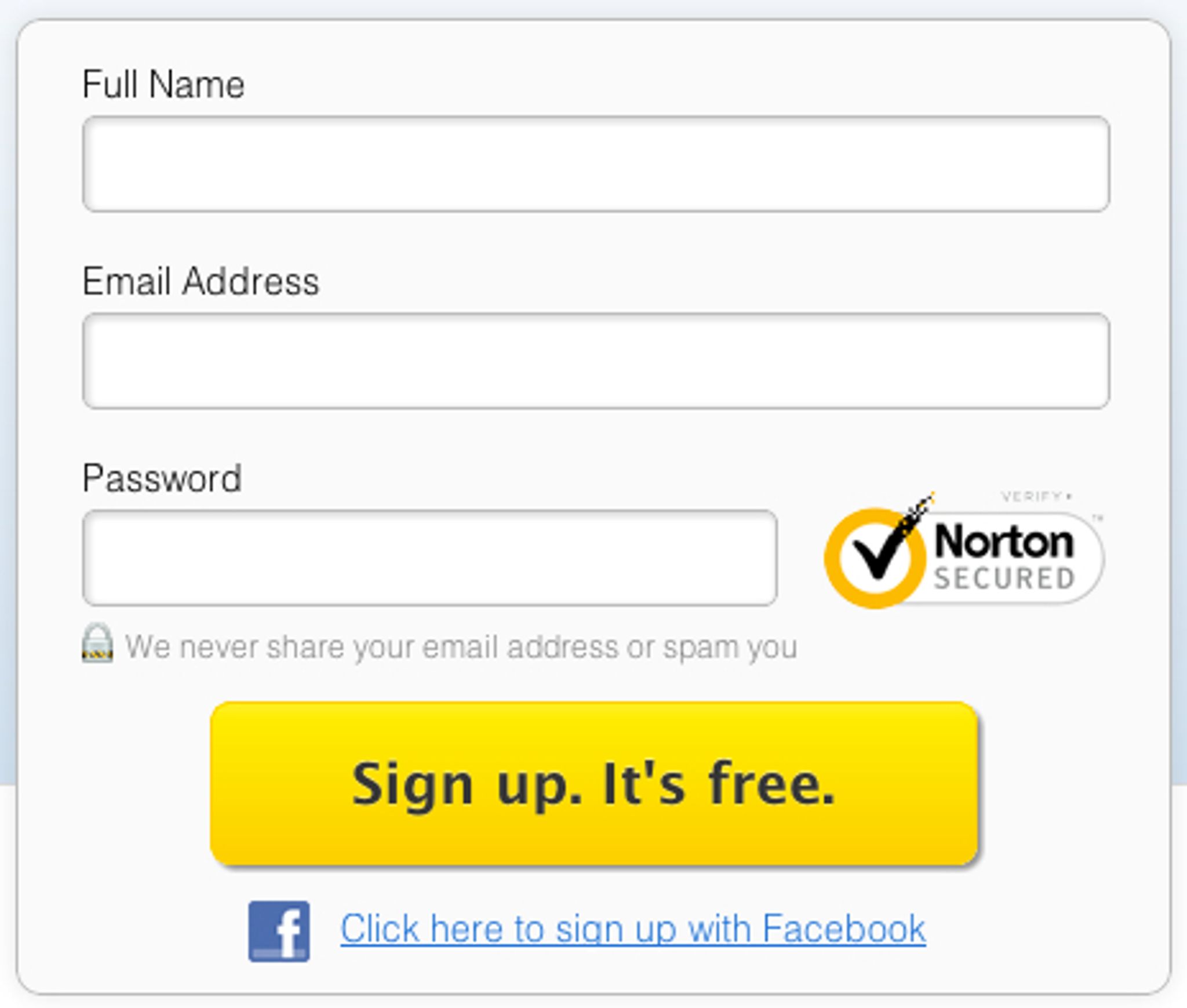
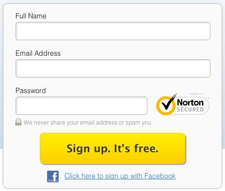
Signing up is incredibly easy. In fact, it almost feels like it's too easy. Is this seriously a CMS I'm signing up for? You can sign up directly from WebStarts home page.
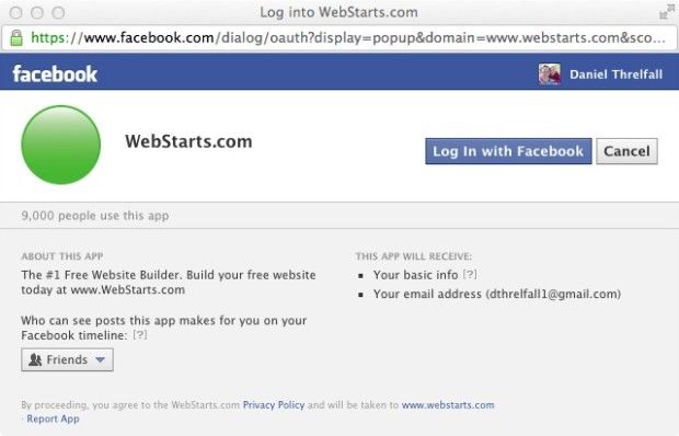
And, yes, you can even sign up through Facebook to make it even easier. The WebStarts.com Facebook app provides you with a Facebook popup with the typical authorization and login information.
Choosing a Design
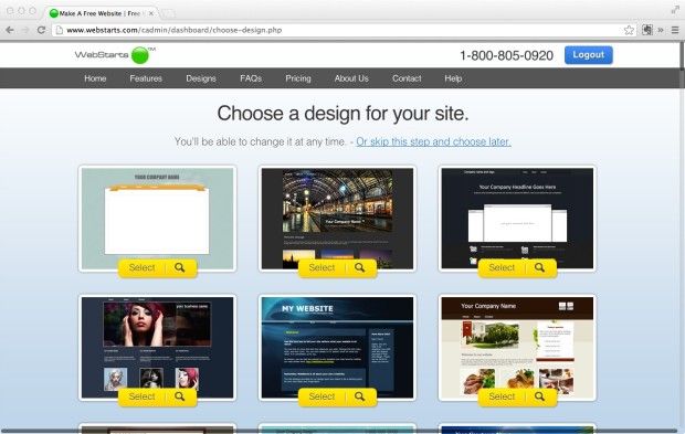
When you first log into the site, you're confronted with the option to immediately choose a design for your site. We counted 105 templates to choose from. From a purely design aesthetic standpoint, most of the templates are quite good. With the extensive design customization that is possible through WebStarts, each of these templates can be completely changed to suit your exact preferences. In keeping with its goal to meet the needs of the non tech-savvy, each of the templates are a good option for a complete website with minimal alterations.
Choosing a Website Address
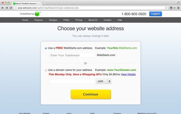
After selecting a template or skipping to the next step, you are prompted to choose a website address. Gratefully, this step informs you that “you can always change it later.” There are two options — 1) choosing a free address with WebStarts, or 2) purchasing a new domain.
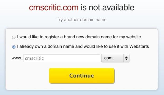
If you choose an existing domain, you will be guided through the appropriate steps on the following page.
Editing or Creating Your Site
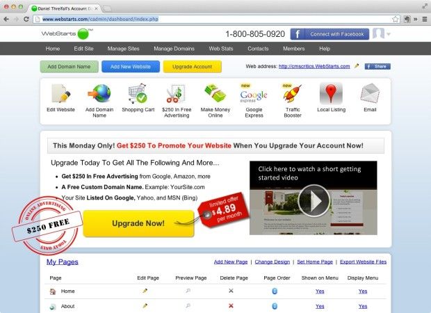
When you've finished setting up your basic site information, you'll be sent through to the main interface of the CMS. It presents a bewildering array of menus, buttons, icons, an advertisement to upgrade your account. Featured at the top is your site menu with clickable links. In our opinion, this page could potentially be improved by simplifying some of the features into a persistent menu bar, and featuring the “My Pages” section more prominently.
Looking Closer at the Editor
Now let's get started editing the website we just created.
Clicking on the colorful “edit website” icon at the top seemed like the best thing to do, although we could have performed the same function in the “My Pages” menu at the bottom.

The drag-and-drop editor is a full overview of a site page. The floating “featured apps” box at the left can be moved or closed. Each of the icons on the floating box is repeated in top menu bar or toolbar.
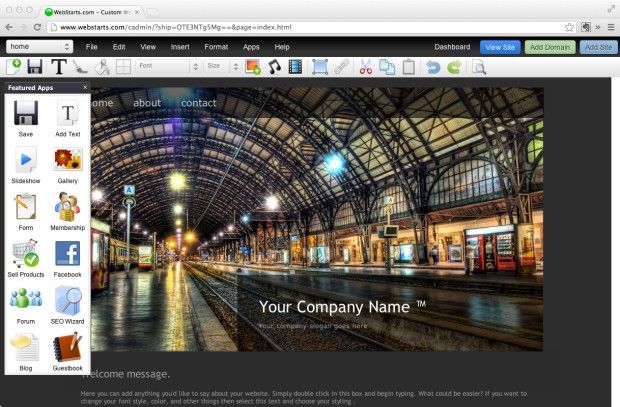
Clicking on any of the items on the page — text boxes, images, etc. — brings up mini toolboxes. Tool tips help explain some of the icons that aren't self evident.
The main screen of the editor is remarkably easy to use. Moving text boxes, images, or background objects is as simple as clicking and dragging. Adding new items is a breeze. The feel of the editor is more like a photo design program than it is a CMS.
I was, however, feeling a distinct sense of HTML-withdrawal. The SEO-geek within me was looking for ways to add H1s and metadata. The CMS was presumably built for people who don't have nerdy impulses, don't have time to learn CSS, and have no idea what an H1 is. In other words, this CMS opens up the mysteries of web-page making to a whole lot more people.
We'll go through each of the top menu items, and discuss how they helped (or didn't help) our effort to build a home page.
Page Drop-Down
The left-most menu item is a drop-down box that allows you to easily navigate to other pages on the site. From this menu, you can also choose to add a new page.
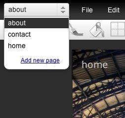
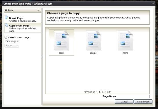
Clicking “add new page” brings up an option box. From this box, it's easy to arrange your site menu and create sub pages. If you wish, you can also copy an existing page, a feature which saves a ton of time.
File Menu
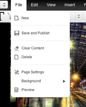
The file menu is a hub of important options. You can make a new page, save and publish your current page, and delete stuff. If you click “delete” or “clear” you receive a confirm button before finally executing the procedure. Most importantly, the file menu allows you to edit your page settings.
The page settings option brings up a fresh array of choices and options. Here is where my SEO itch was scratched. Page settings gives you the ability to upload the XML map, create a favicon, and optimize the page title, keywords, and description. Far from being a medley of optional tweaks, Page Settings is essential for site success.
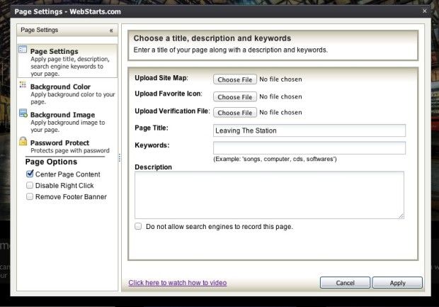
Within Page Settings, you can also choose to center the page content, remove the footer banner, apply a background image, and make other major design changes.
Edit Menu
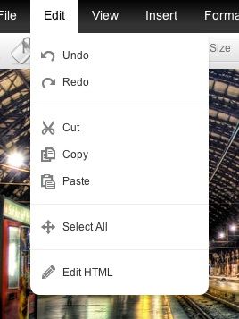
The Edit Menu appears, at first blush, to be a typical display of undo/redo, cut/copy/paste. It is. But it has something else. Notice the “Edit HTML” item at the bottom. That's important if you know code and would like to edit the site code.
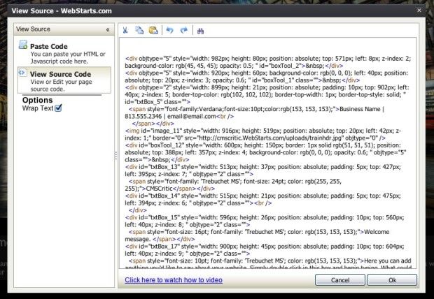
If you're into editing HTML, of course, this is where you'll spend some time. The HTML editor is bare bones, but it does give you the ability to make whatever changes you'd like.
View Menu
From the View menu, you can turn off “guidelines” and close the “Featured Apps” box. We could not determine what happened when we unchecked “guidelines.” Nothing that was visible disappeared from the page we were editing.
Insert
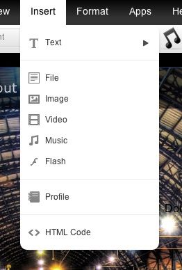
The insert menu allows you to insert files, images, videos, music, and Flash.
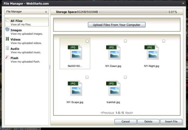
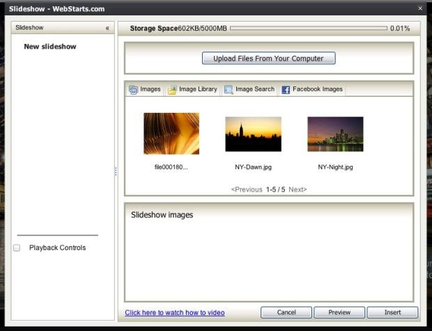
The popup that appears when you click on any of the “insert” options is a File Manager. A handy storage space meter at the top informs you as to how much of your alloted storage has been used. You are allowed 5,000 MB.
Format
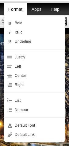
The format menu provides all the typical text formatting tools. Some formatting adjustments that aren't accesible from the formatting menu are available on the top toolbar — font, color, background color, and size.
Apps
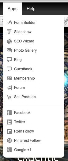
The “Apps” menu contains all of the additional features that WebStarts allows you to build into your website. We experimented with each one of these to test their ease of use, degree of customization, and integration into the site.
Form Builder
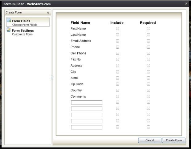
The form builder is not extremely extensive, but it does provide basic options that most users would need.
Slideshow
Slideshows are simple to set up. While customization is limited, the slideshow itself is seamless and simple.
SEO Wizard
We went through each step of the SEO wizard, and found it to be comprehensive. You are guided through the process of creating a page title, meta keywords, and meta description. At the conclusion of the wizard, you are asked if you would like to submit the site to Google for indexing rather than waiting for the crawler to find and index your site. Below are images of the wizard, guiding us through each step of the SEO process. The process is one of the easiest SEO tools that I've used on a website, with the possible exception of some WordPress plugins.
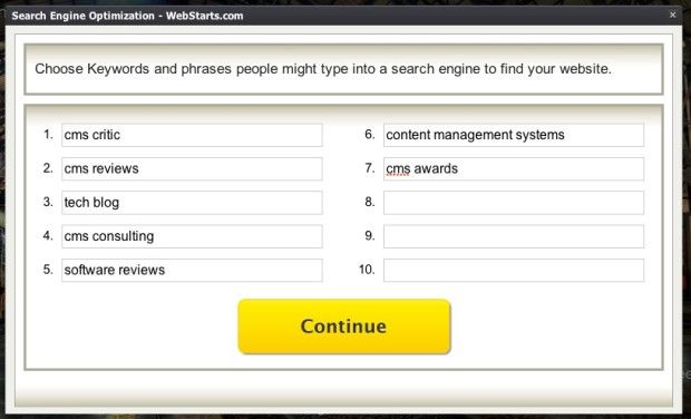
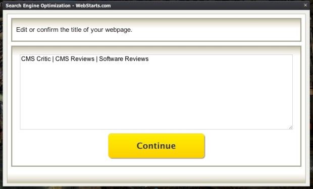
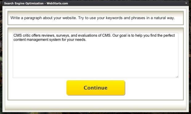
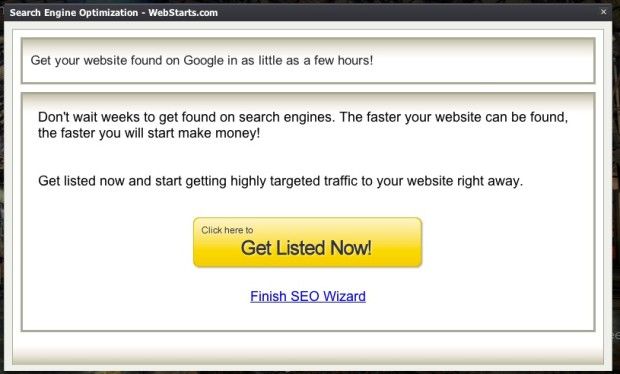
Clicking “get listed now” will take you out of the site editor. Clicking “finish SEO wizard” allows you to return to your site.
Photo Gallery
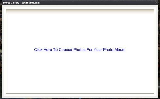
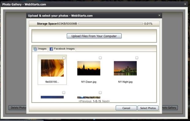
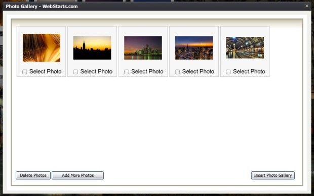
This no-frills photo gallery is an easy way to insert a large number of photos at once. You can even import photos from Facebook. Once the photo gallery is created, you can move it wherever you'd like it to be positioned on the page.
Editing Photos
The built-in photo editor is stacked with features. It is powered by Aviary. Here are a few of the editing options.


Blog
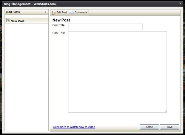
The blog app is more of a glorified text box than an actual “blog.” It allows you to add a title and text — that's it. When you click “save,” the app immediately adds the text to the page. You can, of course, edit the font, color, etc., once you've clicked “save.” As far as an actual “blog,” this falls short of what we envision a blog to be. If you're looking for something really, really simple, this is your forum. We assume that the comment feature, including any comment moderation, is equally simple in terms of features and customization.
Guestbook
Clicking the guestbook app immediately inserts this table into the site:
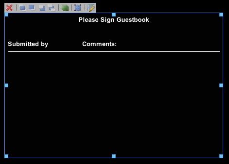
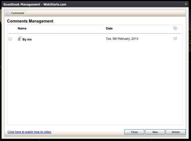
To manage the guestbook, you can simply click on the edit icon (far right). This allows you to add new comments/entries, and delete others.
Membership
To create a members-only section of the site, the “membership” app is handy and simple to set up. The wizard guides you through a series of steps illustrated below.
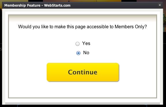
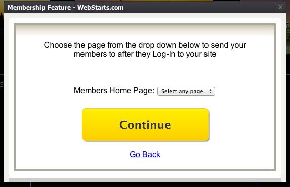
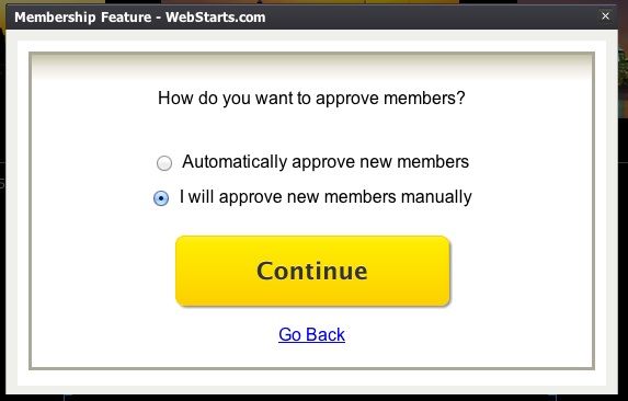
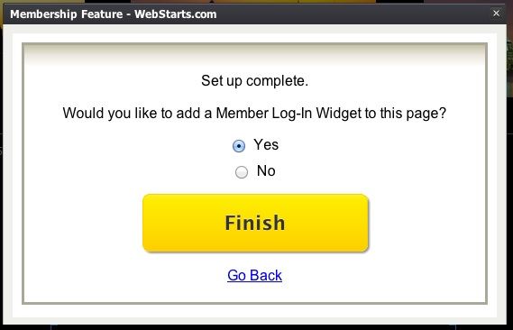
Once you set up the membership access, you cannot change your settings. In order to start over, you'll have to delete the membership widget on the site, and start over again. The completed sign-in link looks like this in edit form:

Forum
I've never seen an easier forum to set up. All it took was one click to get this.
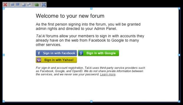
The forum is created by Tal.ki, “the easiest way to embed a forum.” When I tested the forum feature on the live site, it was equally easy to sign in.
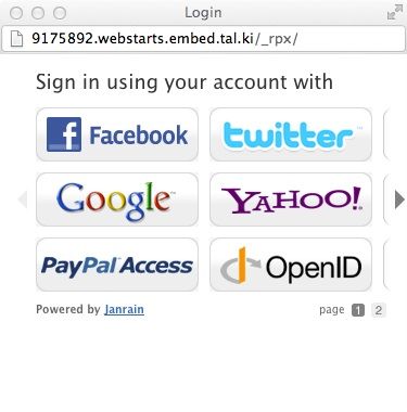
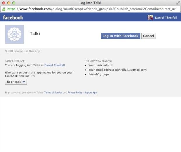
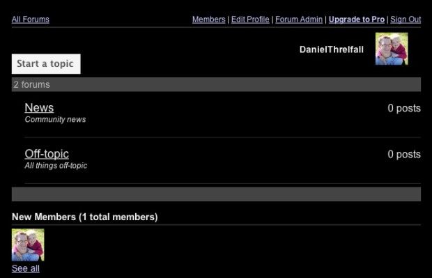
After signing in, I was redirected back to the site forum, and able to navigate easily around. As the site creator, I was automatically made the admin. Among the features on the forum, I saw “upgrades,” which was actually an advertisement to pay $9.95/month for more forum features.
Sell Products
Want a commerce site? WebStarts can do that, too. True to form, the process of adding for sale items is guided by a handy four-step wizard.
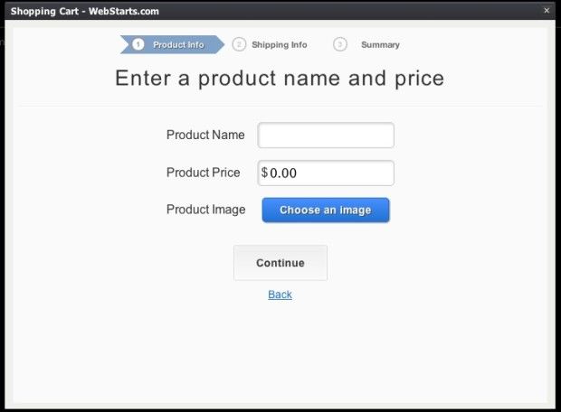
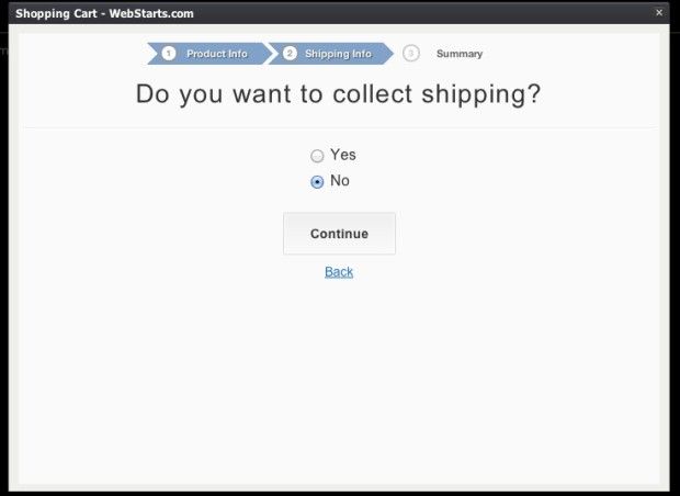
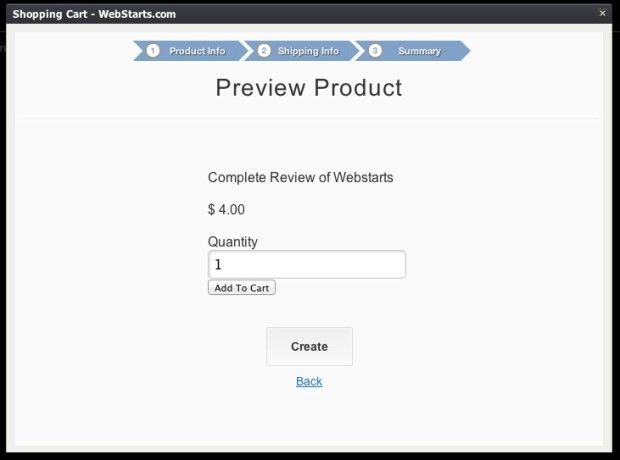
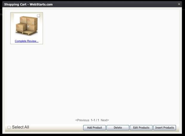
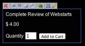
Once the product has been described, priced, and a photo added, you're ready to start selling. When I tested the shopping cart, I was directed to a simple shopping cart overview, followed by the page for payment and order information.
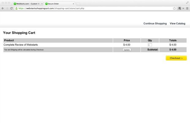
The shopping app works in a straightforward way right out of the box. The shopping cart is customizable with your logo and header, and a few simple templates. You can also set custom tax options, use PayPal, and accept affiliate payouts. Overall, the shopping cart is a robust and full-featured commerce tool that will allow you to safely and securely sell products and accept online payment.
Social Plugins
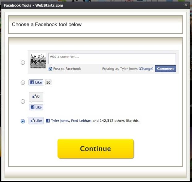
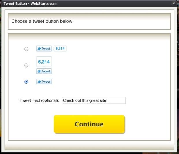
One collection of apps I appreciated were the social plugins. I'm a strong believer in the power of social SEO. WebStarts allows you to add social widgets with just a simple click. Here's a look at each of the social apps.
Rollr
Google +1
Getting Help
The final menu item, “Help” opens a new page with the complete help menu and prominent search field.
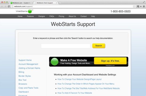
Many of the topics deal with simple questions, such as “What is a blog?” Many more of the topics, however, delve deeper into the aspects of WebStarts that may not be apparent on the surface. For example, “How to change your domain name DNS Name servers settings” is explained in detail, as is “How to broadcast a live webcam on your site.”
The great thing about WebStarts help is that each topic includes a how-to video. We like.
Overview of the Dashboard
The Dashboard is the central hub for managing your sites, pages, shopping cards, stats, and other critical backend information.
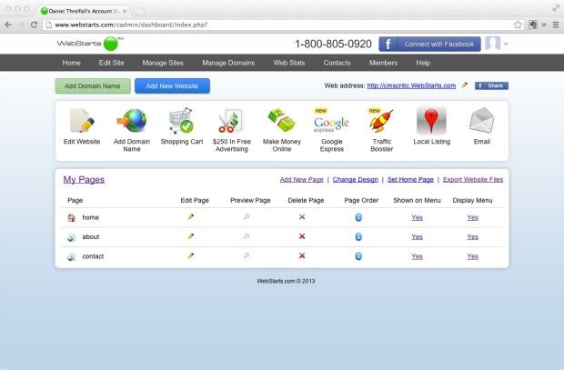
Most of those shiny icon buttons are actually advertisements in disguise. Of course, some of them do provide very helpful services, but you'll have to pay a small fee. Adding 10 custom email addresses, for example, is an annual charge of $69.84. Web Stats Plus costs $9.88/month.
Final Issues
Security
The site seems fairly secure with 256 bit SSL encryption. Authorize.net and Norton Secured icons are also displayed.

SEO
According to the promotional material, WebStarts was designed with SEO in mind. Using their proprietary “one-hop” technology, they claim to have faster and more frequent crawling times, along with improved rankings. Such claims are impossible to verify. Although I was not able to take a close look at the actual “one-hop” technology, I was able to see how SEO played a role in the site setup and design. It is simple to implement and customize.
Cost
I joined and purchased a “WebStarts Shopping Cart Plus” membership. The fee is $149.88 annually. Add-ons such as email addresses, traffic boosters, and web stats cost additional. Although $150 is a lot of money, it's negligible compared to what you would pay in hosting and design from an agency.
Our Site
Wanna check out our brand new mock CMS critic site? Here's what we made.
Customer Service
The 1-800 number is on every page of the site. I gave them a call to see how their service was. I had to wait about forty seconds to speak with a real person. Not bad. The individual I spoke with was a fluent English-speaker, and provided straightforward answers to my questions.
Promo video
Conclusion
We like WebStarts, because it's a powerful CMS that is within reach of just about anyone. Business owners can create their own e-commerce site, and look great doing it. With the easy-to-use interface and customizability, WebStarts should be high on the consideration list for those who want a budget-friendly alternative to an agency site, and who want the accessibility of a drag-and-drop editor.
To check out WebStarts yourself, head over to WebStarts.com and sign up for free.